STUDIO WORKSHOP

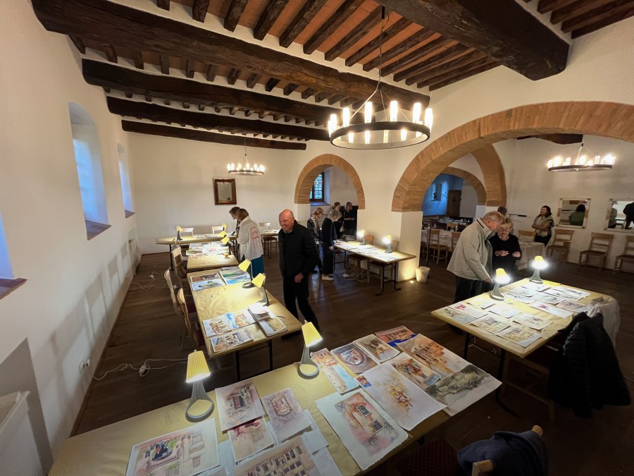
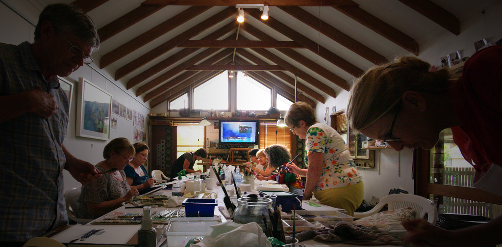
For the last two weeks I have been busy conducting a workshop looking at selecting, manipulating and extracting the most from a painting subject. It was a lot of fun, but we worked hard – doing a couple of paintings each day and squeezing in a few critique sessions, where we examined everybodys work and discussed various problems and solutions.

Studio Workshop John Lovett Nov 2011

It is always a pleasure meeting new students and catching up with students from previous workshops. One of our new students for the second week was Carol and her assistant, Kim. What an inspiring lady – taking up watercolor a couple of years ago after a severe car accident ended her career as a lawyer and left her a quadriplegic. Forgetting about her disability, the standard of her paintings is excellent, but to see how she has overcome so many physical hurdles to produce the work she does is just amazing. On top of this, she is determined to keep on improving and works hard to that end.

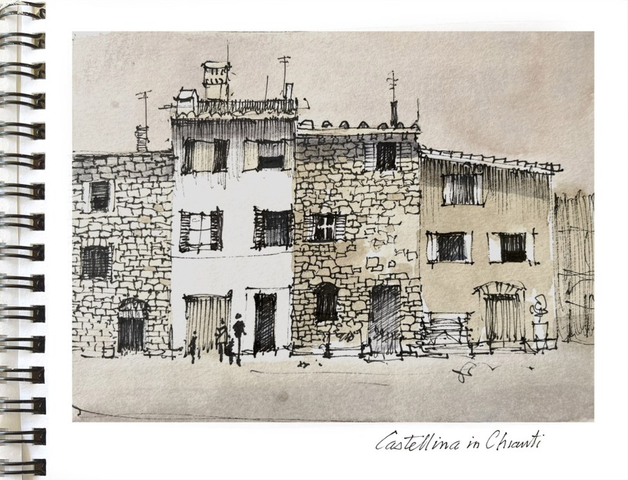
Thumbnail sketches and simple monochrome collages were used to simplify and rearrange our subjects.

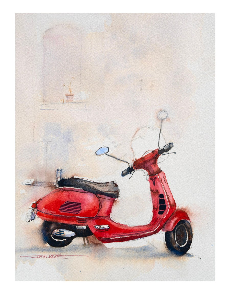
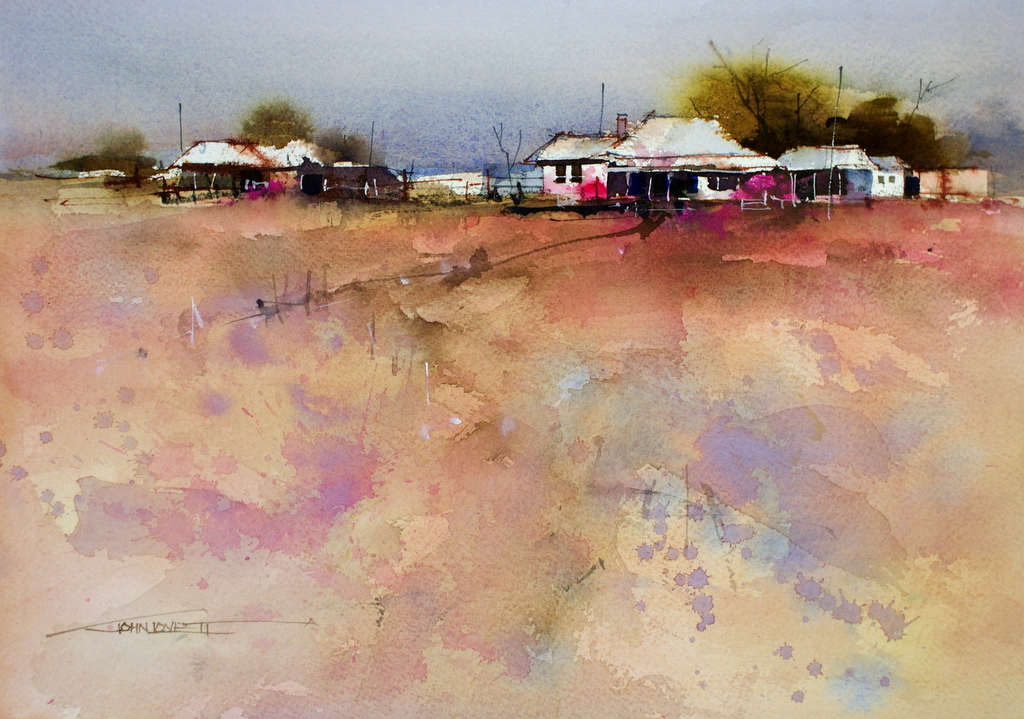
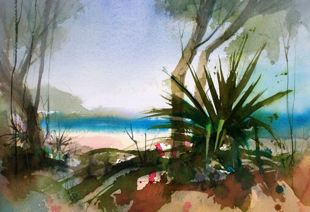
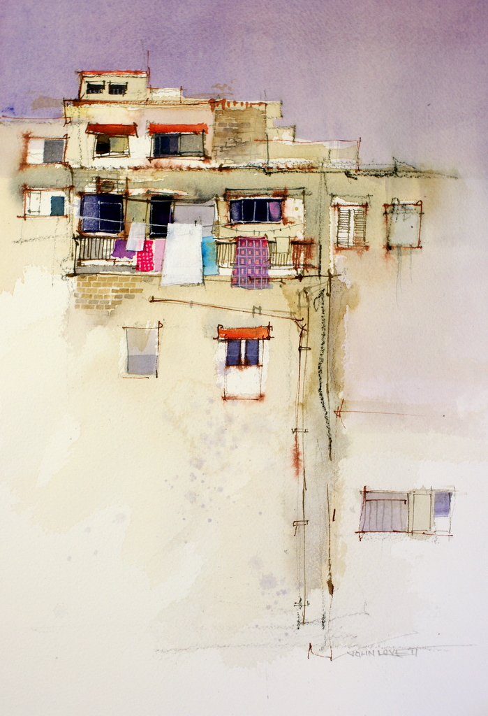
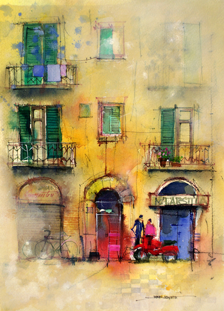
The demonstration paintings below illustrate some of the techniques we explored.

Manipulating a large foreground to lead up to a focal point while not causing a distraction.

Creating depth with hard and soft edges

Flat Ultramarine gouache used to squeeze more vibrancy from the warm, transparent watercolor.

Confining detail and using empty space as an element in the painting.

Practicing the random placement of suggestive abstract marks

Blitz Truck Watercolor


Sometimes an unusual subject will free you up to try new techniques.

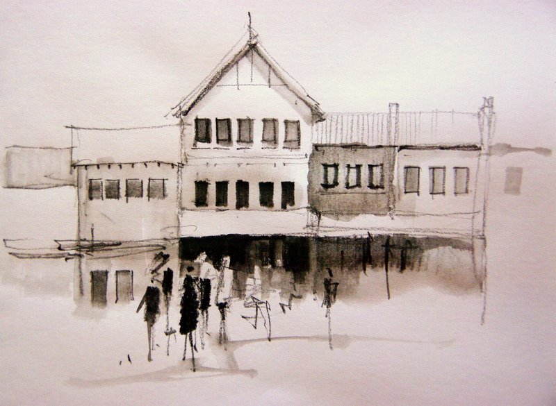
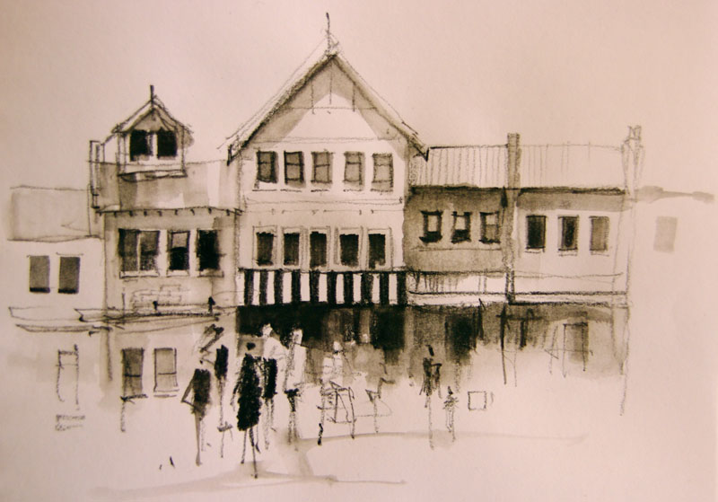
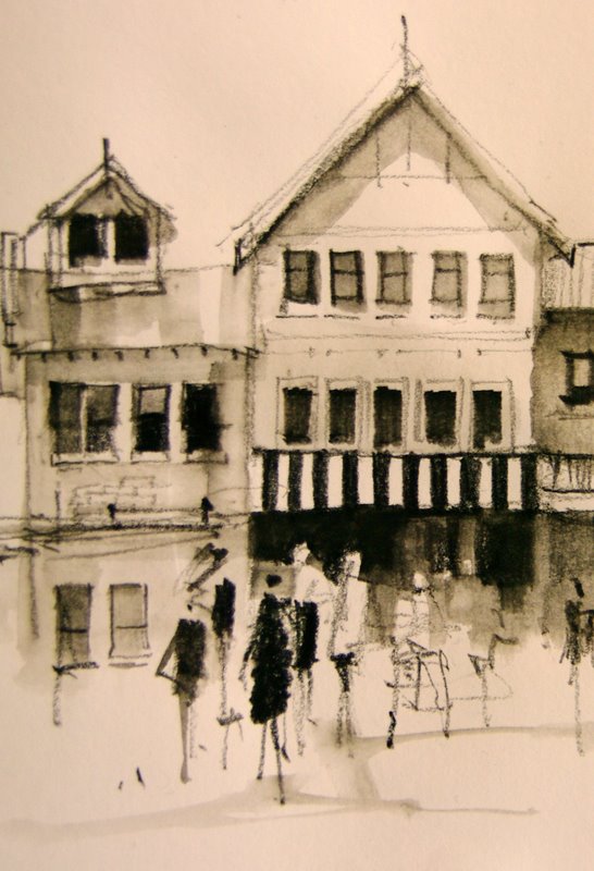
Making a strong focal point in what was a flat uniform facade.

Starting loosly with a big brush and no preliminary drawing, then adding detail as the painting progresses.

Experimenting with techniques to break up a symetrical subject.

NEW TOYS

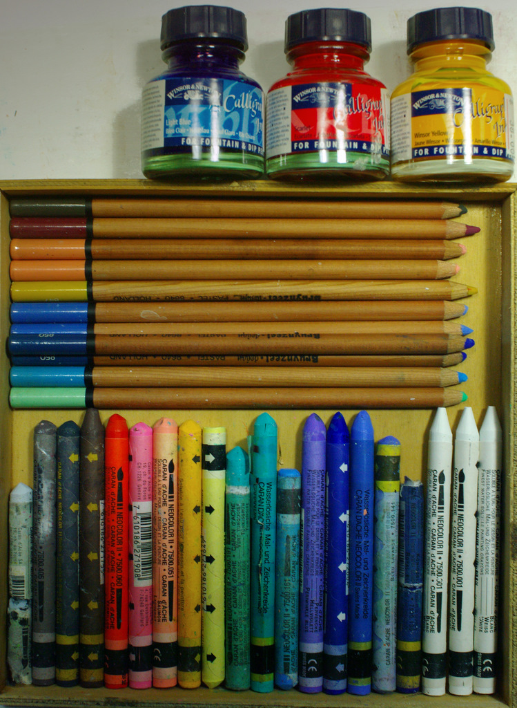
I’m a sucker for an Art Supply Shop. I just can’t walk past them. While we were in Hong Kong an assortment of pastel pencils, water soluble crayons and colored inks became absolute necessities. Things that I couldn’t leave the shop without!

I have drawers full of such items. Essential in the excitement of the moment, but once in the studio and tested, they become just another unnecessary distraction. Fortunately, this bout of impulse buying resulted in some really useful new toys.

The inks are Winsor and Newton Calligraphy inks – Brilliant primary colors

The pastel pencils are a Dutch brand I have not tried before – Bruynzeel. Fine textured and good colors.

I have used the Caran d’Ache water soluble crayons before, but fell for a pile of new colors.

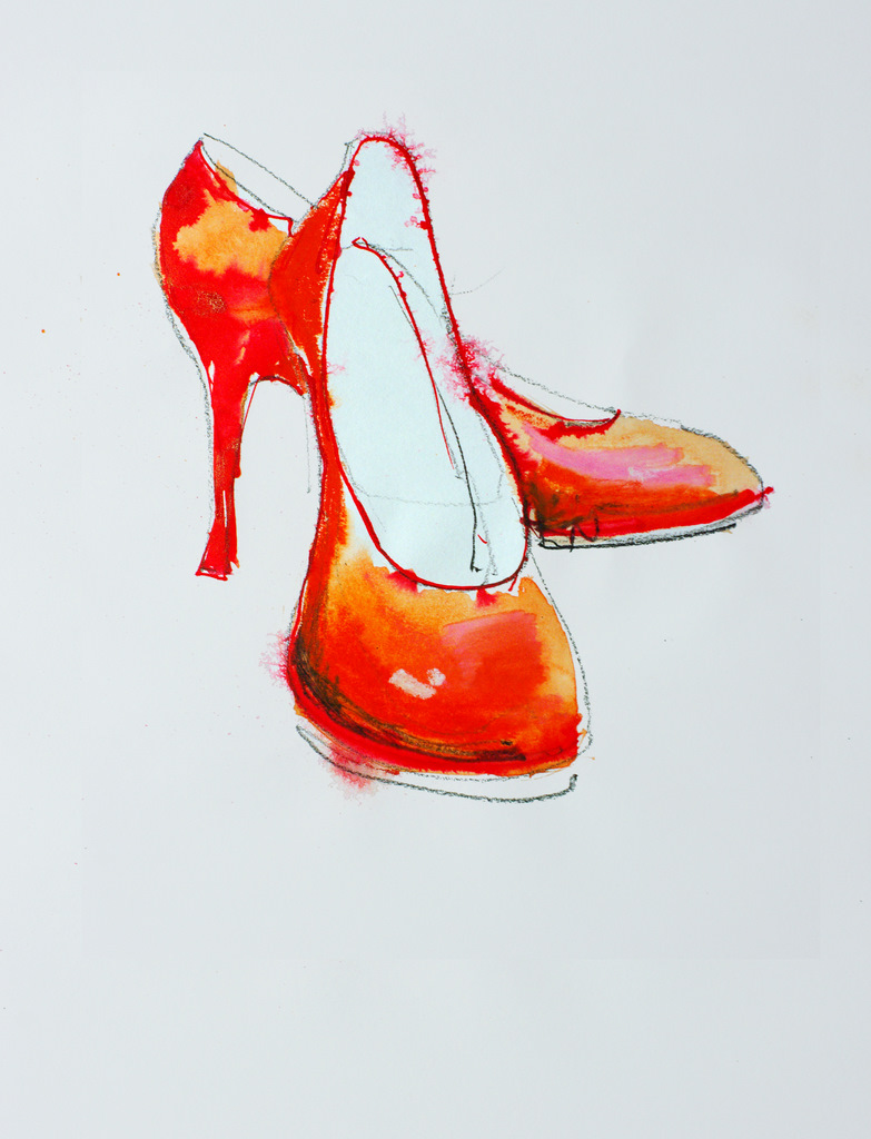
Red Shoes – Sketched with a charcoal pencil then colored with a red, orange and pink crayon. After the crayon was applied, a wet 1/2″ brush was used to dissolve and blend the colors. Finally a few red ink lines were drawn on and sprayed with a mist of water.

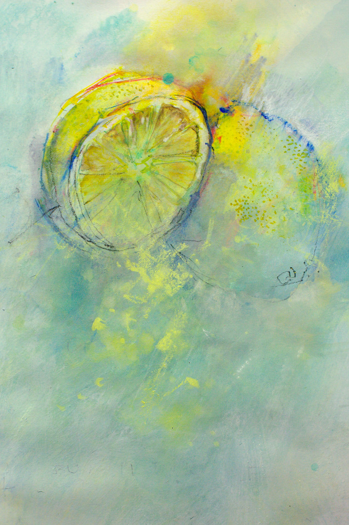
These Lemons were painted with a mixture of crayon ink and pastel pencil. A gesso wash was scrubbed over the foreground before the final yellow crayon marks were applied. Before the Gesso had dried the lemon was carefully sliced and dropped into a Gin and tonic.

CAMERA LUCIDA

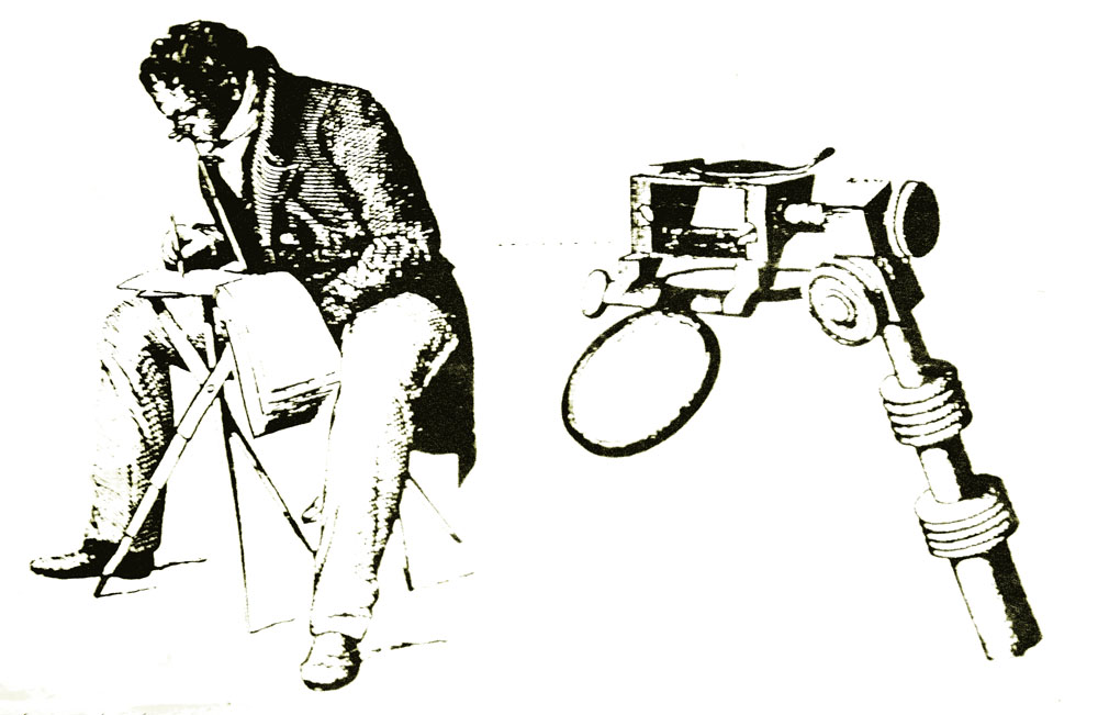
There is something irresistible about things in little wooden boxes. A friend lent me this old Camera Lucida to play around with. It’s an amazing device that allows one eye to see an inverted image of what ever is infront of you while the other eye sees your sketch book. Once the device is set up it is a simple matter to trace what ever you are looking at onto the sketch book.

The device was patented by William Hyde Wollaston in 1806 and was used as an aid to to sketching and visual documentation prior to the development of the camera.

The device is difficult to set up and the results have a tight, traced look about them. The camera lucida is beautifully made from heavy polished brass. The solid brass base clamp is hand engraved in French with the manufactures details. The wooden box has fine dovetailed joints and is lined with felt and satin. What a nice thing to carry around when you go sketching!

Today, the common pose of someone taking a photograph is two arms outstretched, camera gripped at arms length. This replaced the camera pushed to face, squint through viewfinder pose created by the invention of roll film. I wonder if the pose above, with the camera lucida and folding stool, was a common site through the 1800’s?

INKTENSE PENCILS

pencil

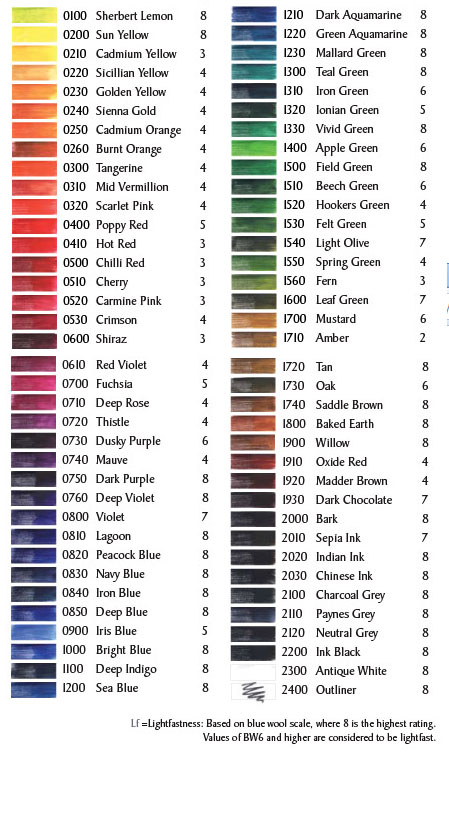
Derwent Cumberland make a great pencil that will draw equally well on wet or dry paper. They come in a broad range of colors, however some are not really lightfast. Fortunately most of the browns, greys, earth colors, and many of the blues are, according to the list below, tested to be lightfast.

IMGP1238

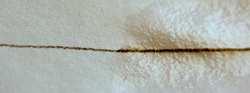
Inktense pencils will produce a strong dark mark on wet or dry paper.

IMGP1232-1

Light shading can be quickly dissolved with a damp brush to make subtle watercolor like washes. Once these washes dry they are permanent and insoluble just like permanent ink. This means they can be worked over without being disturbed.

sketch

detail1

Drawing with Inktense pencils and a damp brush produces interesting results hovering somewhere between pencil and watercolor.

The sketch above was done with a dark brown (Bark 2000). I haven’t experimented with colors yet, but imagine they would be a lot of fun. I have used the Bark (2000) pencil and the Charcoal Grey (2100) in a number of watercolor paintings and I’m really happy with the results.

The pencils are nice and smooth to use and release pigment easily. They sharpen well and the leds, being of a waxy consistency, are resistant to fracturing

colors

Read more about them on the Derwent website (link opens in new window)

INDUSTRIAL STUFF

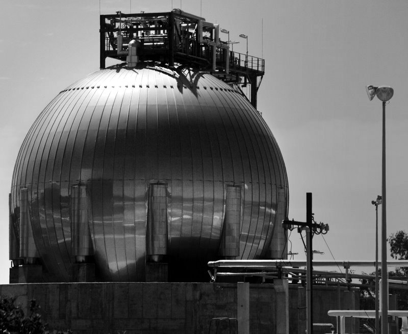
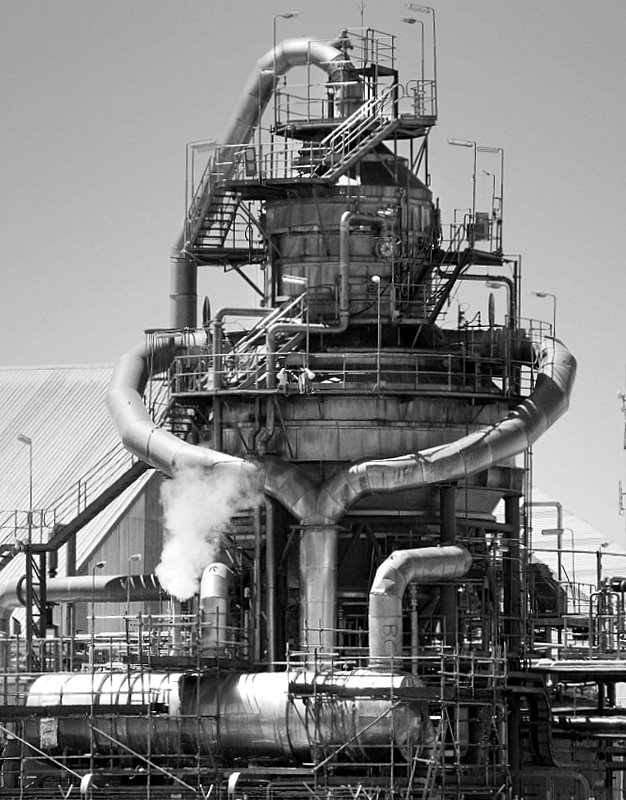
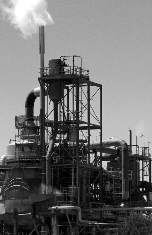
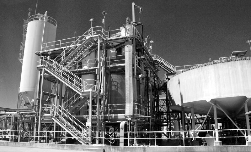
If you’re into over the top industrial hardware, then Western Australia sure is the state to visit.

These giant pieces of apparatus look almost organic. It’s hard to imagine someone sitting at a drawing board, under a cold fluorescent light, creating this sort of stuff. It looks so random and chaotic.

I hope you enjoy the photographs. It’s a dangerous business, standing on the roof of a landcruiser pointing a long lens over five strands of barbed wire. I’m sure I was viewed with much suspicion and, in a different country, would have probably been shot on site.

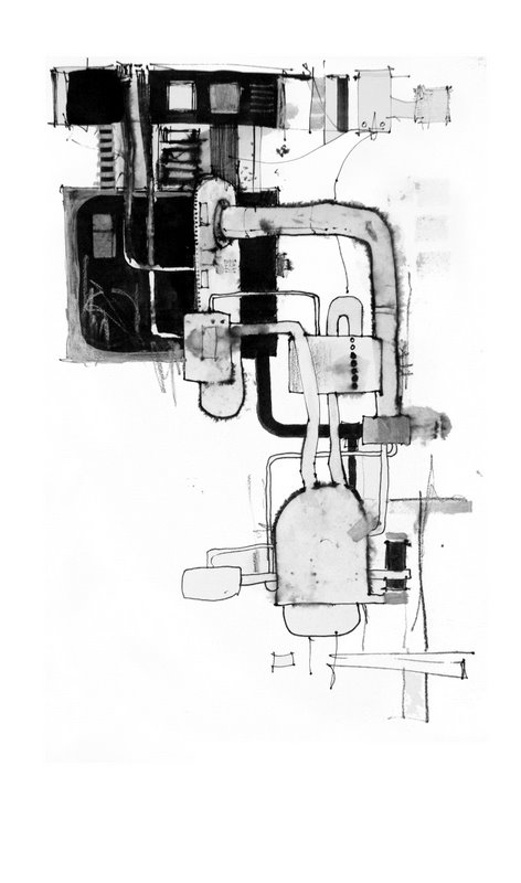
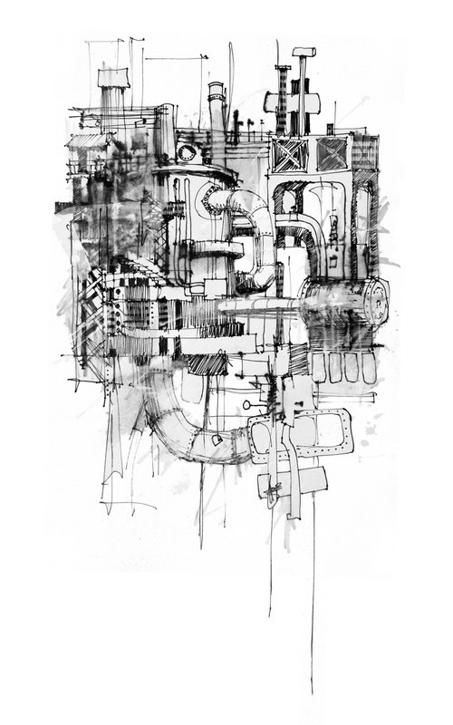
The sketches are done with a 0.4 Black Artline 204 fibre tip, a White uni posca fibre tip, Indigo watercolor and a tea bag

IMGP1138x-1z

.

IMGP1142x-1
.

IMGP1148xz
.


IMGP5841z

.
sketch1
0.4 Black Artline 204 fibre tip, White uni posca fibre tip, Indigo watercolor and a tea bag
sketch2-1
0.4 Black Artline 204 fibre tip,  White uni posca fibre tip, Indigo watercolor, Tissue paper and a glue stick

FISHERMEN’S HUTS

FISHERMEN’S HUTS
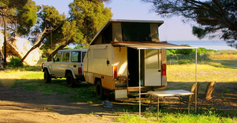
Traveling about looking for interesting things to paint is a lot of fun and occasionally you stumble upon a location you just don’t want to leave. This was the case when we followed a rough sandy track down onto an isolated West Australian beach. The sea was that pristine turquoise color and, sheltered by a low headland, were a number of unoccupied fishermen’s huts looking out to sea. The fishermen had built a makeshift jetty and scattered about were lobster pots, nets, floats, ropes and all the tools of the fishermen’s trade.
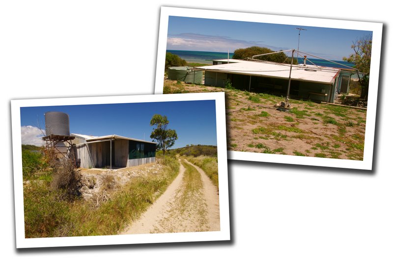
The area was stark and windswept, and the salt air had rusted, corroded and faded everything in site. We wound our way along a sandy track past the huts and set up camp under the shelter of the headland. It was a short walk back to the huts to sketch and paint.
What appealed to me was the bleached weathered look of everything and the interesting contrast between warm and cool blues. For this reason I chose a palette containing three blues. Phthalo, Ultramarine and Cobalt. The only other colors were Permanent Alizarin Crimson and Quinacridone Gold.
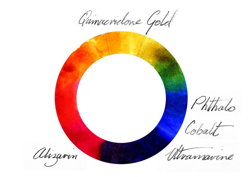
These five pigments give us a good range of colors to suit our subject. Quinacridone Gold doesn’t give us a saturated yellow, but this subject doesn’t require one. What we do have is a warm, neutral and cool blue. The Ultramarine leans towards violet, so contains a little red. This is our warm blue. The Cobalt is neither warm or cool. It is about as close as we can get to a pure primary blue. The Phthalo leans towards green, so contains a little yellow. It is our cool blue.
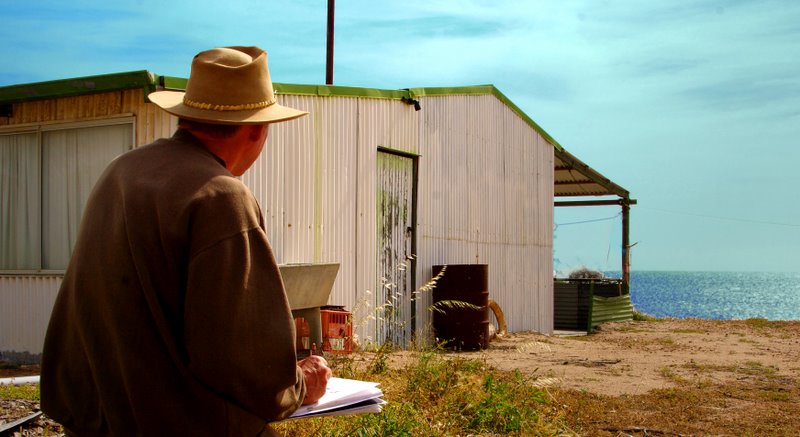
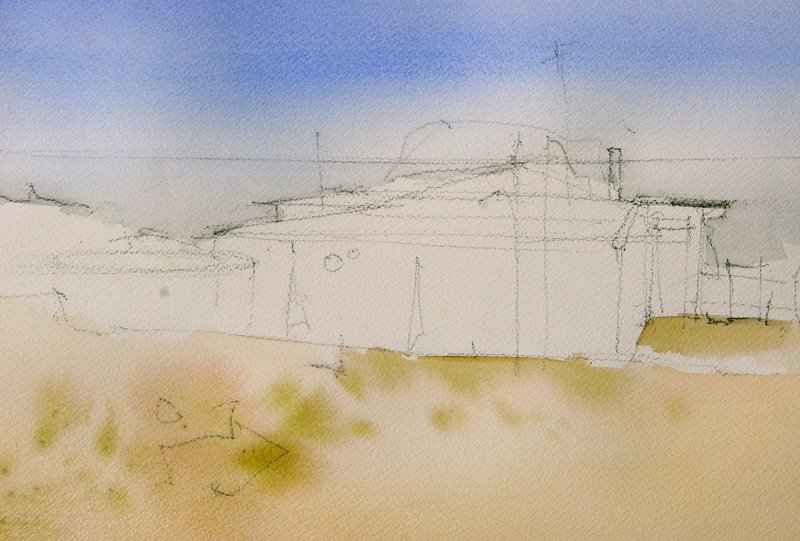
The rough layout drawing was sketched in lightly with a charcoal pencil. Just enough information to indicate where the main shapes will go.
A graded wash of Cobalt Blue was put through the sky and water and allowed to dry. The sandy foreground was washed in with a mixture of Quinacridone Gold, Alizarin and a touch of Ultramarine. Some more Quinacridone Gold and a little Phthalo was added to the sandy color on the palette. This was then splashed into the still wet foreground.
The next step was to wet the sea and drop some pure Ultramarine along the horizon. Before this dried Phthalo blue was put into the lower part of the sea. The shadow areas of the hut were painted with a neutral gray, then Alizarin was dropped in while it was still wet. The important thing to remember at this stage is to leave those punctuating white marks. The bushes were mixed from Quinacridone Gold, Phthalo Blue and a little Alizarin. They were not applied until the painting was completely dry. This meant the edges could be softened with a damp, clean 1″ brush without disturbing the washes underneath. The blue surrounding the door is pure Cobalt.
Fine details were added next with a No.2 Rigger Brush. A few Burnt Sienna ink lines were also added and sprayed with a mist of water to make them bleed and run
The final step after adding some more detail to the foreground, was to grade a wash of straight cobalt in from either side of the painting. This helps focus attention on the center of interest and makes the warm colors of the hut jump out from the surrounding area of cool. For these Cobalt washes to succeed the painting first needs to be thoroughly dry.
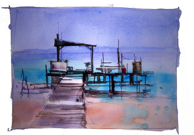
The old makeshift jetty was great to draw with all the interesting negative shapes and varied lines and spacing.
After I finished the sketch, a series of graded washes using the same five colors was laid over the pencil lines. A few dark rigger lines added strength to the pencil marks and a couple of patches of white paper draw attention to the center of interest.

WATERCOLOR PAINTING DEMONSTRATION

www.johnlovett.com – opens in a new window

Traveling about looking for interesting things to paint is a lot of fun and occasionally you stumble upon a location you just don’t want to leave. This was the case when we followed a rough sandy track down onto an isolated West Australian beach. The sea was that pristine turquoise color and, sheltered by a low headland, were a number of unoccupied fishermen’s huts looking out to sea. The fishermen had built a makeshift jetty and scattered about were lobster pots, nets, floats, ropes and all the tools of the fishermen’s trade.

photo2-1

The area was stark and windswept, and the salt air had rusted, corroded and faded everything in site. We wound our way along a sandy track past the huts and set up camp under the shelter of the headland. It was a short walk back to the huts to sketch and paint.

IMGP0946

What appealed to me was the bleached weathered look of everything and the interesting contrast between warm and cool blues. For this reason I chose a palette containing three blues. Phthalo, Ultramarine and Cobalt. The only other colors were Permanent Alizarin Crimson and Quinacridone Gold.

colwheel

These five pigments give us a good range of colors to suit our subject. Quinacridone Gold doesn’t give us a saturated yellow, but this subject doesn’t require one. What we do have is a warm, neutral and cool blue. The Ultramarine leans towards violet, so contains a little red. This is our warm blue. The Cobalt is neither warm or cool. It is about as close as we can get to a pure primary blue. The Phthalo leans towards green, so contains a little yellow. It is our cool blue.

draringhut

3

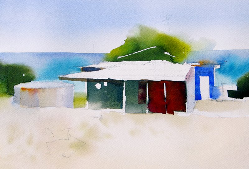
This painting was started with a graded wash of Cobalt Blue put through the sky and water then allowed to dry. The sandy foreground was washed in with a mixture of Quinacridone Gold, Alizarin and a touch of Ultramarine. Some more Quinacridone Gold and a little Phthalo was added to the sandy color on the palette. This was then splashed into the still wet foreground.
4

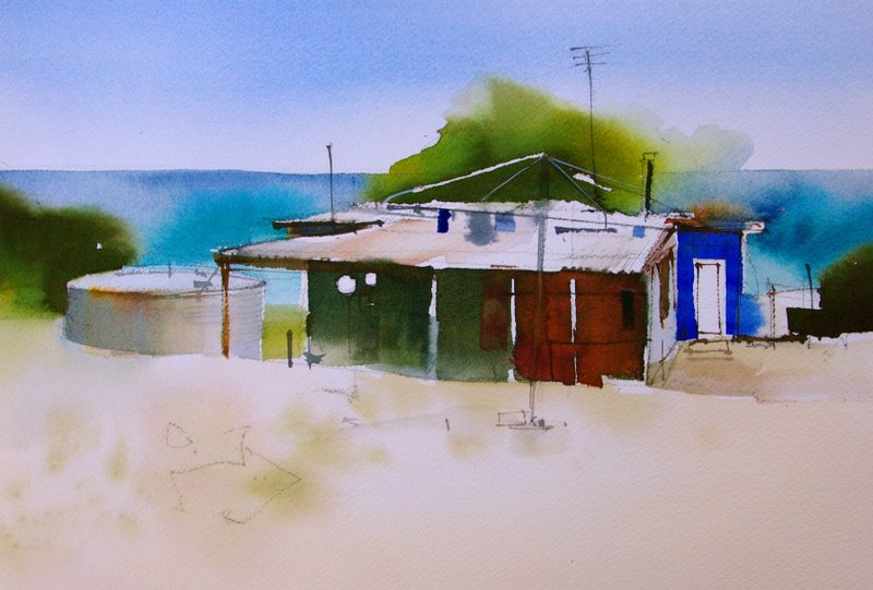
The next step was to wet the sea and drop some pure Ultramarine along the horizon. Before this dried Phthalo blue was put into the lower part of the sea. The shadow areas of the hut were then painted, leaving those punctuating white marks. The bushes were mixed from Quinacridone Gold, Phthalo Blue and a little Alizarin. They were not applied until the painting was completely dry so the edges could be softened.  The blue surrounding the door is pure Cobalt.
5

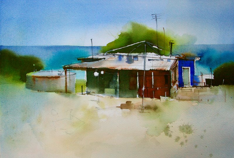
Fine details were added next with a No.2 Rigger Brush. A few Burnt Sienna ink lines were also added and sprayed with a mist of water to make them bleed and run.
final

The final step after adding some more detail to the foreground, was to grade a wash of straight Cobalt in from either side of the painting. This helps focus attention on the center of interest and makes the warm colors of the hut jump out from the surrounding area of cool. For these Cobalt washes to succeed the painting first needs to be thoroughly dry.
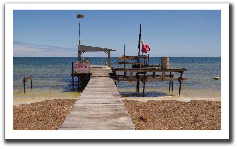
photo1

sketch

The old makeshift jetty was great to draw with all the interesting negative shapes and varied lines and spacing.
colsketch

After I finished the sketch, a series of graded washes using the same five colors was laid over the pencil lines. A few dark rigger lines added strength to the pencil marks and a couple of patches of white paper draw attention to the center of interest.

This article will appear in full in the next issue of INTERNATIONAL ARTIST MAGAZINE.
MINING MACHINERY

Ranger Uranium Mine, in the heart of Kakadu National Park, has the weird attraction of a car accident. It’s all very horrific but you just can’t help looking!
IMGP5796

The dirt from an enormous hole in the ground satisfies 10% of  the worlds hunger for uranium. They dig it up, crush it, mix it with various toxic chemicals (ammonia, sulphuric acid, kerosene), then , once separated and purified, pack it into 44 gallon drums and sell them for over half a million bucks a pop.

All this so the Chinese and Indians can have two door fridges, plasma TV’s and  air conditioned shopping centres,  just like we do.

IMGP5790

As crazy as all this is, I just cant help admiring the technology and machinery that brings it all about. One small human can sit in a giant loader and, with the assistance of hundreds of litres of burning diesel, pick up 30tons of earth in one scoop and drop it in the back of a monstrous truck. These really are awesome machines and they make great painting subjects.

These sketches were done with Indian Yellow, Alizarin Crimson, Ultramarine Blue and White Gouache. Burnt Sienna Ink and charcoal pencil provided most of the fine lines.

IMGP6165

I liked the way this machine was resting, with it’s bucket on the ground like a big, tired elephant

IMGP6167

These trucks carry 100ton of dirt, in and out of the pit all day long. Even so, they look over designed – as if nothing could ever stop them.

IMGP6168

I used bleeding ink lines, rough charcoal marks and washes of dirty white gouache to try and get the smell of grease and diesel into this sketch.

It seems weird I guess, sitting in one of the most beautiful places on earth, painting trucks and graders!  It’s a lot of fun though.