WEST TO WINTON

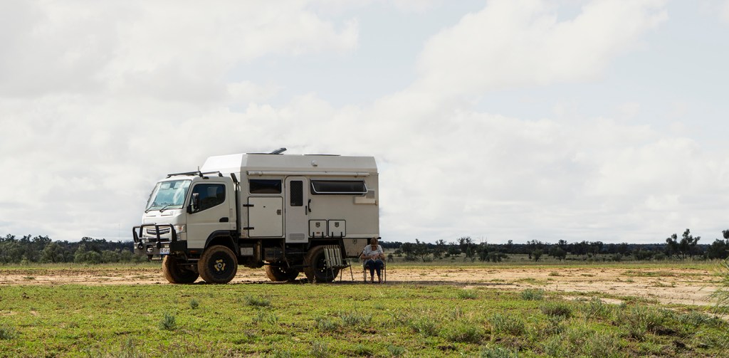
A workshop in Blackall and another spread between Longreach and Winton saw us load up the truck and head off to central Queensland for six weeks. The country was incredibly green after all the rain and flooding. Many roads were still closed and venturing off the bitumen was a slippery, muddy exercise.

© John Lovett

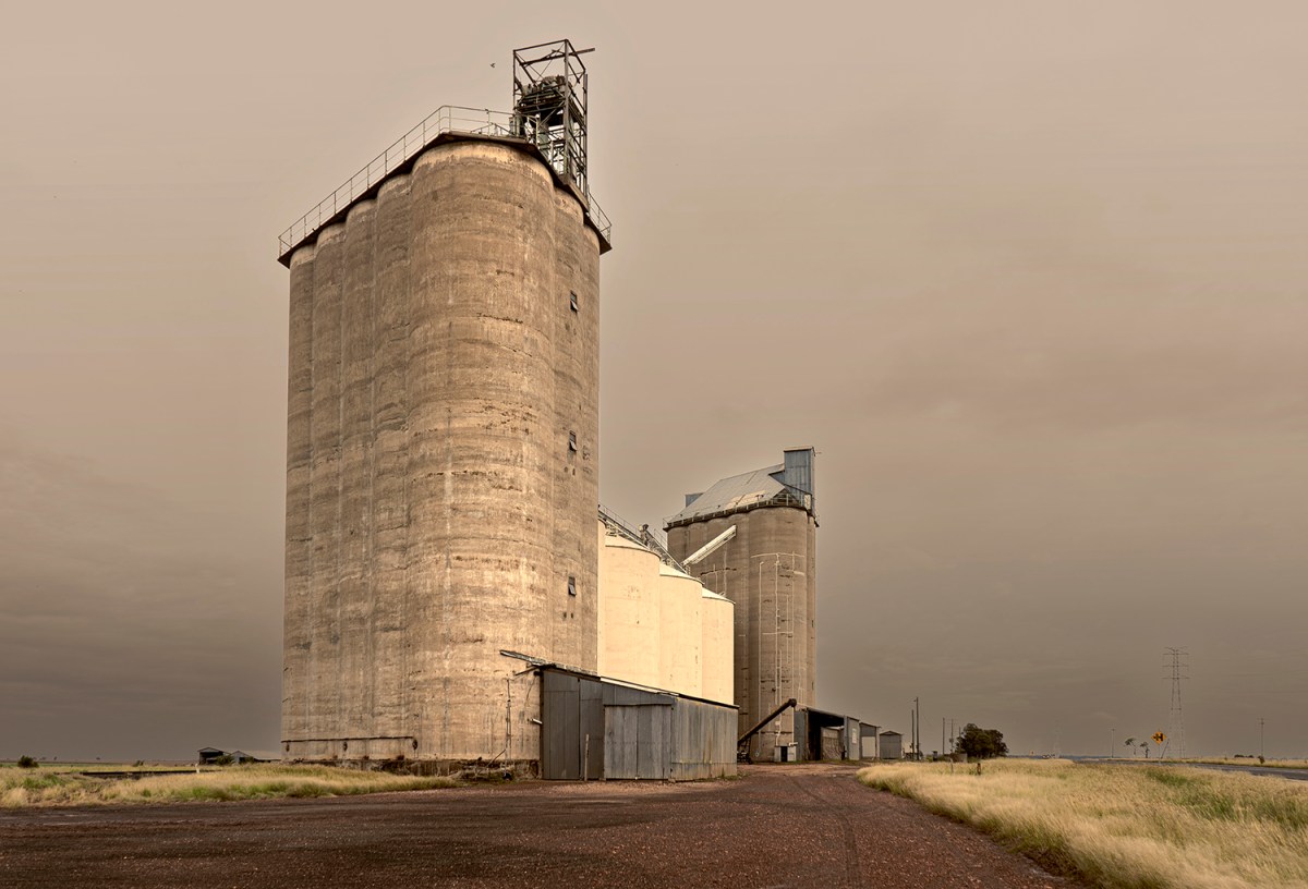
Silos on the road to Roma

© John Lovett

This old pub at Wallumbilla looks less than inviting soaked in rain and surrounded by mud, but the local graziers couldn’t be happier.

© John Lovett

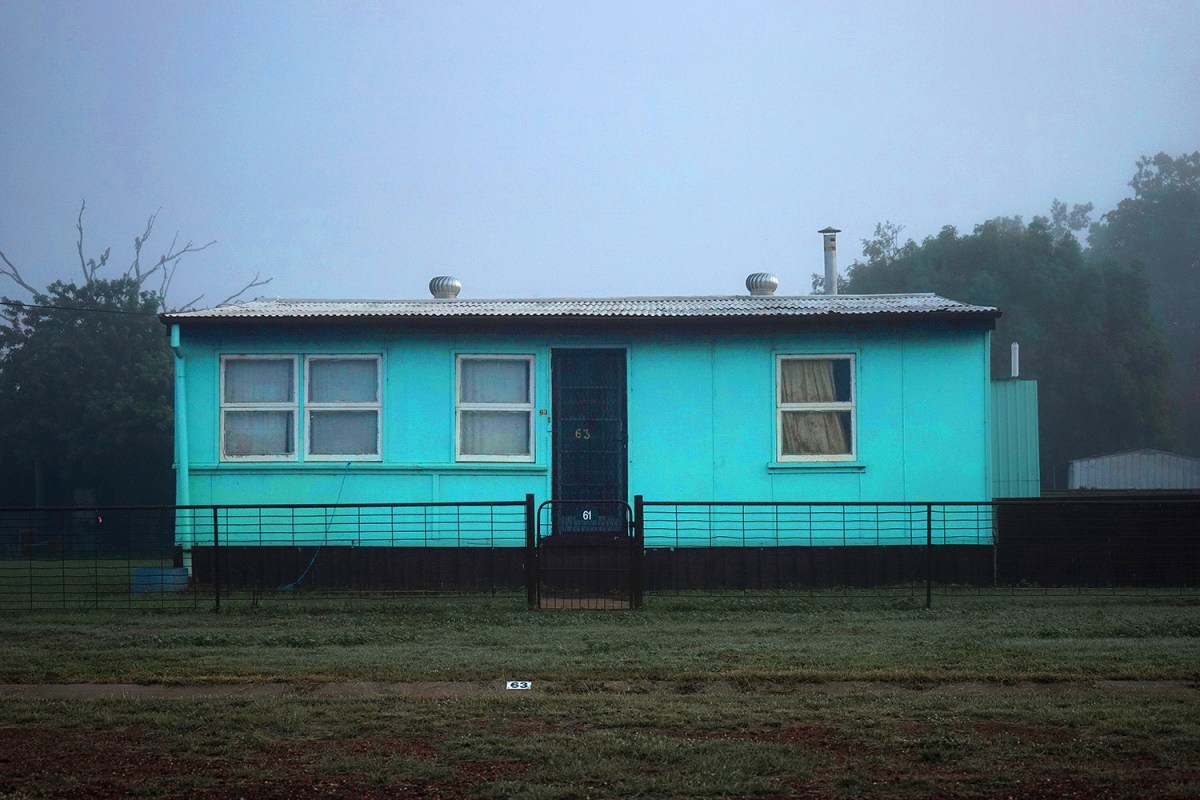
Retirement green confusion – Morvan.

© John Lovett

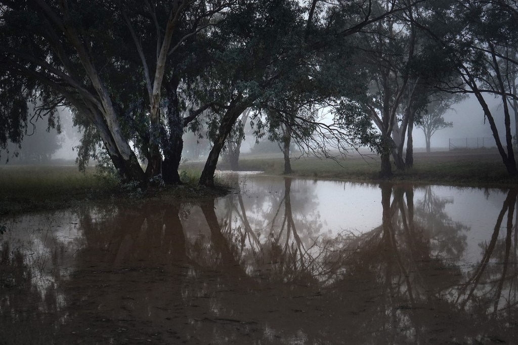
Early morning – Morven waterhole

© John Lovett

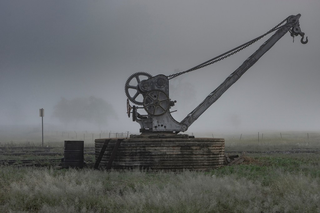
Disused railway crane – Morven

© John Lovett

Camping out of Tambo was a little tricky – where there wasn’t grass there was thick, sticky mud.

© John Lovett

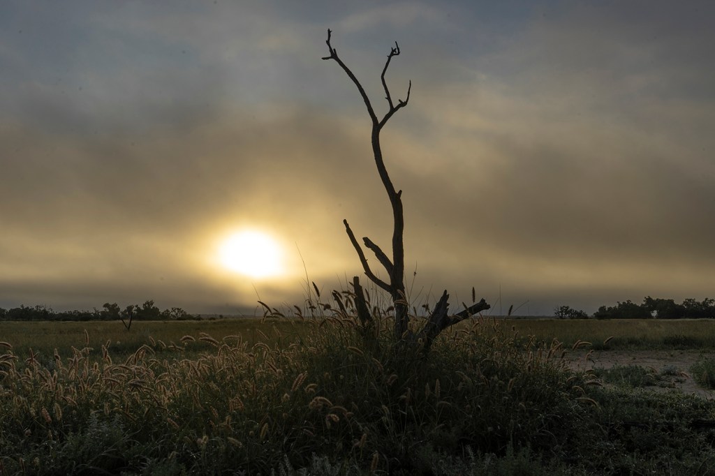
Sunrise through a layer of fog, Tambo

© John Lovett

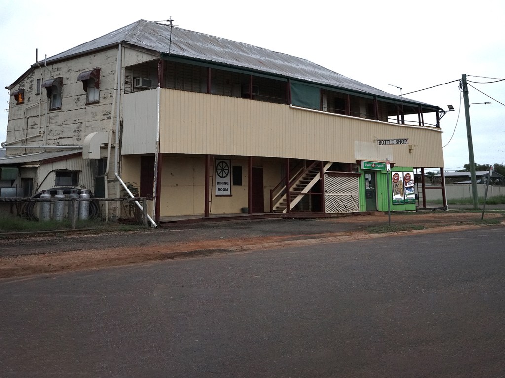
Union Hotel Blackall – still sells cold beer, but not much else

© John Lovett

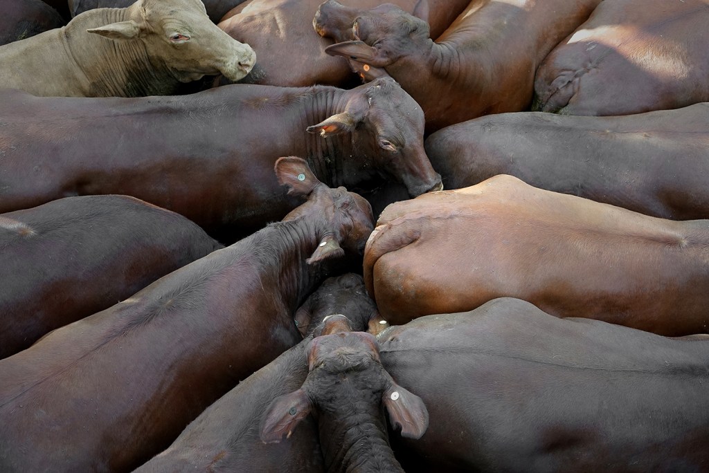
The weekly cattle sale in Blackall saw some fat’ healthy cattle, happy sellers and not so happy re-stockers.

© John Lovett

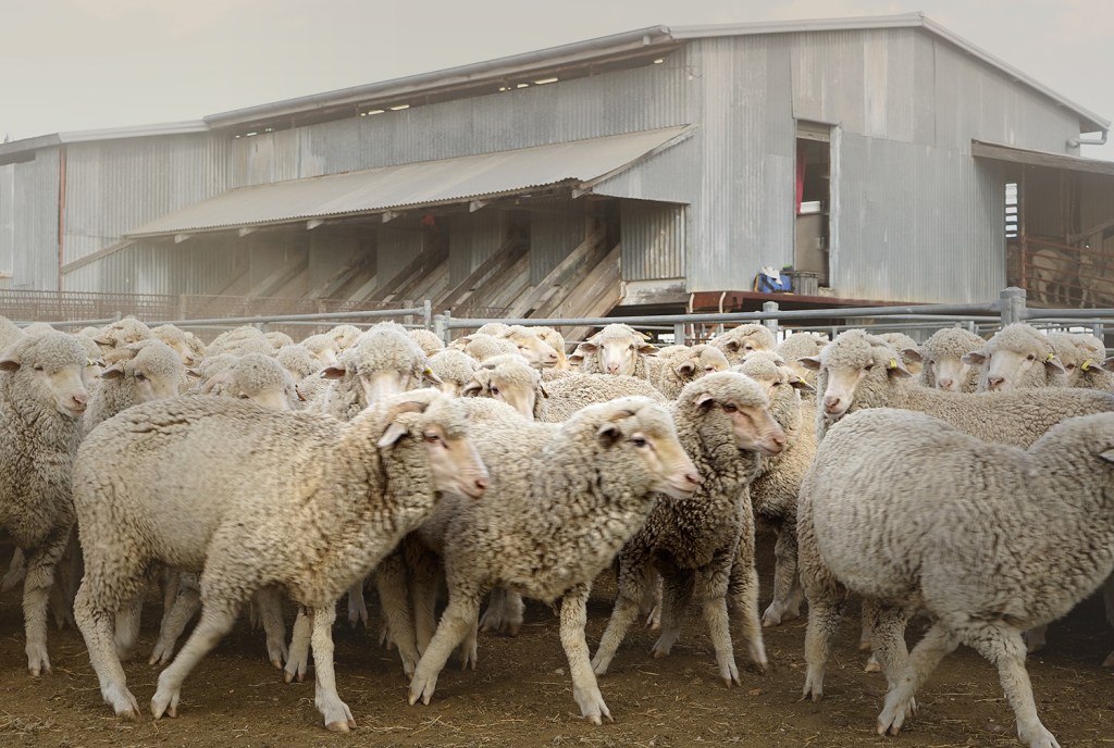
Lisa and Bruce, from one of the big sheep stations out of Blackall, invited us out to see the end of the shearing.

© John Lovett

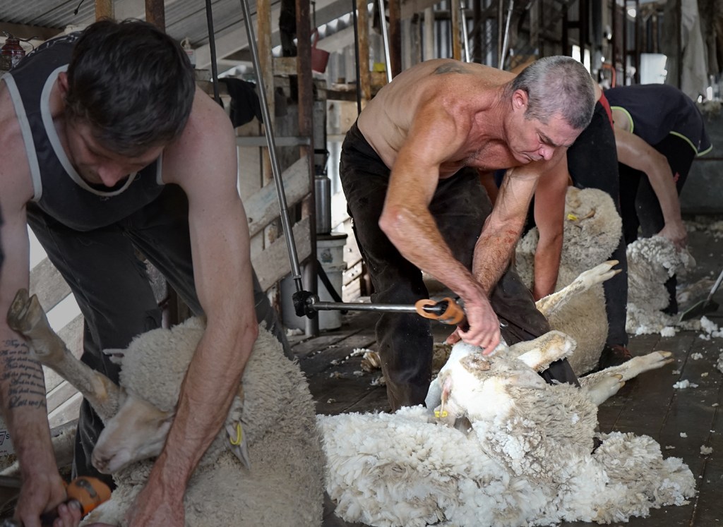
These guys work flat out, fired up by loud, fast music, high demand and and a competitive attitude.

© John Lovett

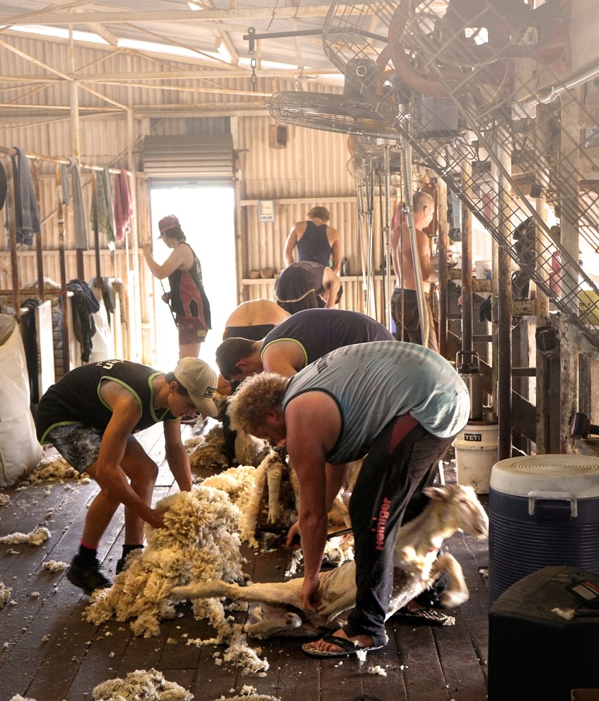
Shearing their way through several thousand sheep is hard, back breaking work.

© John Lovett

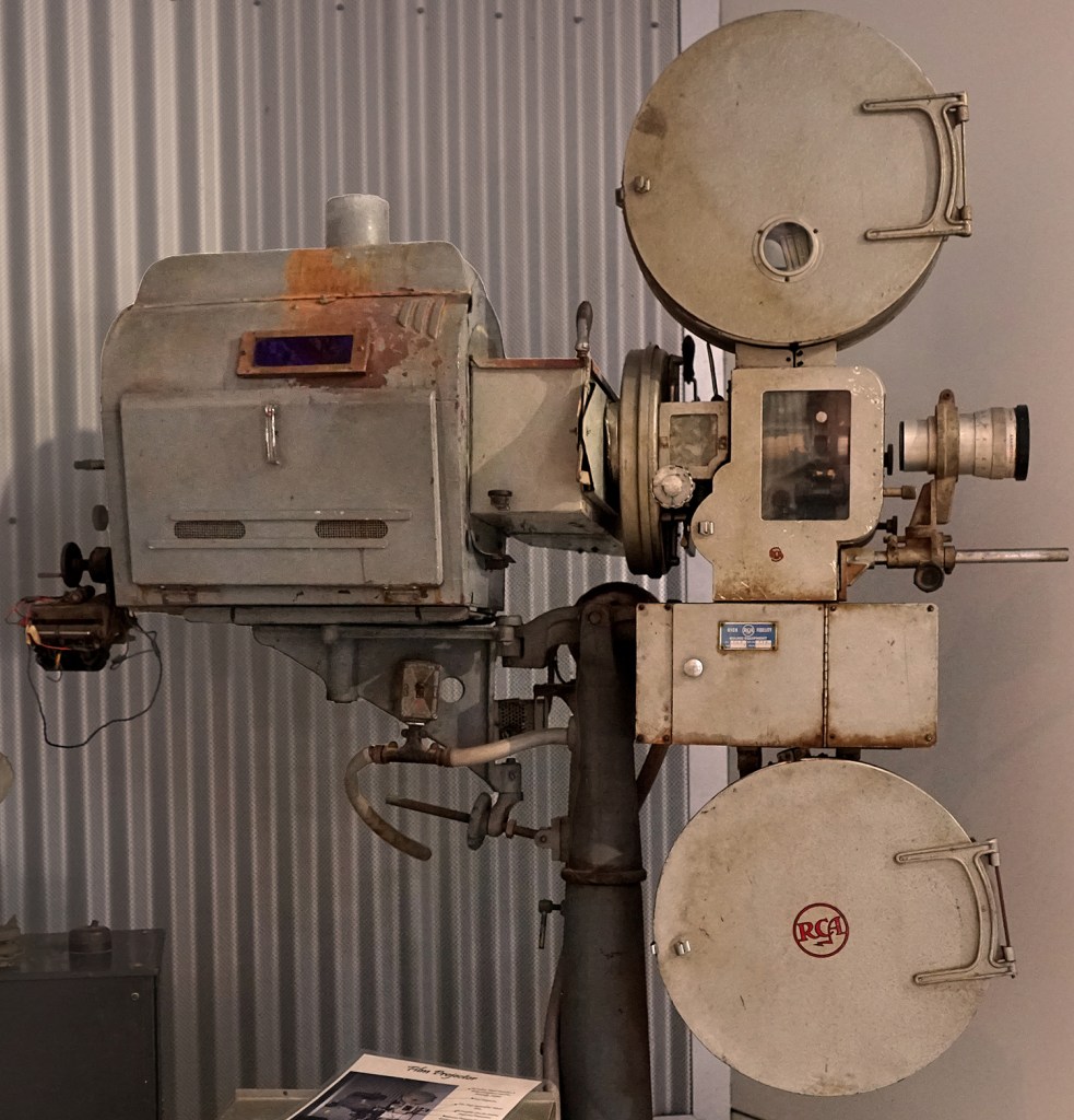
Ancient Technology from the Isisford Picture Theatre.

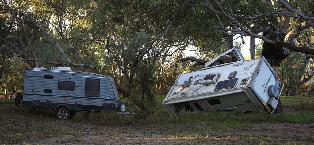
Drowned caravans camped in the Barcoo River, Isisford. Ignore the locals at your peril.

© John Lovett
© John Lovett

An empty paddock next to the old Langenbaker House in Ilfracombe made a great place to paint

© John Lovett
© John Lovett

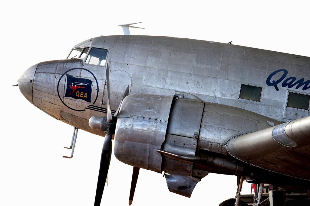
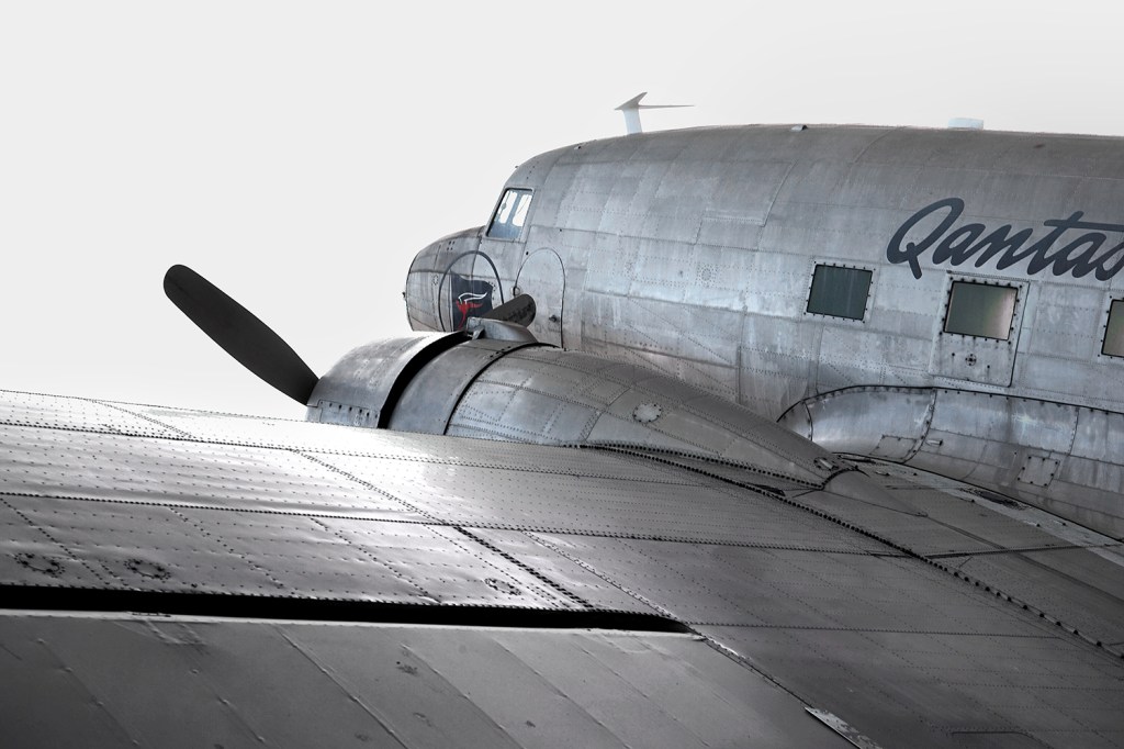
DC3 at the Qantas Museum Longreach

© John Lovett

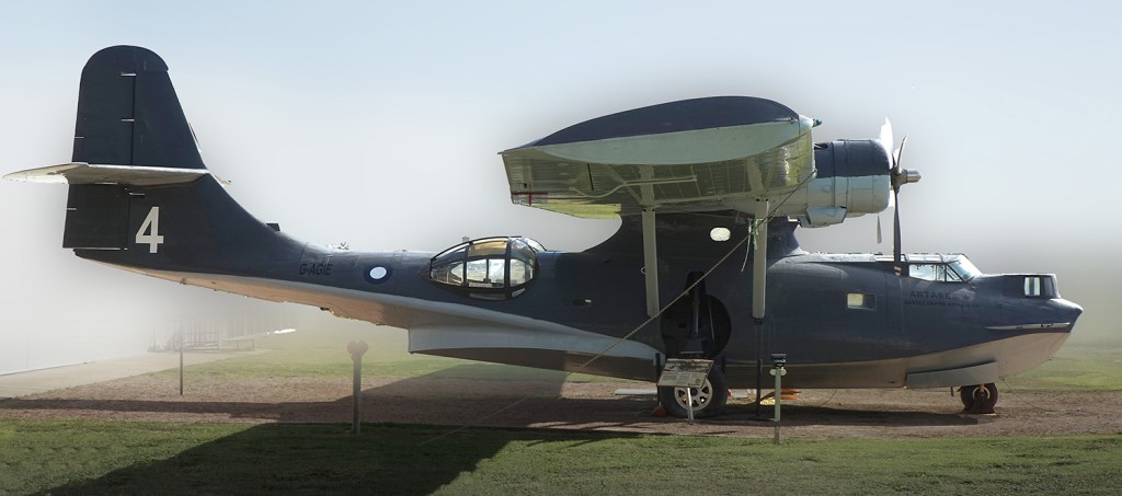
Retired Catalina at the Qantas Museum

© John Lovett

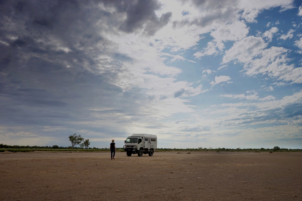
Before the workshop in Winton, Dianne and I went out to the clay pans at Bladensburg to find a painting location

© John Lovett

Willy Mar’s old market garden store, Winton

©John Lovett

We painted Willy Mar’s old truck (now up on blocks next to his old market garden and store.

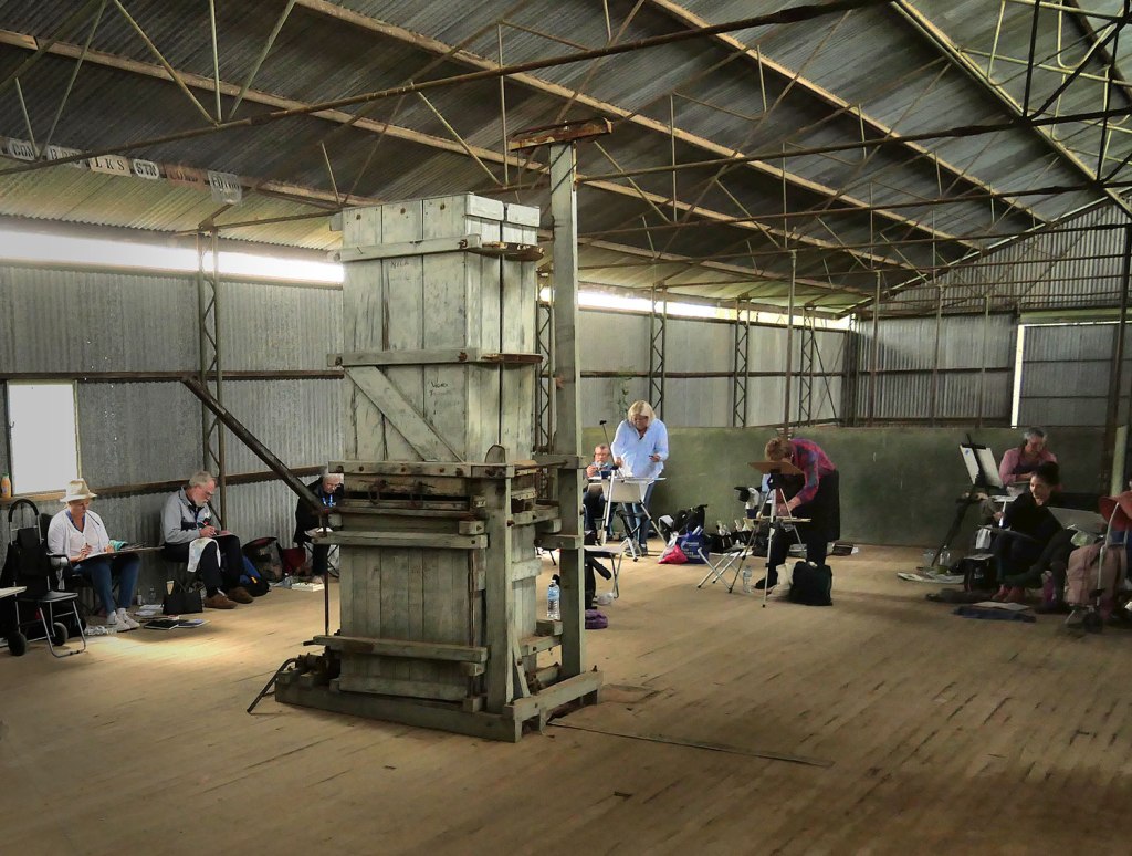
We spent a morning in the old Bladensburg woolshed painting the ancient wool press.

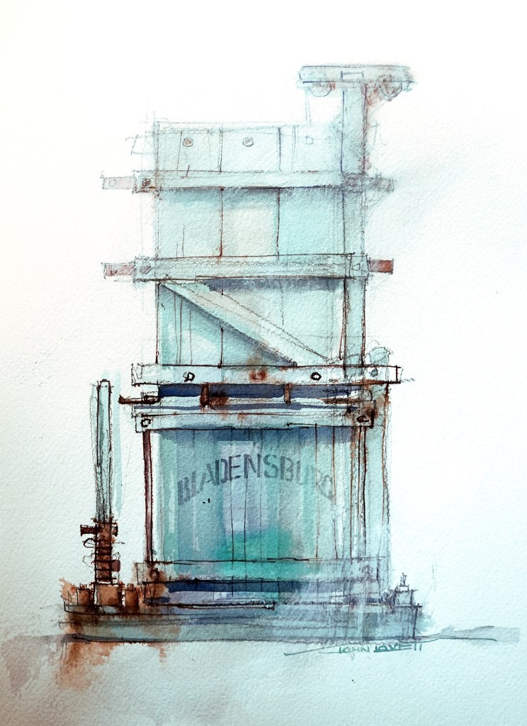
This was the demonstration painting I did. (Couldn’t help using Phthalo Green!)

©John Lovett

Looking west towards Winton – an unusual sea of lush, green grass

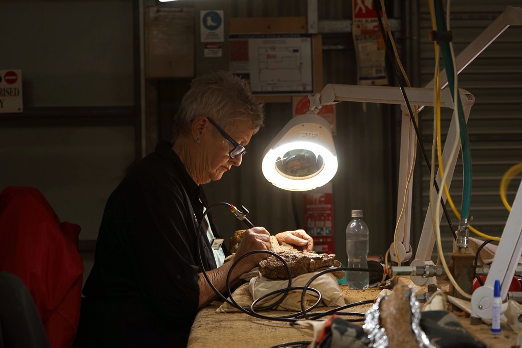
At the Winton Dinosaur Centre, volunteers work tirelessly separating rock from fossil to reconstruct the skeletons of dinosaurs.

©John Lovett

After the Winton workshop Dianne and I headed back out to Bladensburg to camp and watch the sun go down.

©John Lovett

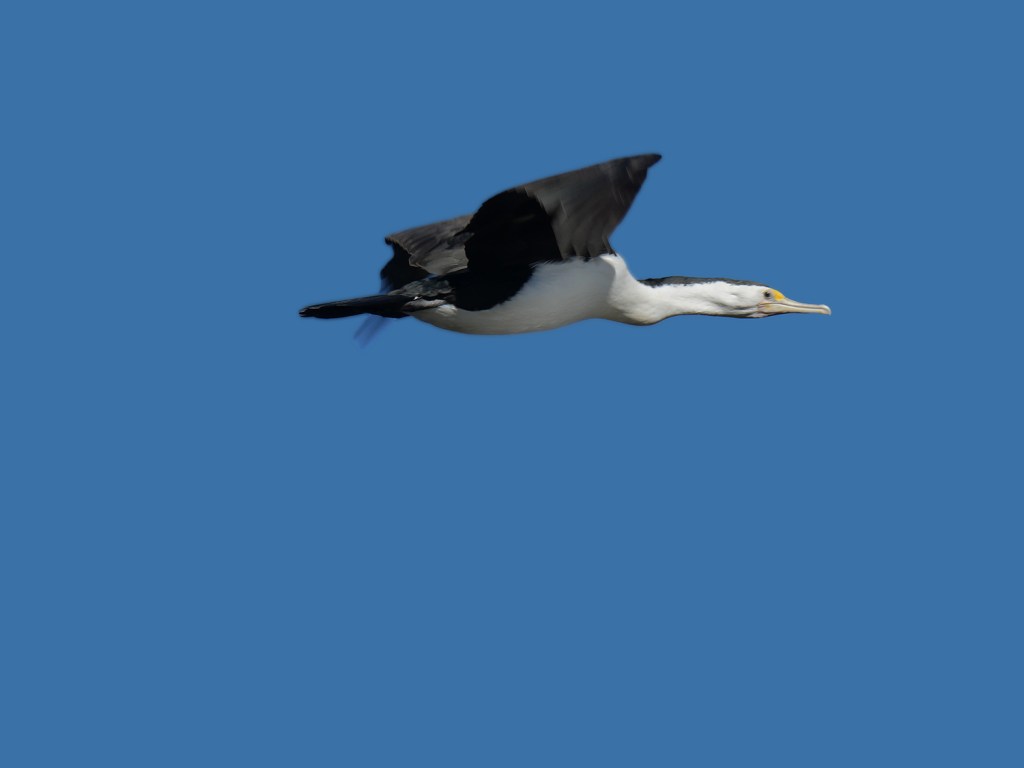
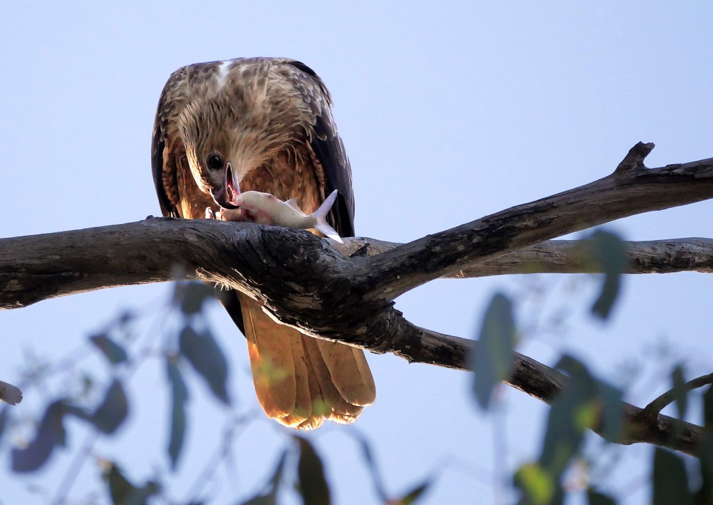
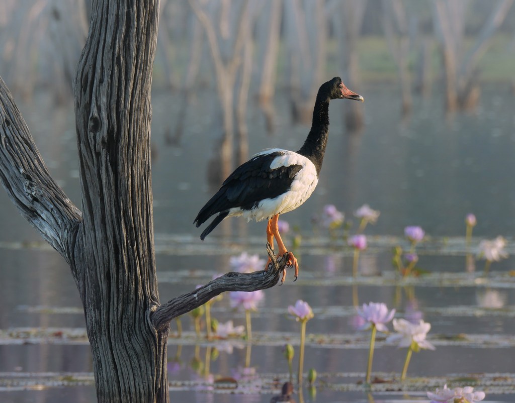
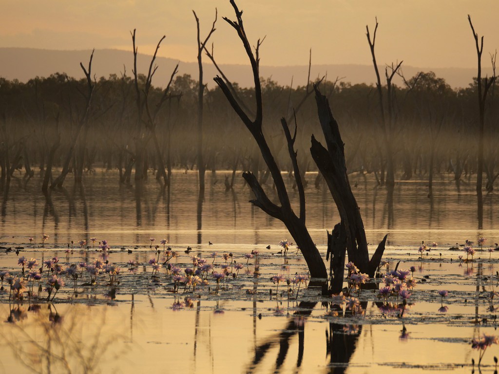
Heading east, we found this lake with amazing sunsets and fantastic birdlife.

©John Lovett

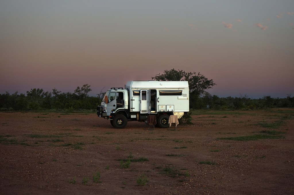
Our camp, just visible from the top of a nearby hill

©John Lovett

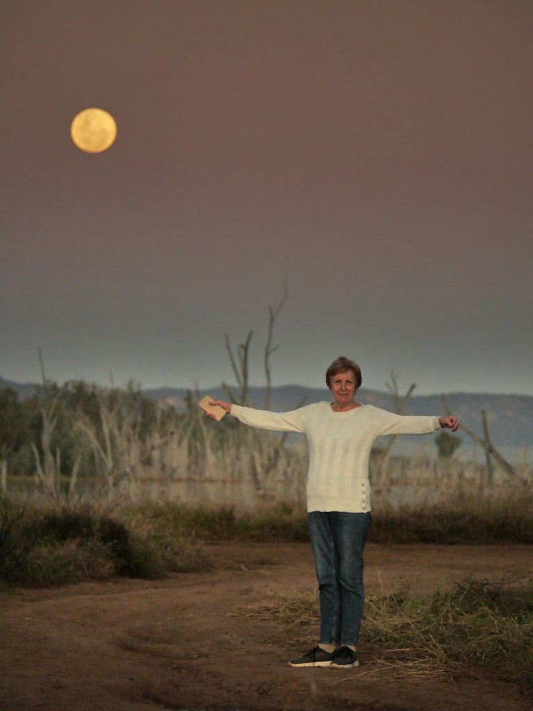
Sunset one side, full moon the other.

©John Lovett
©John Lovett
©John Lovett
©John Lovett
©John Lovett
©John Lovett
©John Lovett

WORKSHOP DEMOS

Here are some of the demo paintings from the Tasmanian workshop.

Bicheno bay

Cray Boats moored in the bay at Bicheno – Gesso, Gouach and Phthalo Blue

Bicheno

Further around the bay at Bicheno are rock formations covered in brilliant orange lichen

Coles Bay

Old boat sheds at Coles Bay made a great subject – interrupted briefly by the retrieval of a dozen yellow kayaks paddled into the bay.

cradle mtn

Dove Lake at Cradle Mountain is a spectacular sight. We were lucky to be able to paint it – the mountains are usually blanketed in thick fog.

Hobart

Hobart Waterfront – watercolor, ink, gesso and gouache

Straun

Macquarrie Harbour from the hotel balcony, Strahan.

AUGUST STUDIO WORKSHOP

We have just finished two full on weeks of workshops in the studio. Some familiar faces and some new faces. This is the first time we have had a completely new group for the second week, so I thought it would be interesting to repeat some of the demonstrations with some variation.

These two landscapes based on recent photos from Western Queensland were started with transparent washes (Quinacridone Gold, Cobalt Blue and Permanent Rose) Then the trees and other details were added with more opaque mixtures of Ultramarine Blue, Phthalo Blue, Alizarin Crimson and Quinacridone Gold. Graded washes were used on either side to create a band of light through the focal point, then various layers of gesso and White gouache glazes were worked through the sky and distance.

I have painted this Old house on Sydney Harbour from various angles and thought it would be a good workshop subject, having problems of symmetry and conflicting focal points to be sorted out.

I was surprised when we started drawing, to find that one of the students had lived in the flat behind the house back in the 70’s – when Brett Whitely lived and painted a little further around the bay.

These paintings were done with the same simple palette of Quinacridone Gold, Alizarin Crimson, French Ultramarine Blue, Phthalo Blue and Permanent Rose. I also used Charcoal pencil, White Gouache, Gesso and Burnt Sienna Ink. The vibrant blue window in the top painting was painted with Ultramarine Gouache.

Not far from Venice is the small fishing port of Chioggia. These weather beaten trawlers make an interesting subject with their confusion of masts and rigging and the complicated backdrop of ancient buildings. The idea here was to suggest all the complicated detail without trying to carefully render it. We started with under washes of Permanent Rose and Aureolin and gradually built up detail over the tinted paper.

A different subject using the same transparent under wash technique. This time graded washes of Cobalt Blue and Permanent Rose formed the under wash.

Painting these Lorrikets was a lot of fun – balancing sharp detail with loose suggestion. The wings and much of the body were roughly washed in with an old 1/2″ bristle brush. Detail was built up around the head and body with a 1/4″ flat brush and a #1 rigger. Finally the wings were attacked with gesso and a white charcoal pencil to get a feeling of movement.

Everyone enjoyed painting these rocks and sapplings. The purpose was to shuffle around the source material to create an interesting composition, then to build up textures and depth with watercolor, gouache, ink, charcoal pencil and Gesso. We used a number of techniques – splashing, splattering and spraying to build up the textures and gesso glazes to soften and push back the distance.

Another exercise in rearranging  the subject. This time a soft abstract foreground to lead the eye into the focal point of trees and buildings.

So thanks to everyone that attended the workshops and thanks to Dianne for the mighty cakes – back to dry biscuits now!

WATERCOLOR HAMMERS

Over the past couple of weeks it has been pouring rain here, so I’ve been having a great time shut away in the studio painting hammers. It all started with the claw hammer and grew from there. Following through on an idea is a great way to build up a series of paintings. It gives you the chance to experiment with techniques, play around with the subject and not be too worried about the outcome. These were all done on paper with various combinations of Charcoal, Gesso, watercolor, gouache, ink and ocher powder.

THIS LITTLE PIG

Down the road from Chateau de la Fleunie, where we spent the last week of our workshop in France, were two pigs penned up and being fattened by the local farmer. They were like a pair of friendly dogs – running around and getting into as much trouble as possible in their small wire enclosure.

I’ve been looking forward to painting them since we arrived home. They look so pink and meaty – just like bacon running around. They have no idea of hygiene, make amazing grunting sounds and seem really happy locked up in a tiny wire pen. I’m sure they’d make better pets than breakfast.

Alizarin Crimson, Permanent Rose, Quinacridone Gold, Ultramarine Blue and, in the background, Phthalo Blue. Opaque washes of tinted White Gouache were used to loose the back end and some scratchy white charcoal pencil marks break up the surface.

NEW CHRISTMAS TOYS

Santa Claus was good to me and left a box of shiny new paint from Japan. These trays of  watercolor are handmade  by the Ueba company in Kyoto. They were established in 1751 and still operate out of the same premises, so they must be doing something right. The main ingredient of the paint is finely ground scallop shells. The process they use to create these paints can be seen on their website (click on Factory Tour)

To experiment with these new paints I painted this Barramundi.

Starting with a loose charcoal line drawing, I then washed in some shadows with a mixture of the rich purple color and the yellow ochre. The pigments are very intense and more transparent than I expected, considering the high ground shell content.

After the first washes dried, more detail was built up with Indigo and the pale Turquoise. Scale shapes were painted on and some fine detail marks were applied with a rigger brush. A patchy wash of the orange/red was worked through the upper half of the fish before some spots of the white pigment were applied. I expected the white to be similar to white gouache, but it is more transparent  and dries to a beautiful, pearl like sheen. When the white is used to tint other colors the resulting mixture also dries with this unusual sheen.

Finally, because the Barramundi is an elusive, almost mythical fish, I decided he shouldn’t be presented so blatantly. A big rough brush full of gesso and some scribbly white charcoal marks pushed him back into murky water. A green/grey wash around the head suggests the milky green of a tropical waterhole.

I love these new paints and look forward to playing with them some more. My only fear is that I’ll become hooked on them and then they will run out!