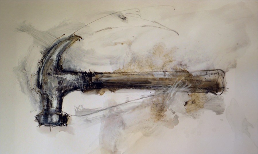
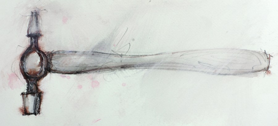
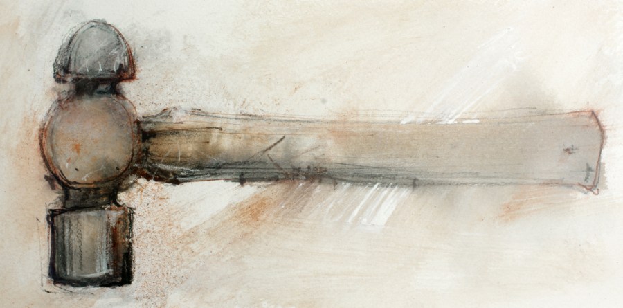
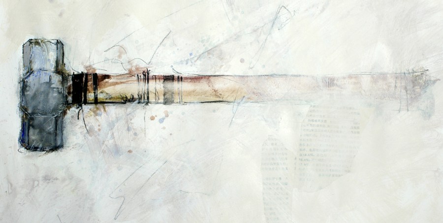
WATERCOLOR HAMMERS

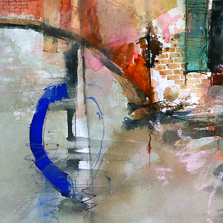
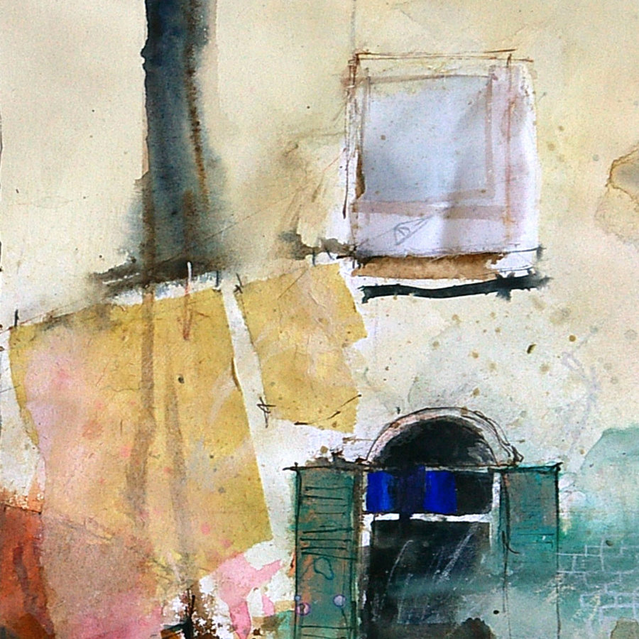
Over the past couple of weeks it has been pouring rain here, so I’ve been having a great time shut away in the studio painting hammers. It all started with the claw hammer and grew from there. Following through on an idea is a great way to build up a series of paintings. It gives you the chance to experiment with techniques, play around with the subject and not be too worried about the outcome. These were all done on paper with various combinations of Charcoal, Gesso, watercolor, gouache, ink and ocher powder.

STUDIO WORKSHOP

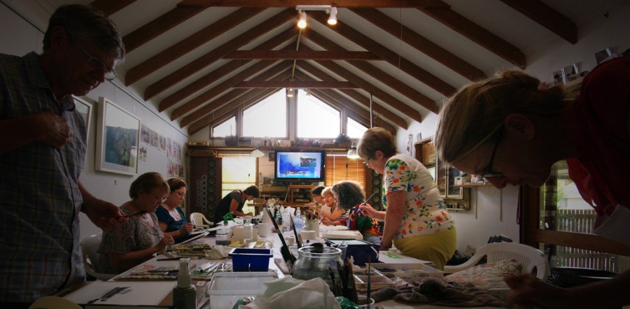
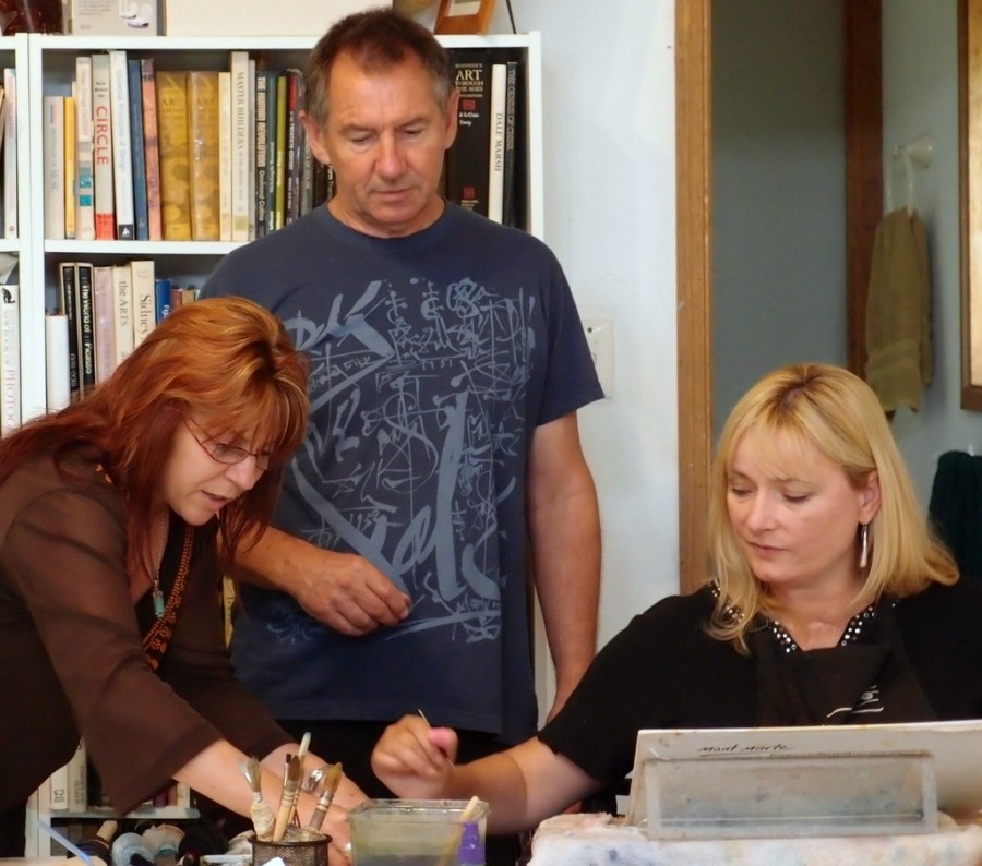
For the last two weeks I have been busy conducting a workshop looking at selecting, manipulating and extracting the most from a painting subject. It was a lot of fun, but we worked hard – doing a couple of paintings each day and squeezing in a few critique sessions, where we examined everybodys work and discussed various problems and solutions.

Studio Workshop John Lovett Nov 2011

It is always a pleasure meeting new students and catching up with students from previous workshops. One of our new students for the second week was Carol and her assistant, Kim. What an inspiring lady – taking up watercolor a couple of years ago after a severe car accident ended her career as a lawyer and left her a quadriplegic. Forgetting about her disability, the standard of her paintings is excellent, but to see how she has overcome so many physical hurdles to produce the work she does is just amazing. On top of this, she is determined to keep on improving and works hard to that end.

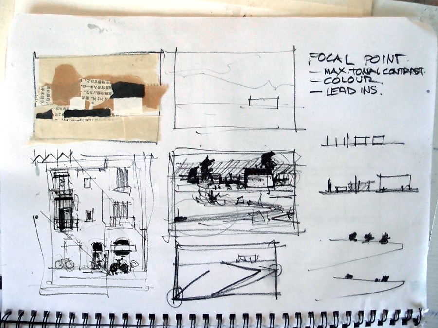
Thumbnail sketches and simple monochrome collages were used to simplify and rearrange our subjects.

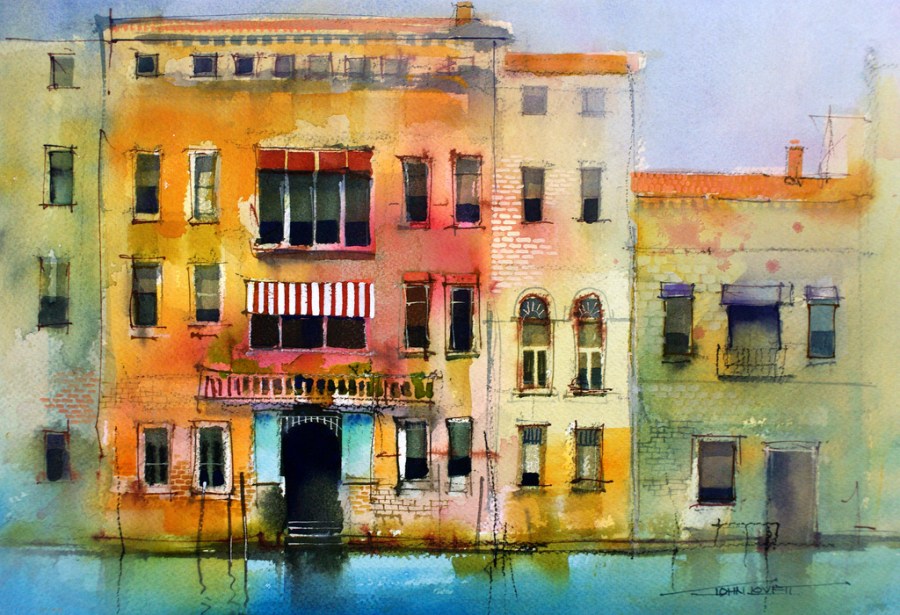
The demonstration paintings below illustrate some of the techniques we explored.

Manipulating a large foreground to lead up to a focal point while not causing a distraction.

Creating depth with hard and soft edges

Flat Ultramarine gouache used to squeeze more vibrancy from the warm, transparent watercolor.

Confining detail and using empty space as an element in the painting.

Practicing the random placement of suggestive abstract marks

Blitz Truck Watercolor


Sometimes an unusual subject will free you up to try new techniques.

Making a strong focal point in what was a flat uniform facade.

Starting loosly with a big brush and no preliminary drawing, then adding detail as the painting progresses.

Experimenting with techniques to break up a symetrical subject.

NEW TOYS

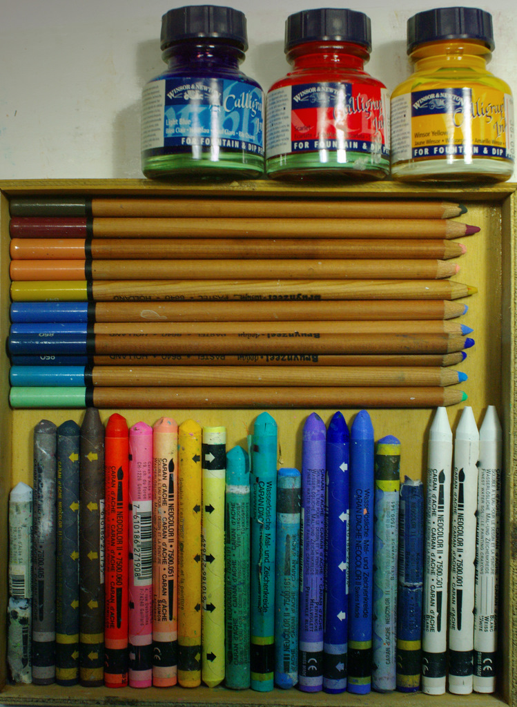
I’m a sucker for an Art Supply Shop. I just can’t walk past them. While we were in Hong Kong an assortment of pastel pencils, water soluble crayons and colored inks became absolute necessities. Things that I couldn’t leave the shop without!

I have drawers full of such items. Essential in the excitement of the moment, but once in the studio and tested, they become just another unnecessary distraction. Fortunately, this bout of impulse buying resulted in some really useful new toys.

The inks are Winsor and Newton Calligraphy inks – Brilliant primary colors

The pastel pencils are a Dutch brand I have not tried before – Bruynzeel. Fine textured and good colors.

I have used the Caran d’Ache water soluble crayons before, but fell for a pile of new colors.

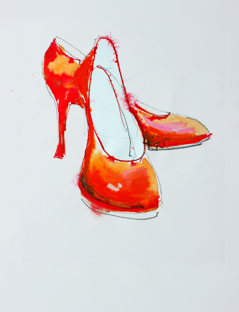
Red Shoes – Sketched with a charcoal pencil then colored with a red, orange and pink crayon. After the crayon was applied, a wet 1/2″ brush was used to dissolve and blend the colors. Finally a few red ink lines were drawn on and sprayed with a mist of water.

These Lemons were painted with a mixture of crayon ink and pastel pencil. A gesso wash was scrubbed over the foreground before the final yellow crayon marks were applied. Before the Gesso had dried the lemon was carefully sliced and dropped into a Gin and tonic.

SUGGESTING DETAIL

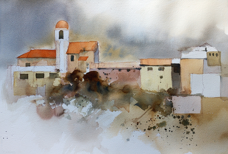
Italian Village
.
When faced with a complex, detailed subject, the temptation is often to try and include every detail. This approach can lead to a confusing overload of information. In this demonstration we will concentrate on simplifying and suggesting detail. Our approach will be to decide on an area of interest to serve as our focal point or centre of interest, then simplify and suggest detail in the rest of the painting.
.
MATERIALS
Paper
1/2 sheet 300gsm (140lbs) Cold Pressed
Colors
Ultramarine Blue
Permanent Alizarin Crimson
Quinacridone Gold
Ink – Burnt Sienna and Dip Pen
Brown Pastel Pencil
Brushes
1″  Bristle Brush
1″ and 1/4″ Flat brushes
No. 2 Rigger Brush
3″ Hake Brush
.
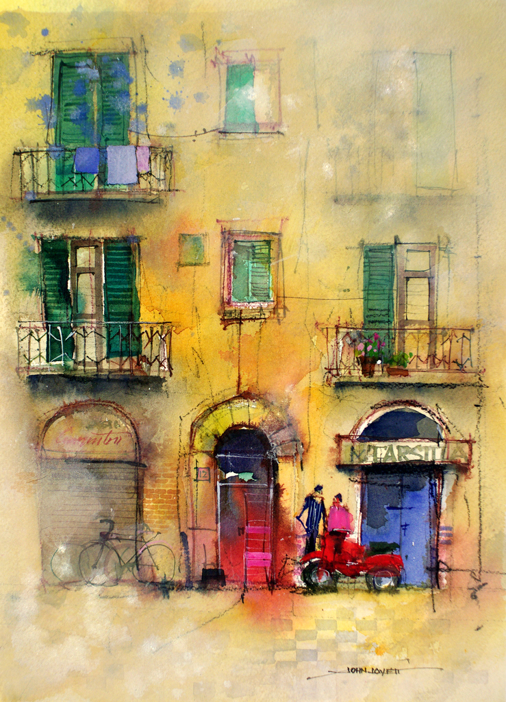
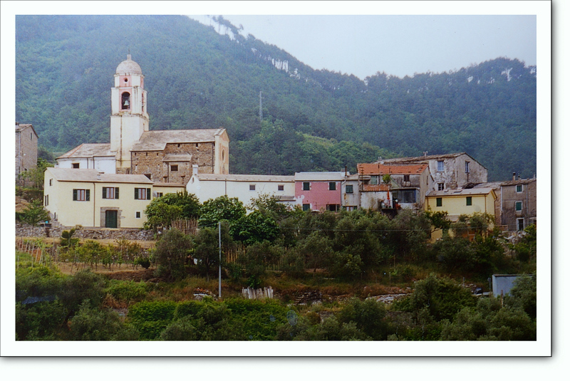
This little village, high above the sea on the coast of Italy makes a wonderful subject. The impact of the weathered textures and subdued colors can be amplified by focusing attention on the area of the bell tower and simply suggesting the detail in the right hand side of the village.
.
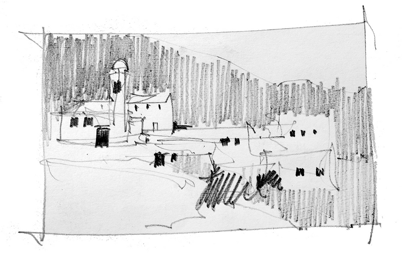
A quick thumbnail sketch will help organise the composition for your painting. I have decided to spread the interest horizontally across the painting then contrast it with a  dark diagonal band from the top left to the bottom right. The top right and lower left areas will be left virtually untouched.
.
Quinacridone Gold, Ultramarine Blue and Alizarin Crimson are all we need to mix all the colors in this painting
.
DRAWING AND FIRST WASHES
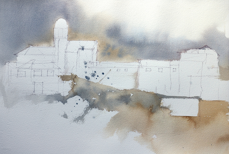
Simply block in the major shapes with a brown pastel pencil. More detail can be drawn in as the painting progresses if necessary. The entire area above the village is first wet with clean water before a wash of Ultramarine Blue, Quinacridone Gold and Alizarin Crimson is worked diagonally through the background. Vary the mixture from a warm, dirty yellow to a cool grey. The same colours can then be roughly washed through the dry paper in the foreground. All these early washes are best applied with an old 1″ bristle brush. (The cheap house painting type are ideal).
A loose soft suggestion of background trees works much better than carefully painting in the line of trees in the photograph.
.
BUILDING SHAPES
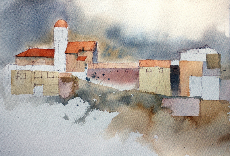
Using various combinations of our three colours and a 1″ flat brush, we can suggest the shapes for the various buildings. Keep the tones fairly light at this stage. We can always make them darker but it’s a bit more difficult to make them lighter if we need to.
Vary the size and shape of the buildings to keep them interesting
.
DARKER BUSHES AND WINDOWS
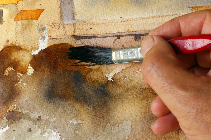
Once all the building shapes are dry we can use our three colors to mix up a nice rich dark – aim for a color something like Burnt Sienna. Splash it on fairly loosely with your old 1″ bristle brush, then quickly rinse out the brush, dry it slightly and run it around the edge of some of the marks you have just made. This will make the edges bleed out and soften, helping tie the shapes to the rest of the painting.
Before these shapes dry, drop a couple of spots of pure Ultramarine into the lower part of the bushes. This gives them a more three dimensional appearance. Use your 1/4″ flat brush to paint in some of the windows. Remember to vary their shape, tone and colour slightly.
When you paint the bushes, try to think of them as shapes that will suggest bushes rather than trying to carefully render a realistic looking bush.
.
Use a clean, damp brush to soften and feather out the top edge of the bush shapes.
.
BUILDING TEXTURES
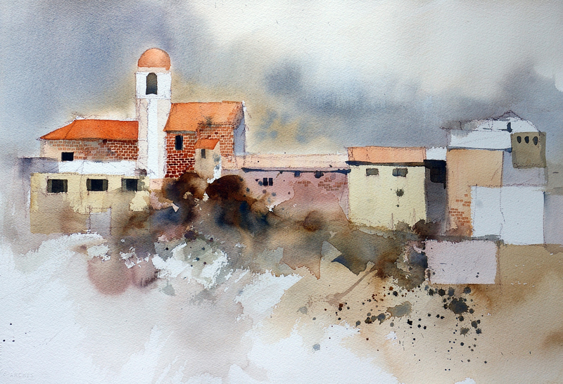
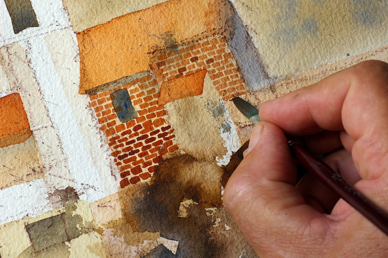
To help reinforce the centre of interest, we will add some brick textures to some of the walls. Spread a few small, less noticeable areas of brick into other parts of the painting, but keep the texture in the centre of interest strong and definite
The detailed brick texture at the centre of interest holds attention in this area. Adding softer, less defined brick textures to a few of the other buildings maintains unity and helps tie the centre of interest to the rest of the painting.
.
A flat 1/4″ brush is perfect for putting brick texture into some of the walls. Keep the lines of bricks roughly horizontal and stager the brick joints.
.
IMPACT THROUGH CONTRAST
The final step is to add some depth and drama to the painting by darkening the background behind the centre of interest and the lower right foreground.
Before we do this though, a few fine pen lines sprayed with a fine mist of water will add some interesting textures to the buildings.
Burnt Sienna ink works well. Spray it as soon as it’s applied and it will produce fantastic spidery lines. Have a tissue or some paper towel handy as the results are a bit unpredictable and you may need to do some quick tidying up.
The dark contrast behind the main building is a combination of our three colours. Wet the area behind the building first so the top edge of the wash feathers out softly. A dry Hake brush can be used to help even out the wash.
Apart from the detail at the centre of interest, most of the painting is fairly loose and suggested. There is enough information there for the viewer to know what is happening but much of the painting requires some sort of viewer interpretation making it much more engaging than an overload of carefully rendered detail.
 

.

CAMERA LUCIDA

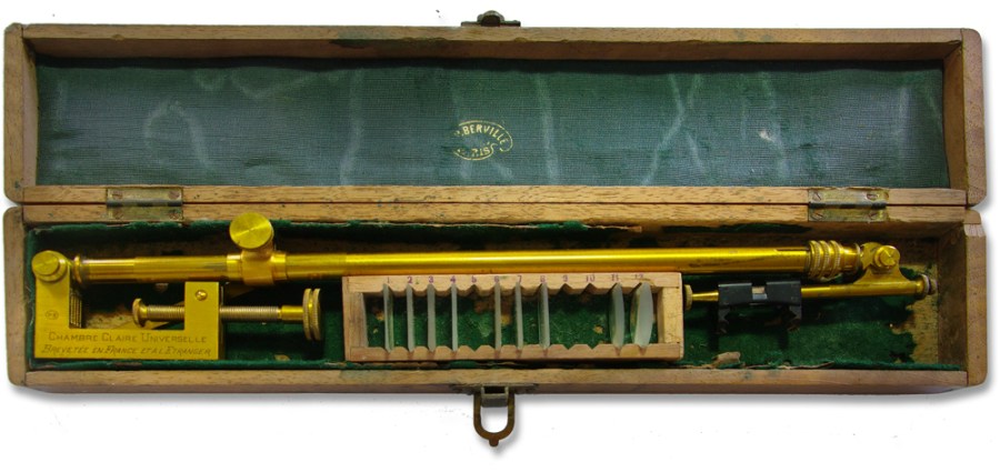
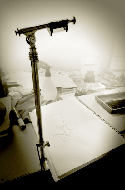
There is something irresistible about things in little wooden boxes. A friend lent me this old Camera Lucida to play around with. It’s an amazing device that allows one eye to see an inverted image of what ever is infront of you while the other eye sees your sketch book. Once the device is set up it is a simple matter to trace what ever you are looking at onto the sketch book.

The device was patented by William Hyde Wollaston in 1806 and was used as an aid to to sketching and visual documentation prior to the development of the camera.

The device is difficult to set up and the results have a tight, traced look about them. The camera lucida is beautifully made from heavy polished brass. The solid brass base clamp is hand engraved in French with the manufactures details. The wooden box has fine dovetailed joints and is lined with felt and satin. What a nice thing to carry around when you go sketching!

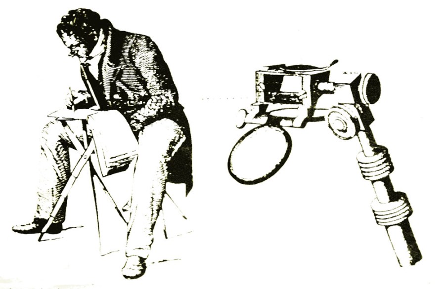
Today, the common pose of someone taking a photograph is two arms outstretched, camera gripped at arms length. This replaced the camera pushed to face, squint through viewfinder pose created by the invention of roll film. I wonder if the pose above, with the camera lucida and folding stool, was a common site through the 1800’s?

TELLING A STORY

This is an article I wrote for International Artist Magazine a couple of years ago. A comment on imagining stories to embellish different locations prompted me to upload it.  It is amazing what goes through your mind after thirty or forty minutes sketching. Almost subconsciously stories emerge tying up and making sense of all the observed details.
.
.
TELLING A STORY
It is easy to be seduced by spectacular scenery or panoramic landscape, but sometimes it’s the little incidents associated with fairly unspectacular subject matter that can be the catalyst for a successful painting. In these paintings the appeal, for me, lies beyond the immediate visual impact and has more to do with the incidents or atmosphere surrounding what is depicted.
.
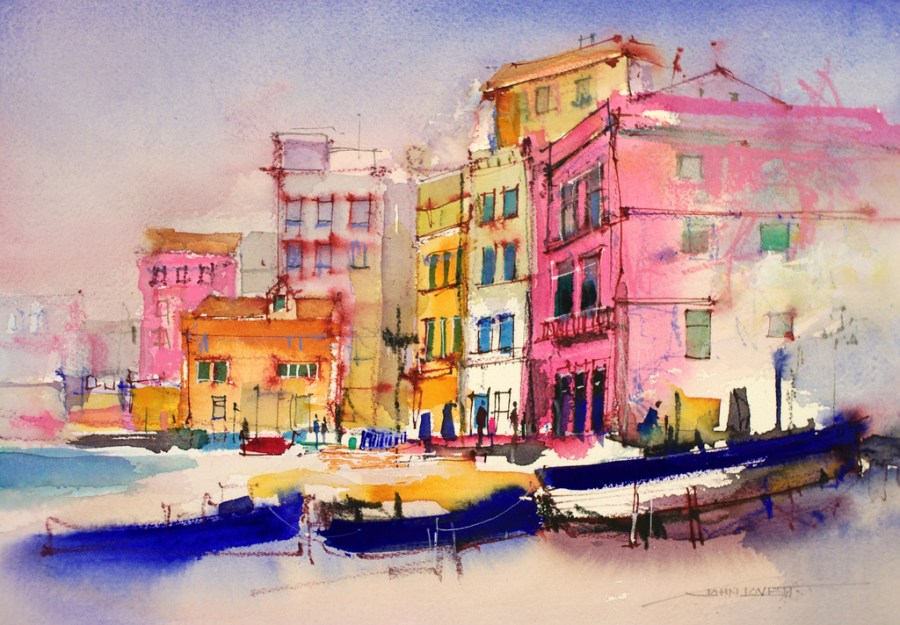
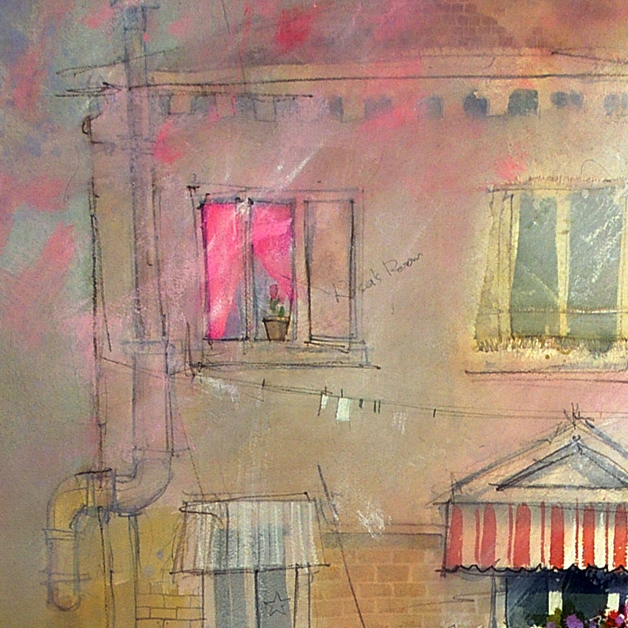
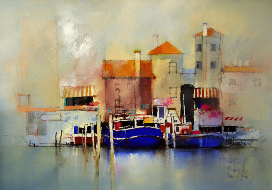
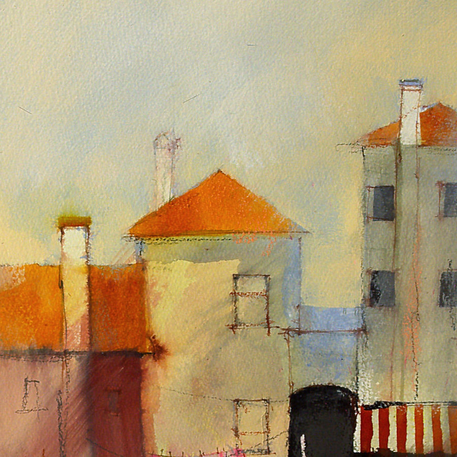
Rosa’s New Pink Curtains
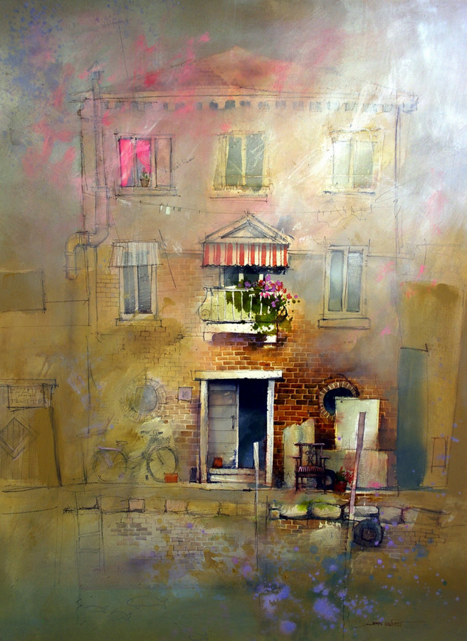
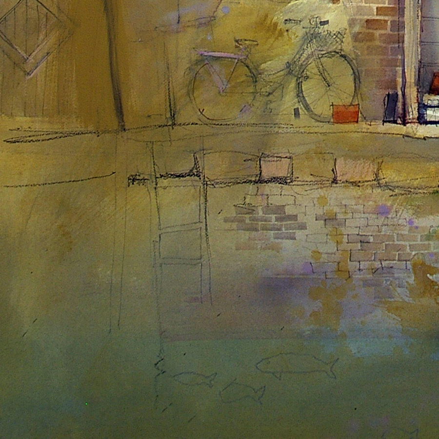
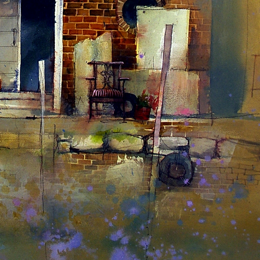
These old Italian waterfront buildings tell wonderful stories about their inhabitants. Pushbikes, fishing gear, potted herbs and flowers, an old comfortable chair in the sun. An hour spent sketching all these details cause all sorts of stories to evolve concerning the day to day life of the building.
.
The paintings title is derived from the bright pink curtains in the upper window. To stop this bright color drawing too much attention away from the centre of interest, Permanent Rose was worked over the greys in the top corner of the painting. This eases the impact of the curtains, pushing them back into the painting.
.
Fine rigger lines and sketchy pencil marks define the detail in the bottom left. This describes what is happening without drawing too much attention.
.
The center of interest is treated with strong contrast and sharp, focused detail to act as a pivot point for the painting. The viewers eye can wander out to other areas of less defined detail, but will always be drawn back to this area.
.
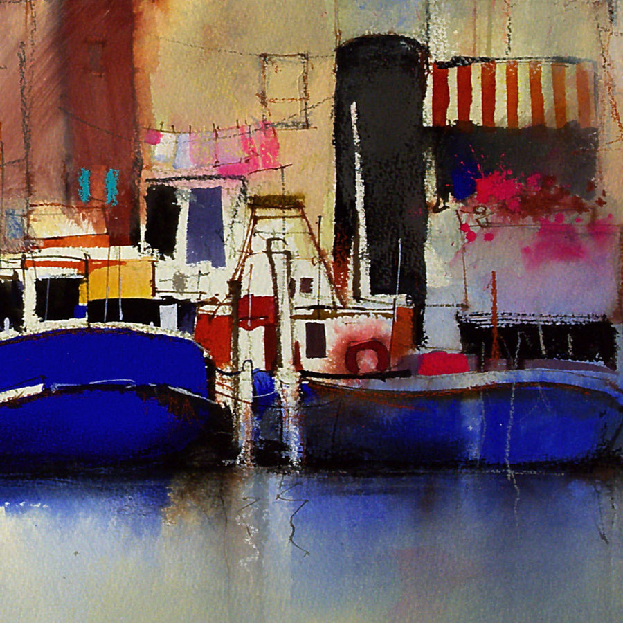
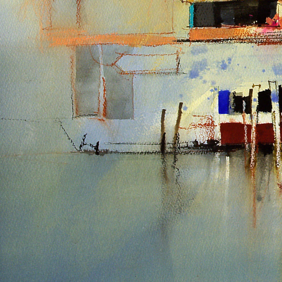
Fishermen Wait – Pelleistrina
The long thin island of Pellestrina protects the Venetian lagoons from the Adriatic Sea. Passing the Island early in the afternoon it struck me that even the fishermen, along with every other inhabitant, observes the afternoon siesta. Tide and fish can wait, food, wine and rest come first, then the fishing. I have used strong horizontal and vertical lines to give the painting a sleepy static feeling. The vertical drift of smoke adds to the calm quiet atmosphere
.
Flowers were splashed in with a mixture of Permanent Rose and White Gouache. I liked the contrast between the dirty, smelly fishing boats, clean washing and fresh flowers. Ultramarine Blue Gouache gives the fishing boats a flat, velvety finish.
.
The hazy sky was first washed over with Ultramarine watercolor. After this dried, a glaze of  cream tinted Gesso was worked over the surface giving the sky a pearly translucent quality.
.
The calm water adds to the sleepy feeling of the painting. The same technique of Gesso over glazing similar to the sky was used. This time the underlying wash was Phthalo blue.
.
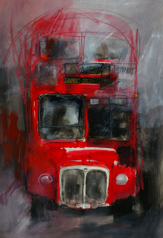
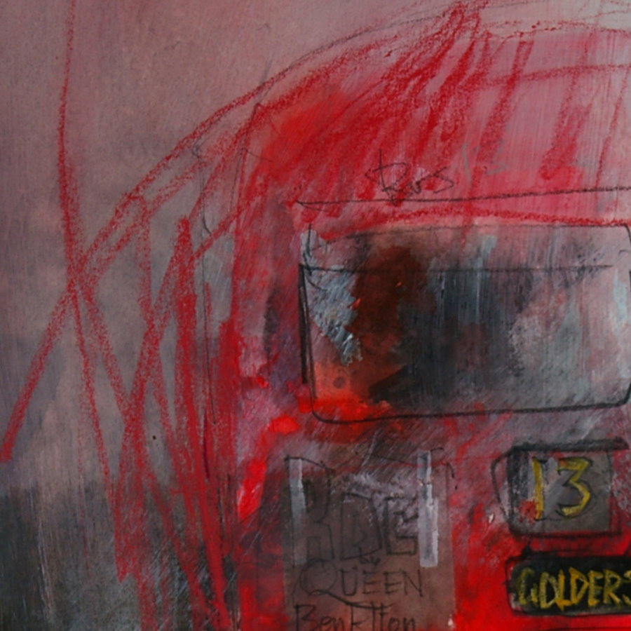
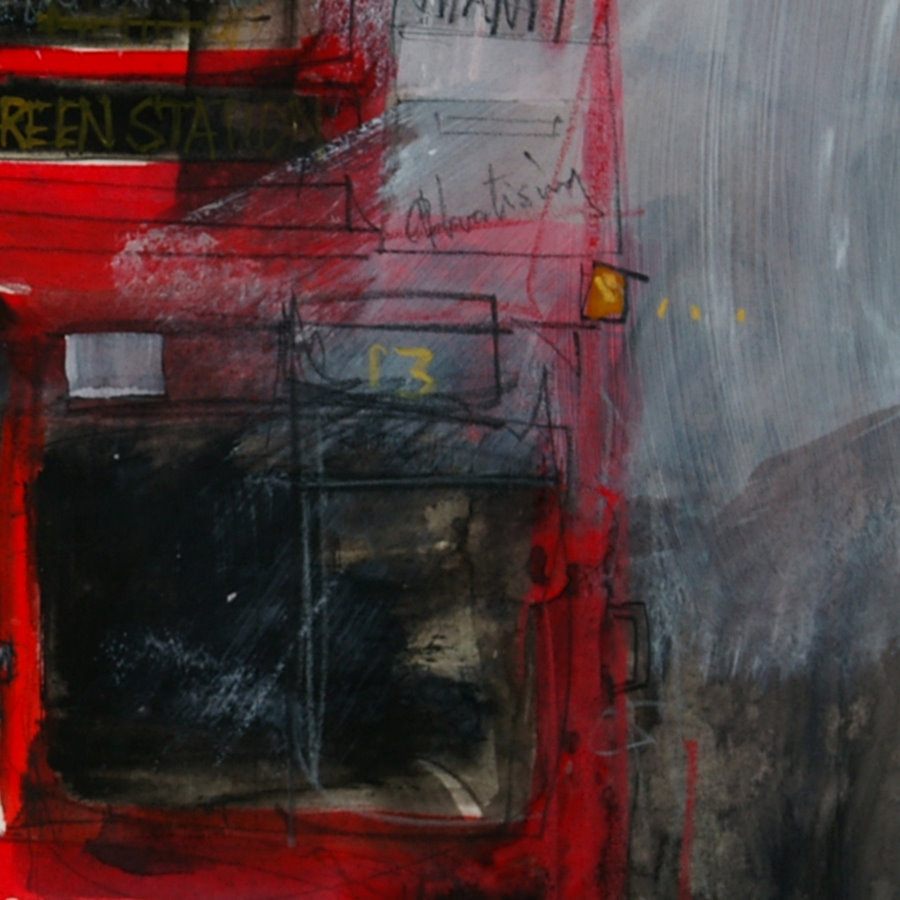
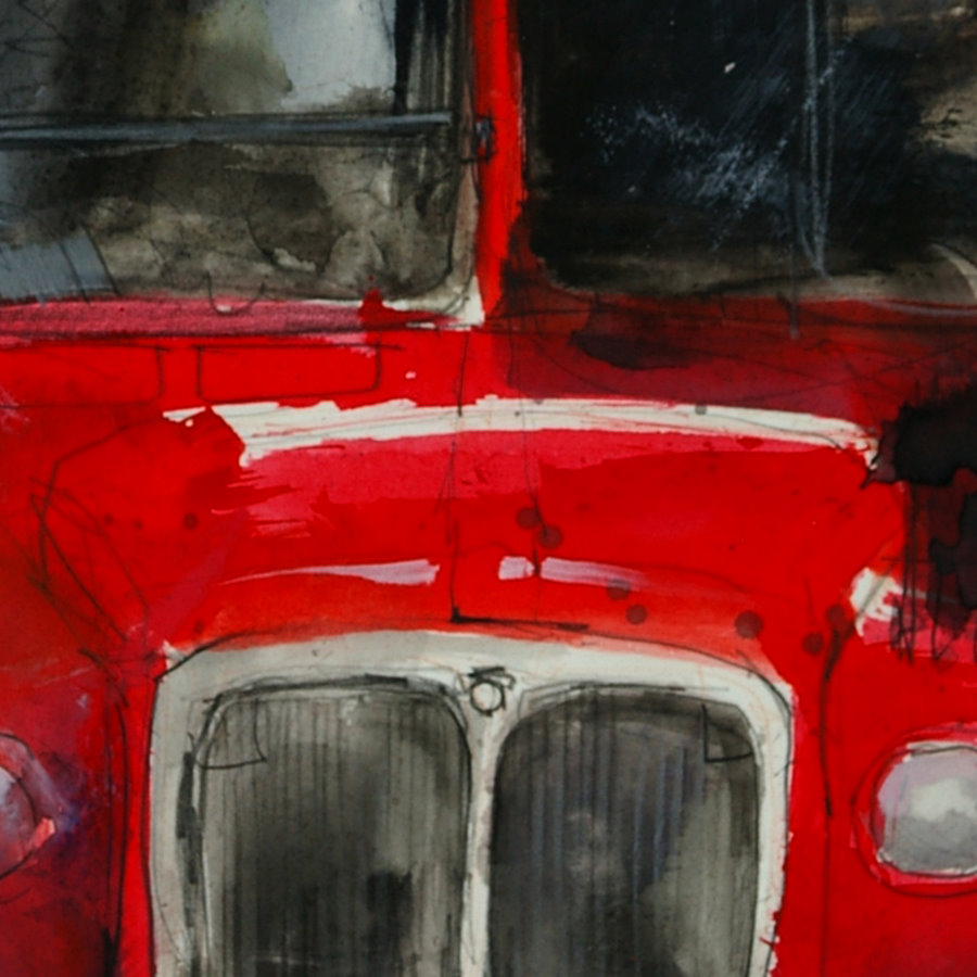
Last Bus Leaving
The frantic pace of down town London is regularly punctuated by the hot diesel clatter of these ancient relics. Huge and shiny, it’s hard to believe these  awesome machines form the backbone of a reliable transport system. This painting plays on the contrast between the enormous mass of lovingly polished duco and the machines apparent attempt to self destruct while idling.
.
Loose strokes of red pastel suggest the resonating vibration of the engine and contrast with the glossy sheen of the paintings centre of interest.
.

Halfway through the painting  a loose scumbling of dilute gesso was scrubbed over the top right hand corner. This obliterated most of the roof and upper detail allowing it to be loosely suggested with pencil lines and red pastel.
.
The bonnet and lower section of the bus were treated with more detail to pull attention down to this area of the painting. The bright red bonnet and white highlights make a great contrast with the surrounding black gouache. I normally avoid flat neutral black, but used it in this case to give the feeling of bitumen, soot and diesel oil associated with the bus.
.
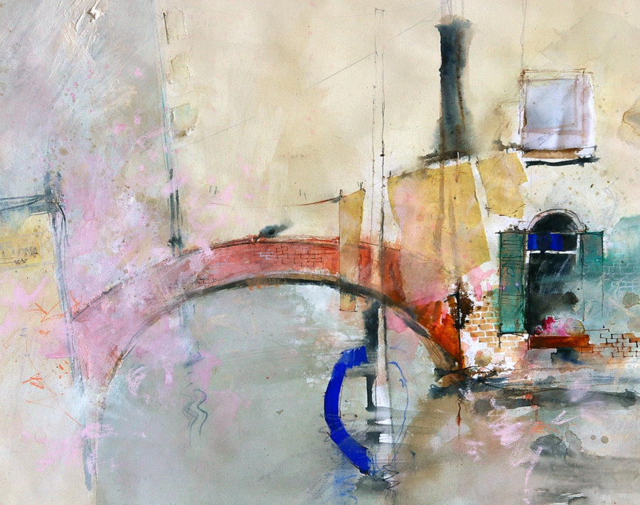
Pass This Way – Venice
This is one of a thousand romantic corners that draw you deeper and deeper into the labyrinth of Venice. Rather than documenting all the details, I have focused on the essential elements and reduced everything else to simple areas of contrasting textures. Lines and angles have been distorted to echo the random chaotic nature of Venice.
.
Flat Ultramarine gouache was used to convey the brilliant blue of the canal boat. By contrasting this with the rich terracotta of the bridge, a focal point is established.
.
The washing hanging on the line was torn from pieces of Japanese rice paper and stuck to the surface with acrylic matt varnish. The rice paper shapes were softened by splashing them with a mixture of Permanent Rose watercolour mixed with  White gouache.
.
A fine translucent glaze of White gouache and Permanent Rose watercolor softens the far end of the bridge, encouraging the eye back to the centre of interest.
.

INKTENSE PENCILS

pencil

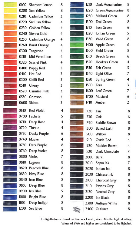
Derwent Cumberland make a great pencil that will draw equally well on wet or dry paper. They come in a broad range of colors, however some are not really lightfast. Fortunately most of the browns, greys, earth colors, and many of the blues are, according to the list below, tested to be lightfast.
IMGP1238

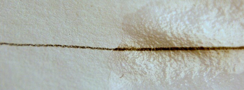
Inktense pencils will produce a strong dark mark on wet or dry paper.
IMGP1232-1

Light shading can be quickly dissolved with a damp brush to make subtle watercolor like washes. Once these washes dry they are permanent and insoluble just like permanent ink. This means they can be worked over without being disturbed.
sketch

detail1

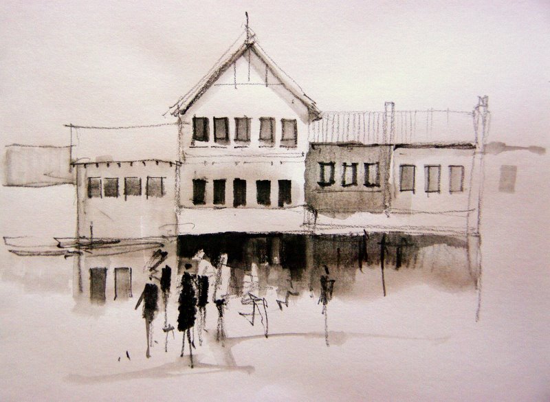
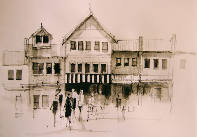
Drawing with Inktense pencils and a damp brush produces interesting results hovering somewhere between pencil and watercolor.

The sketch above was done with a dark brown (Bark 2000). I haven’t experimented with colors yet, but imagine they would be a lot of fun. I have used the Bark (2000) pencil and the Charcoal Grey (2100) in a number of watercolor paintings and I’m really happy with the results.

The pencils are nice and smooth to use and release pigment easily. They sharpen well and the leds, being of a waxy consistency, are resistant to fracturing
colors

Read more about them on the Derwent website (link opens in new window)