Western Australia’s mining boom might have slowed, but our recent visit showed a state still prosperous and positive, despite the economic downturn. Our first workshop was in Mandurah, 70km south of Perth. A spacious well lit venue in the RAAFA complex kept us busy and dry in the cold squally outside conditions.


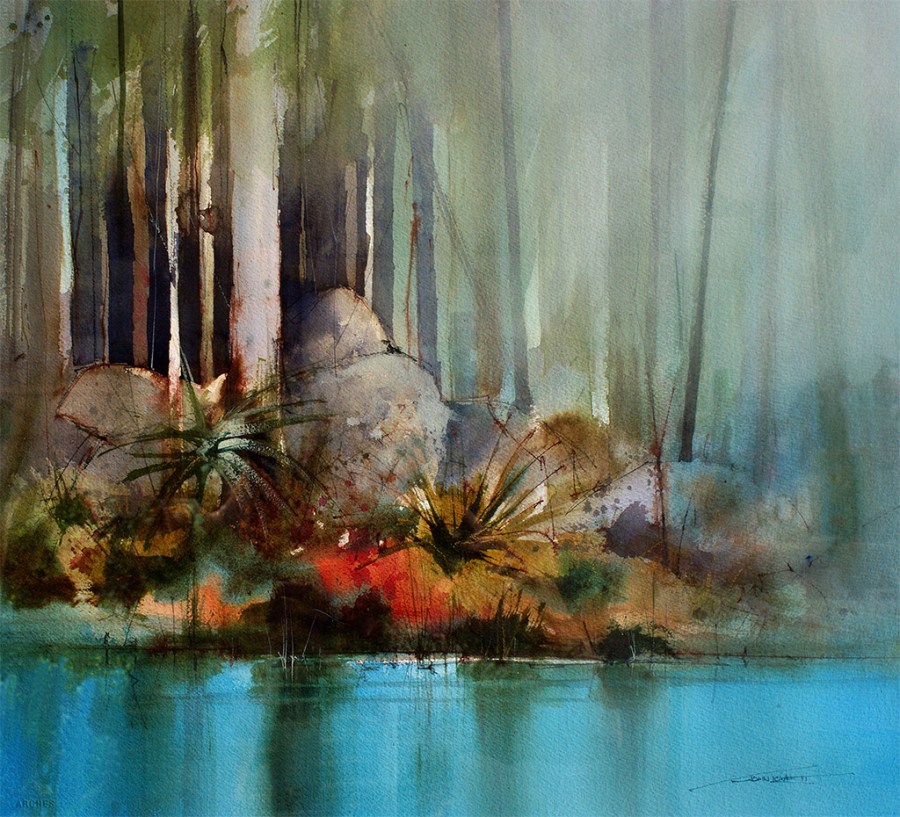
In this demo the subject is finely detailed in contrast to the simple, understated foreground. A rough meandering brushstroke and pale splash of Cobalt Blue take the eye through the empty foreground and up to the focal point.

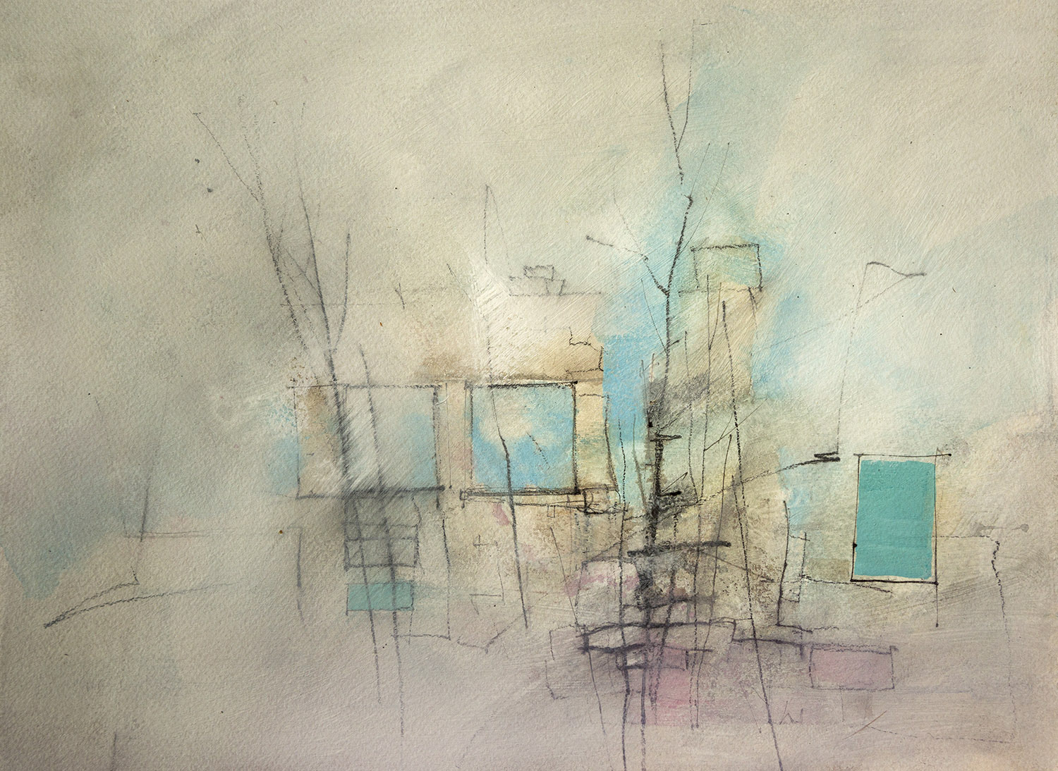
Placing muted colors in a field of grey, built up with a series of washes, gives the feeling of dampness and clearing rain.
 Washes of Phthalo Blue through the water and over part of the buildings tightens up color harmony and allows the warm focal area to dominate.

In Bunbury an old, heritage listed school building right in the middle of town has been handed over to a number of art groups as a permanent venue. The light was great and the old school had a fantastic character.

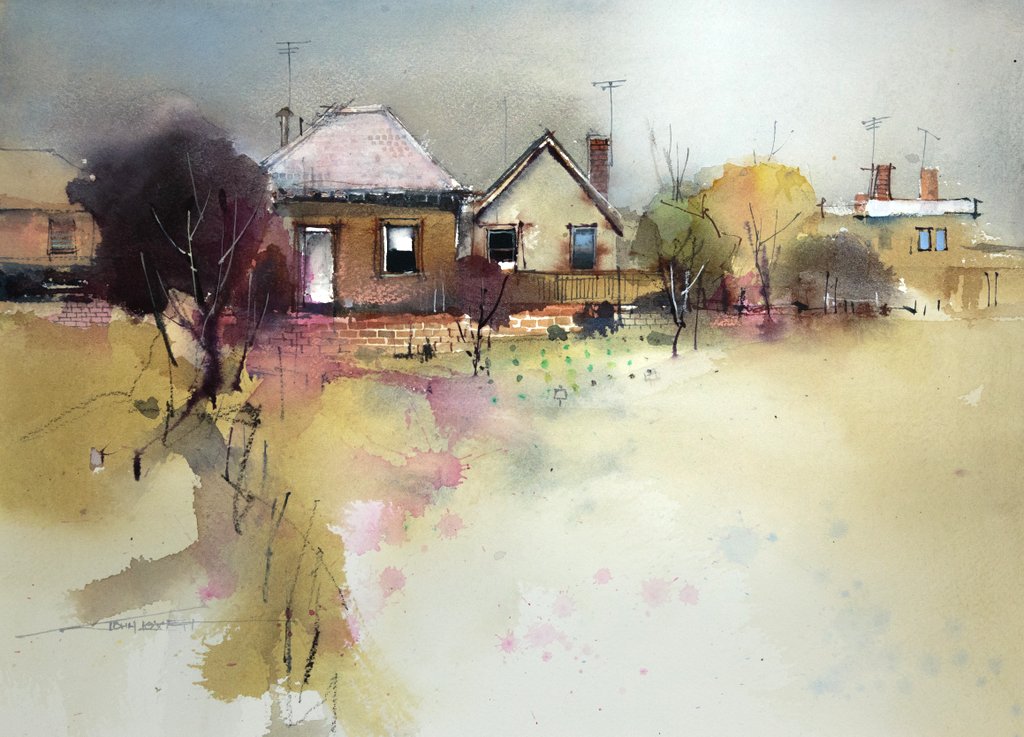
An interesting subject treated in a simple, graphic way. Disregarding perspective and focusing on the composition and simple color arrangement amplifies the character of these uncomplicated, white washed buildings.

Breaking waves are always fun to paint. Phthalo Blue and Green, Ultramarine, Alizarin Crimson and Indian Yellow create the unmistakable color of the West Australian surf.

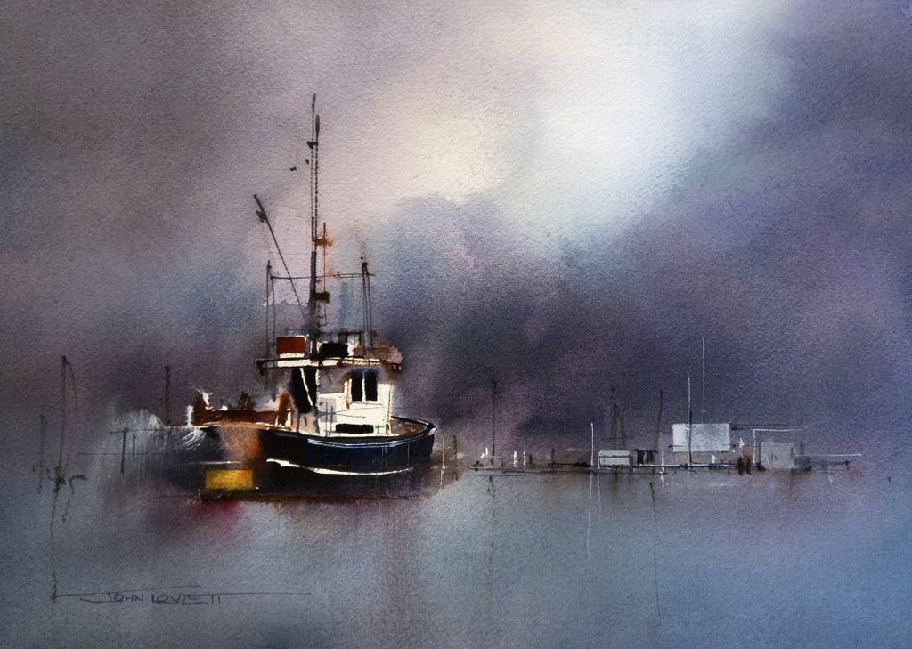
Another simple, graphic approach – no perspective or surrounding clutter to take away from the weathered patina of this sea weary fishing trawler up on slips.

In Perth our workshop venue was spacious, well lit and not far from the city. We did three two day workshops, so new faces seemed to pop up all the time.

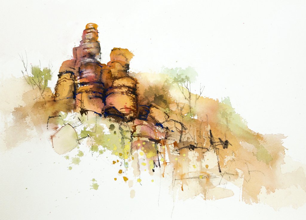
This weathered sandstone outcrop is full of color and texture. Eliminating most of the foreground and background gives the monolithic outcrop an understated simplicity. Ultramarine Blue gouache dropped into the shadows contrasts with the warm orange and makes the shadows much more vibrant. A predominantly warm color arrangement made from Alizarin Crimson, Permanent Rose and Indian Yellow is relieved by Ultramarine Blue in the sky and small patches of Phthalo Blue tinted with White Gouache in the buildings. A simple abstract mark leads the eye across the open foreground and up to the focal point.
Small calligraphic marks either side of this resting trawler suggest buildings, jetties and nautical paraphernalia without being too descriptive. This simplicity contrasts with the apparent detail in the trawler to engage the viewer and make the painting more interesting.