VENICE WORKSHOP

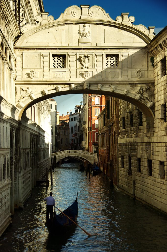
Venice has to be one of  the most spectacular painting destinations in Italy. Standing on Rialto bridge and looking down the Grand Canal feels more like watching a bizarre movie than experiencing a thriving city.

We arrived in the afternoon and were rapidly transported to our hotel by water taxi.

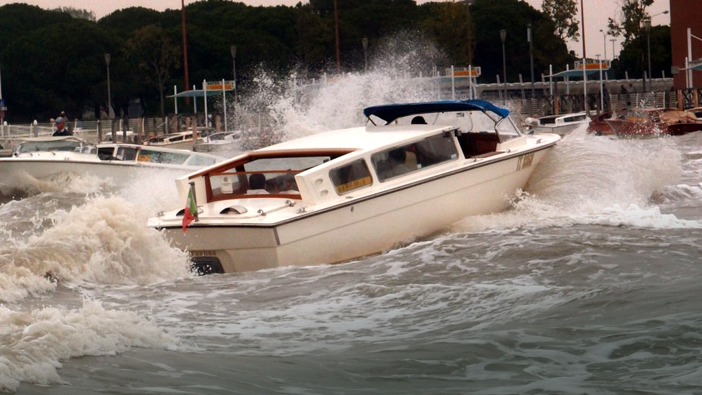
Leaving Marco Polo Airport by water taxi is a chaotic experience. 110 Euro from the airport to the city means the drivers are pretty serious about getting the job done quickly.

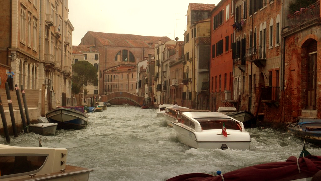
Churning through the back alleys en route to Accademia Bridge

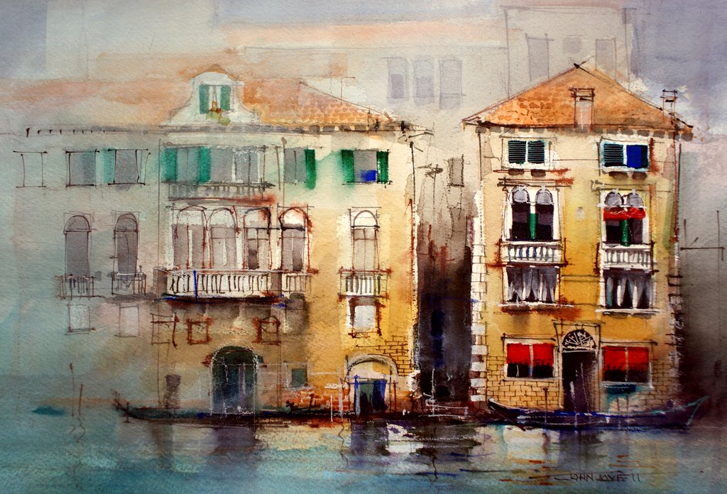
Painting on the grand canal.

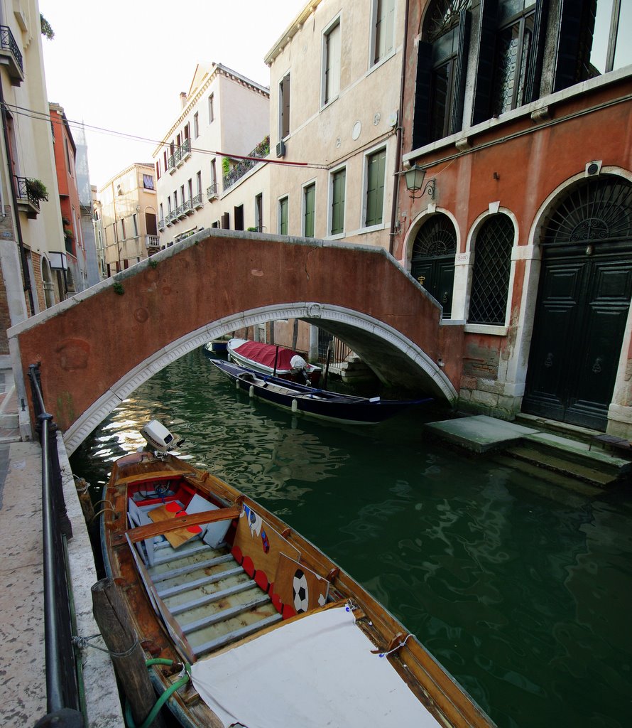
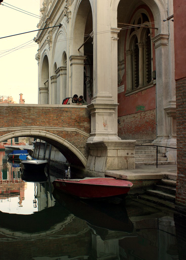
Early morning along the canals

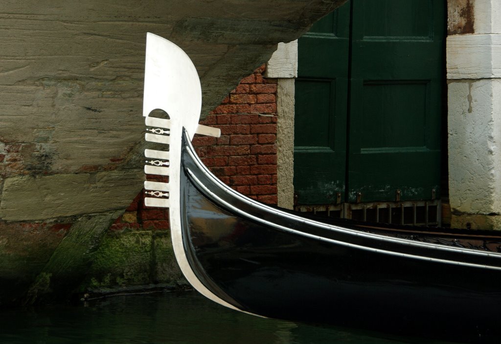
The last gondola workshop in Venice was just around the corner from our hotel … and right opposite a great little bar.

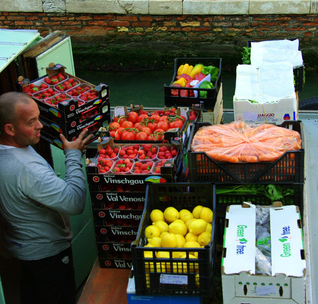
Everything is delivered by barges along the canals

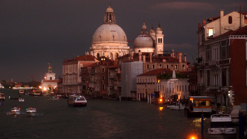
A late afternoon storm blackened the sky behind Santa Maria della Salute making for some great photos.

Evening drinks along the waterfront

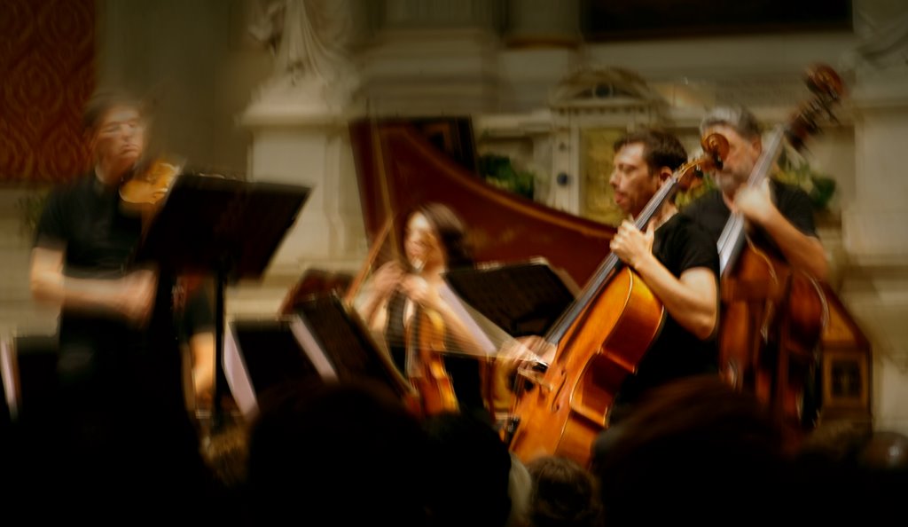
Interpreti Veneziana were performing at the San Vidal Church, 5 minutes from our hotel. Italian Baroque played with passion and enthusiasm – a fantastic night.

Burano Houses

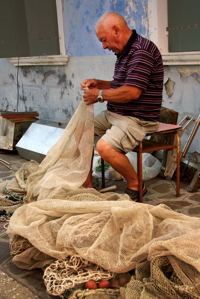
Burano is famous for its lace making, but I think this guy is mending a fishing net.

AUGUST STUDIO WORKSHOP

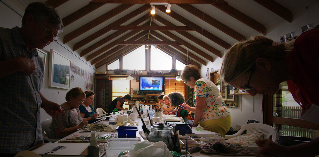
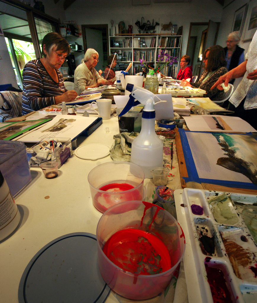
We have just finished two full on weeks of workshops in the studio. Some familiar faces and some new faces. This is the first time we have had a completely new group for the second week, so I thought it would be interesting to repeat some of the demonstrations with some variation.
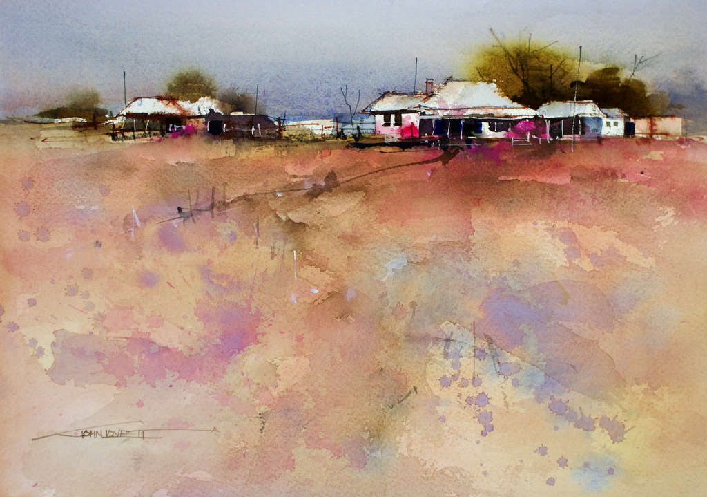
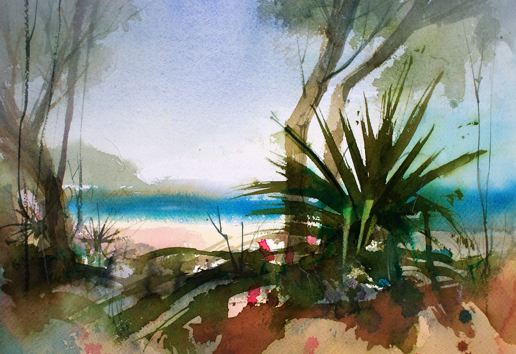
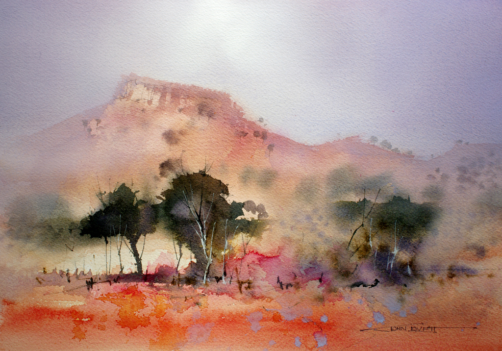
These two landscapes based on recent photos from Western Queensland were started with transparent washes (Quinacridone Gold, Cobalt Blue and Permanent Rose) Then the trees and other details were added with more opaque mixtures of Ultramarine Blue, Phthalo Blue, Alizarin Crimson and Quinacridone Gold. Graded washes were used on either side to create a band of light through the focal point, then various layers of gesso and White gouache glazes were worked through the sky and distance.
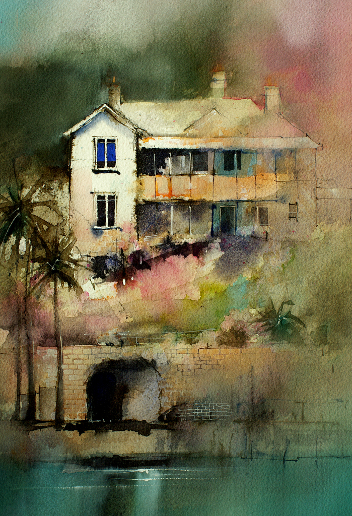
I have painted this Old house on Sydney Harbour from various angles and thought it would be a good workshop subject, having problems of symmetry and conflicting focal points to be sorted out.

I was surprised when we started drawing, to find that one of the students had lived in the flat behind the house back in the 70’s – when Brett Whitely lived and painted a little further around the bay.

These paintings were done with the same simple palette of Quinacridone Gold, Alizarin Crimson, French Ultramarine Blue, Phthalo Blue and Permanent Rose. I also used Charcoal pencil, White Gouache, Gesso and Burnt Sienna Ink. The vibrant blue window in the top painting was painted with Ultramarine Gouache.

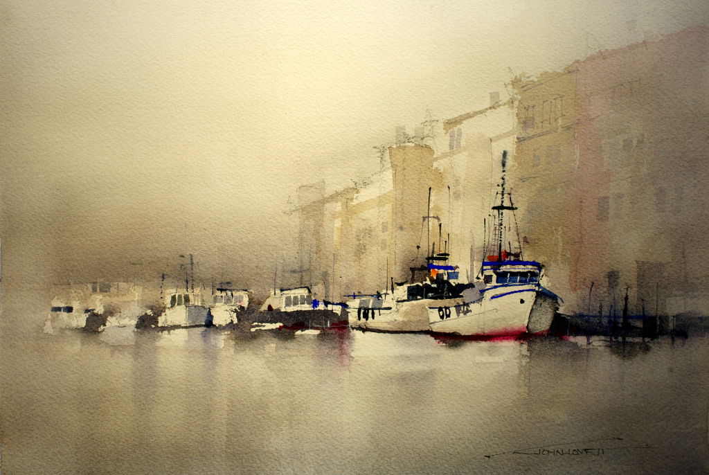
Not far from Venice is the small fishing port of Chioggia. These weather beaten trawlers make an interesting subject with their confusion of masts and rigging and the complicated backdrop of ancient buildings. The idea here was to suggest all the complicated detail without trying to carefully render it. We started with under washes of Permanent Rose and Aureolin and gradually built up detail over the tinted paper.
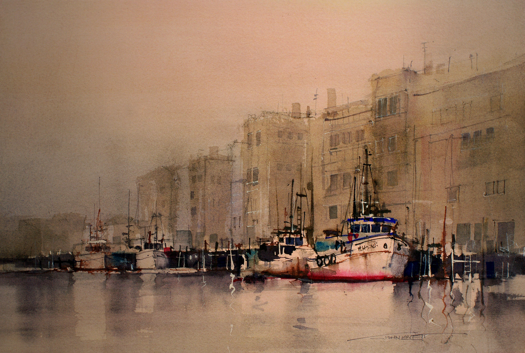
A different subject using the same transparent under wash technique. This time graded washes of Cobalt Blue and Permanent Rose formed the under wash.

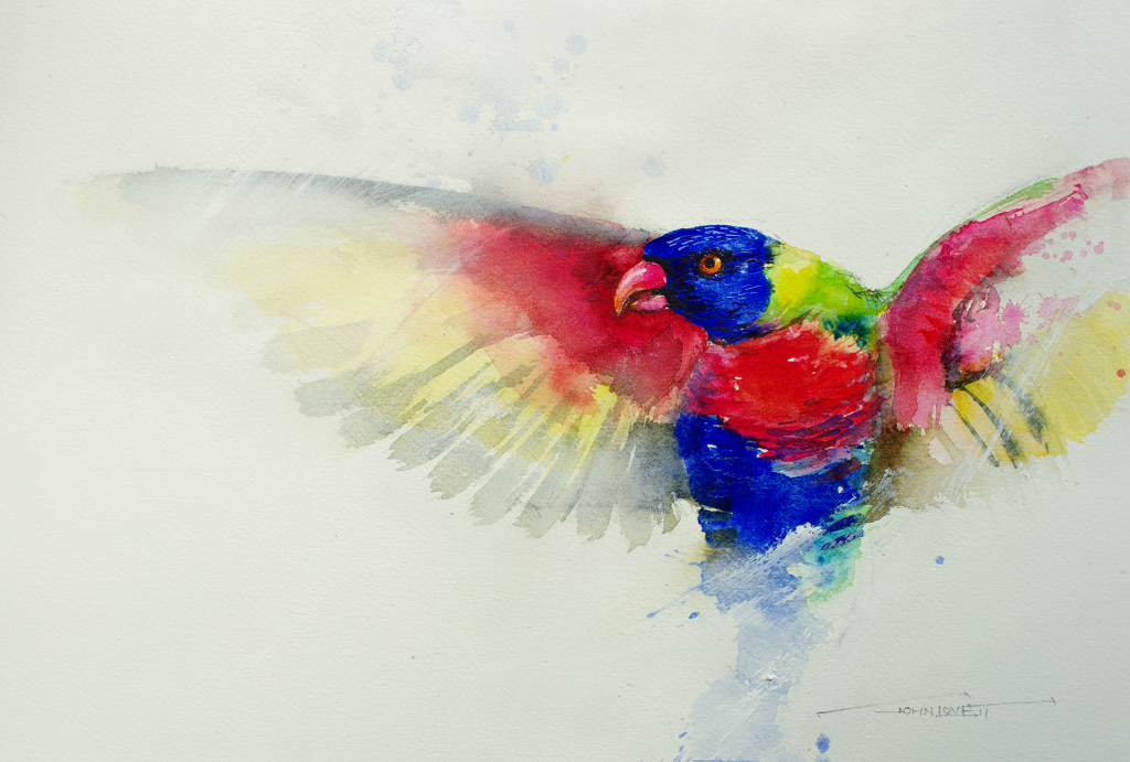
Painting these Lorrikets was a lot of fun – balancing sharp detail with loose suggestion. The wings and much of the body were roughly washed in with an old 1/2″ bristle brush. Detail was built up around the head and body with a 1/4″ flat brush and a #1 rigger. Finally the wings were attacked with gesso and a white charcoal pencil to get a feeling of movement.

Everyone enjoyed painting these rocks and sapplings. The purpose was to shuffle around the source material to create an interesting composition, then to build up textures and depth with watercolor, gouache, ink, charcoal pencil and Gesso. We used a number of techniques – splashing, splattering and spraying to build up the textures and gesso glazes to soften and push back the distance.
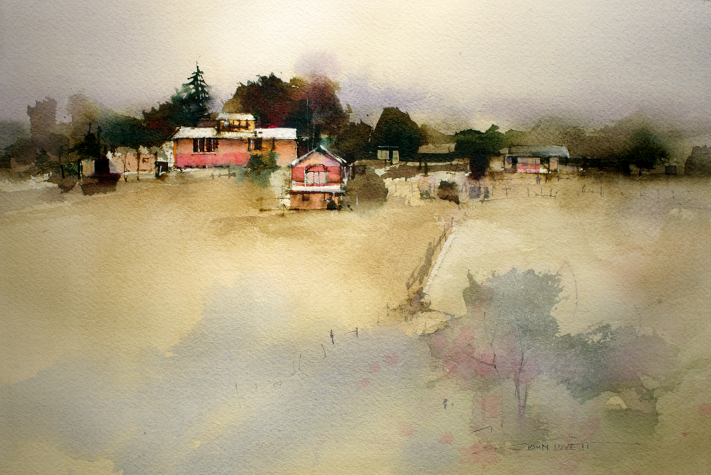
Another exercise in rearranging  the subject. This time a soft abstract foreground to lead the eye into the focal point of trees and buildings.

So thanks to everyone that attended the workshops and thanks to Dianne for the mighty cakes – back to dry biscuits now!

WATERCOLOR HAMMERS

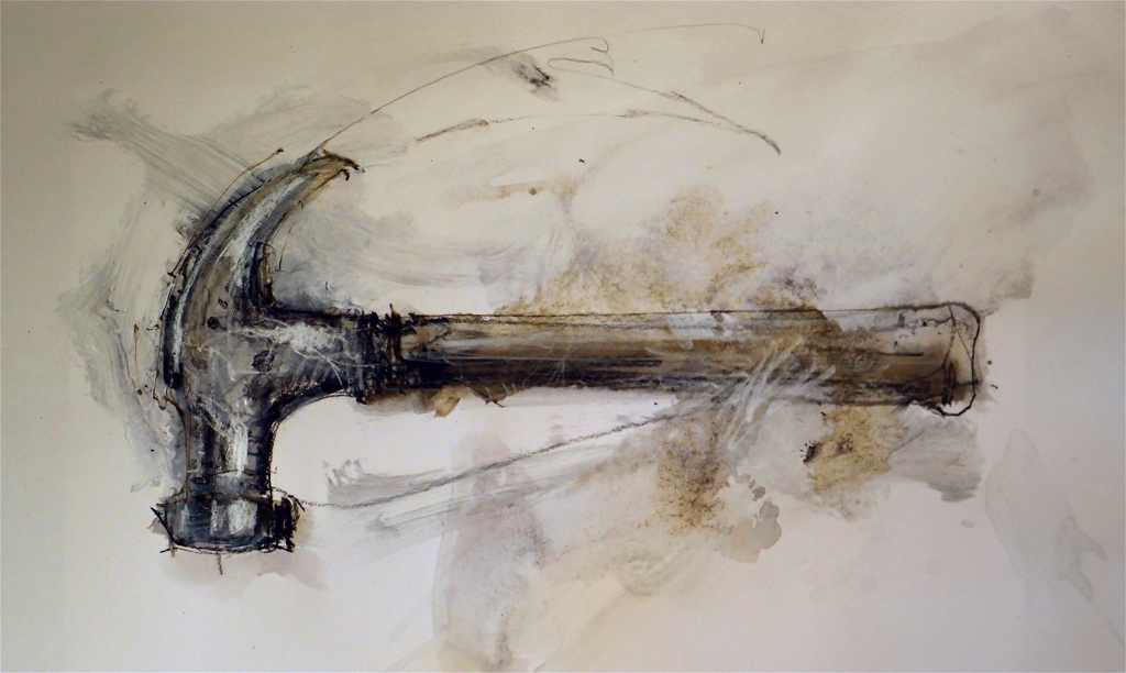
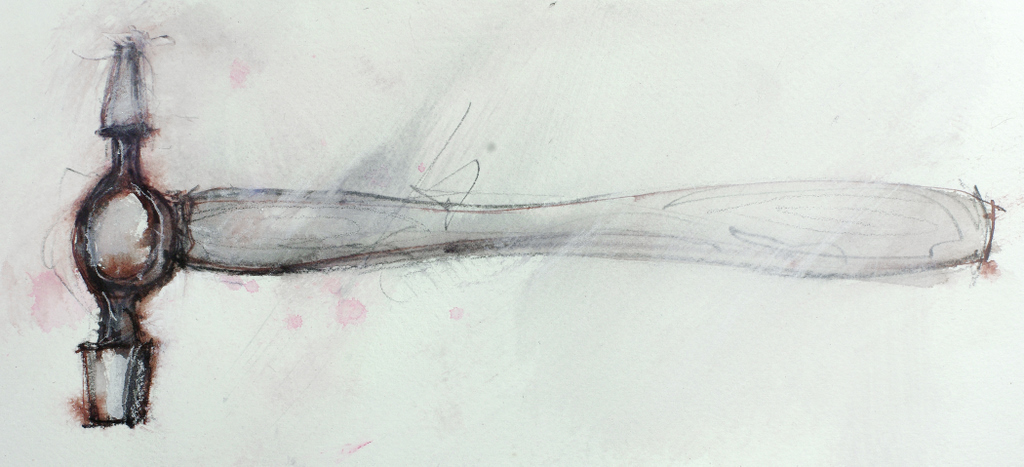
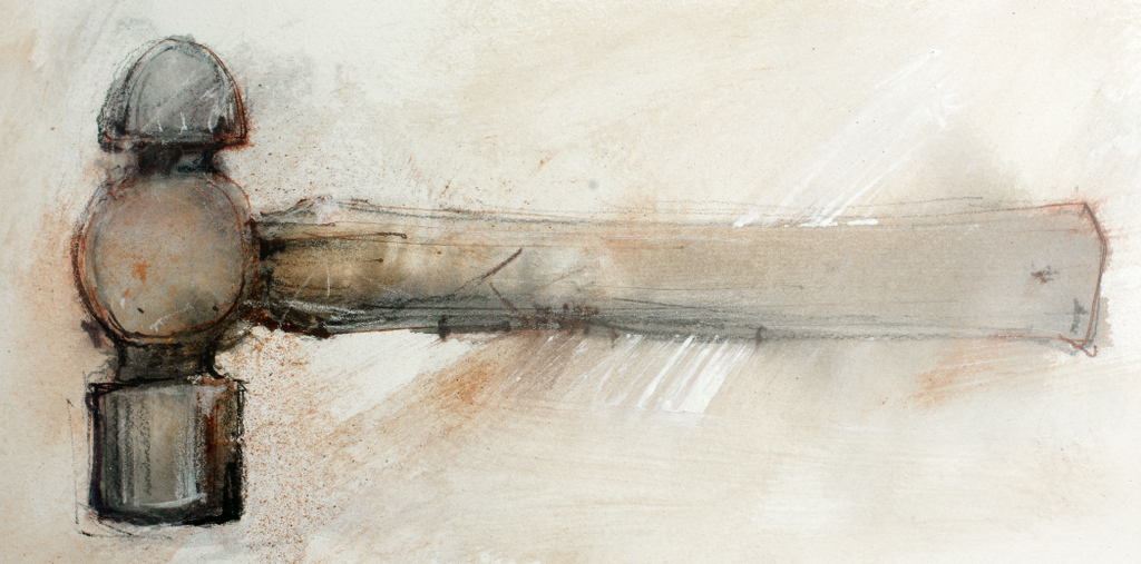
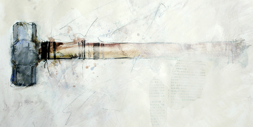
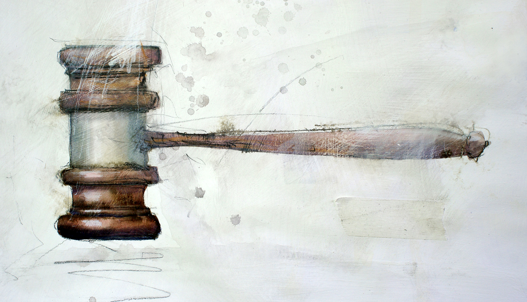
Over the past couple of weeks it has been pouring rain here, so I’ve been having a great time shut away in the studio painting hammers. It all started with the claw hammer and grew from there. Following through on an idea is a great way to build up a series of paintings. It gives you the chance to experiment with techniques, play around with the subject and not be too worried about the outcome. These were all done on paper with various combinations of Charcoal, Gesso, watercolor, gouache, ink and ocher powder.

NEW CHRISTMAS TOYS

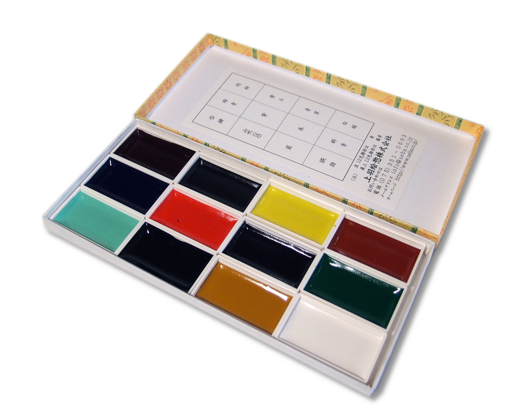
Santa Claus was good to me and left a box of shiny new paint from Japan. These trays of  watercolor are handmade  by the Ueba company in Kyoto. They were established in 1751 and still operate out of the same premises, so they must be doing something right. The main ingredient of the paint is finely ground scallop shells. The process they use to create these paints can be seen on their website (click on Factory Tour)

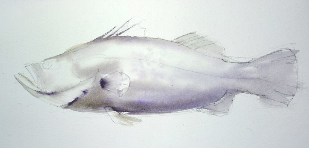
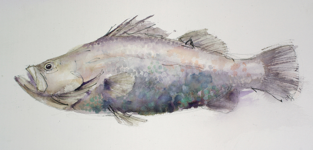
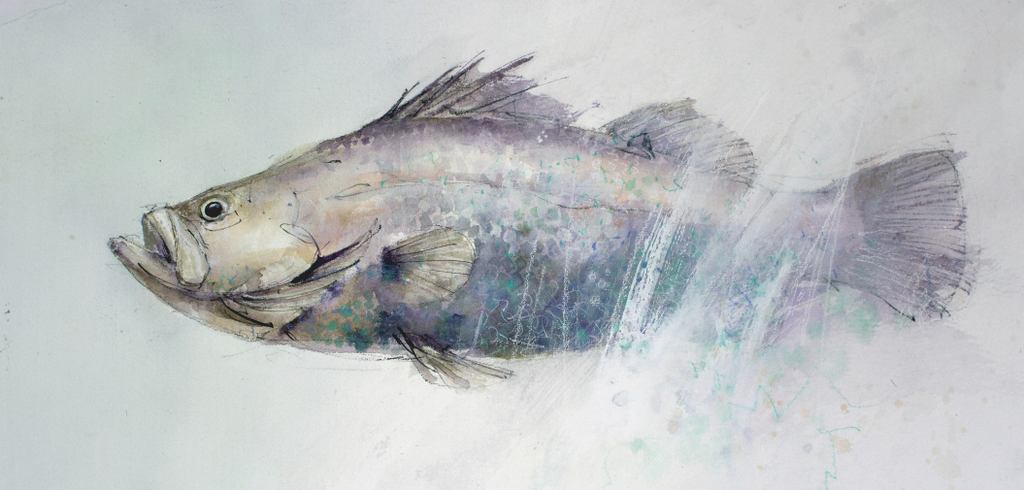
To experiment with these new paints I painted this Barramundi.

Starting with a loose charcoal line drawing, I then washed in some shadows with a mixture of the rich purple color and the yellow ochre. The pigments are very intense and more transparent than I expected, considering the high ground shell content.

After the first washes dried, more detail was built up with Indigo and the pale Turquoise. Scale shapes were painted on and some fine detail marks were applied with a rigger brush. A patchy wash of the orange/red was worked through the upper half of the fish before some spots of the white pigment were applied. I expected the white to be similar to white gouache, but it is more transparent  and dries to a beautiful, pearl like sheen. When the white is used to tint other colors the resulting mixture also dries with this unusual sheen.

Finally, because the Barramundi is an elusive, almost mythical fish, I decided he shouldn’t be presented so blatantly. A big rough brush full of gesso and some scribbly white charcoal marks pushed him back into murky water. A green/grey wash around the head suggests the milky green of a tropical waterhole.

I love these new paints and look forward to playing with them some more. My only fear is that I’ll become hooked on them and then they will run out!
STUDIO WORKSHOP

For the last two weeks I have been busy conducting a workshop looking at selecting, manipulating and extracting the most from a painting subject. It was a lot of fun, but we worked hard – doing a couple of paintings each day and squeezing in a few critique sessions, where we examined everybodys work and discussed various problems and solutions.

Studio Workshop John Lovett Nov 2011

It is always a pleasure meeting new students and catching up with students from previous workshops. One of our new students for the second week was Carol and her assistant, Kim. What an inspiring lady – taking up watercolor a couple of years ago after a severe car accident ended her career as a lawyer and left her a quadriplegic. Forgetting about her disability, the standard of her paintings is excellent, but to see how she has overcome so many physical hurdles to produce the work she does is just amazing. On top of this, she is determined to keep on improving and works hard to that end.

Thumbnail sketches and simple monochrome collages were used to simplify and rearrange our subjects.

The demonstration paintings below illustrate some of the techniques we explored.

Manipulating a large foreground to lead up to a focal point while not causing a distraction.

Creating depth with hard and soft edges

Flat Ultramarine gouache used to squeeze more vibrancy from the warm, transparent watercolor.

Confining detail and using empty space as an element in the painting.

Practicing the random placement of suggestive abstract marks

Blitz Truck Watercolor


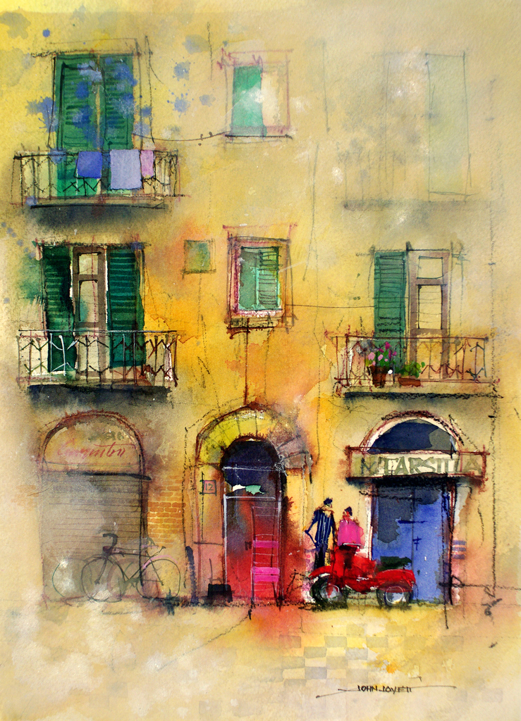
Sometimes an unusual subject will free you up to try new techniques.

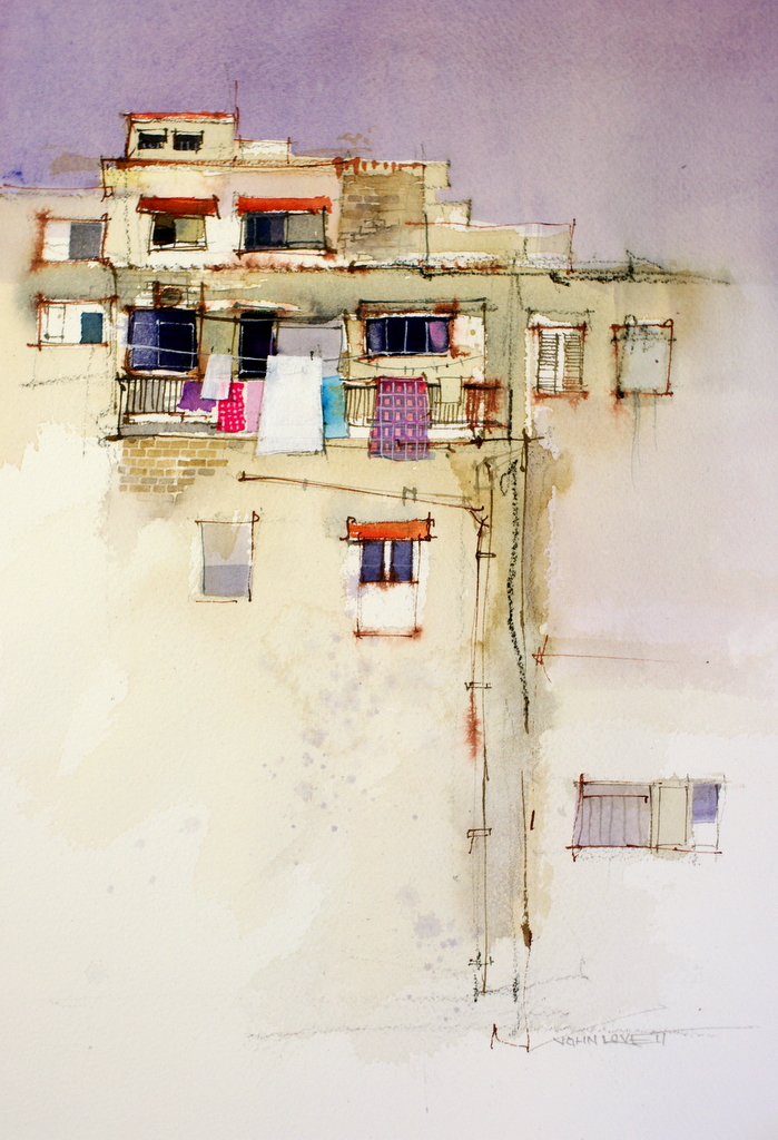
Making a strong focal point in what was a flat uniform facade.

Starting loosly with a big brush and no preliminary drawing, then adding detail as the painting progresses.

Experimenting with techniques to break up a symetrical subject.

PAINT RECYCLING

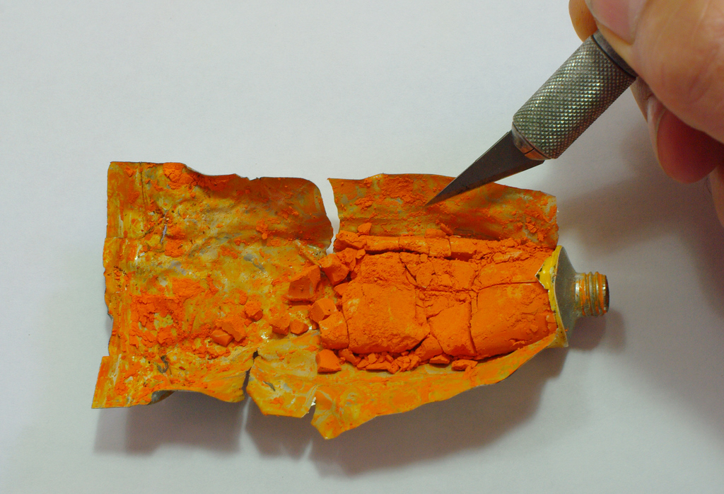
Do you have a collection of dried up paint tubes you just can’t bring yourself to throwing out?

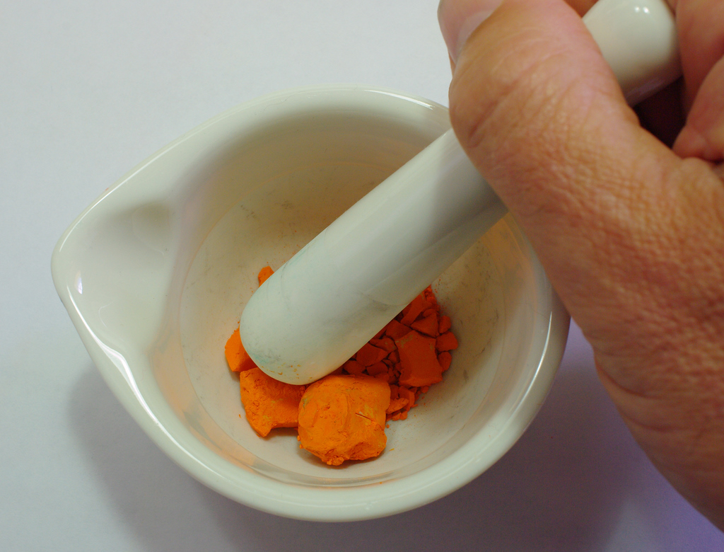
Here is a way to bring the paint back to life.  I found a small pestle and mortar hidden in the back of a kitchen cupboard. It turned out to be the perfect device for grinding the contents of all those dried out tubes into a fine powder, ready to be brought back to life.

The first thing to do is cut open the tube and empty the dry lumps of pigment into the motar

Next step is to grind them to a fine powder. The pigment sticks to the pestle, so a metal palette knife is handy to scrape and loosen the pigment.

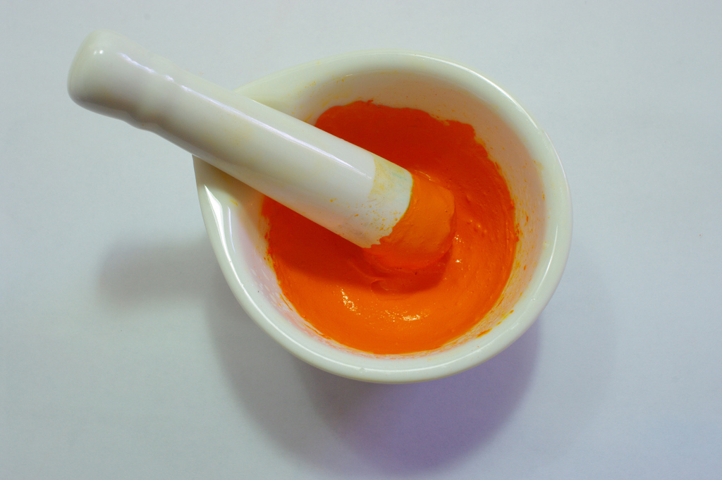
Once the pigment is a fine even powder, slowly stir in some water. Just enough to make a thick, creamy consistency. Keep grinding the paste for a few minutes to make sure there are no small, unbroken lumps left.

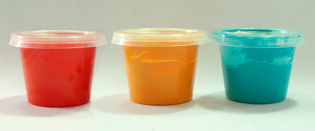
The final step is to scoop the recycled paint into a container. These little plastic sauce containers come from the local Thai restaurant – a couple of dollars for a plastic bag full. A piece of masking tape with details identifying the brand and color is a good idea before you throw away the empty tube.

WARNING

Some pigments contain heavy metals such as Cobalt and Cadmium (check the warnings on the tube). Be careful not to breathe in or swallow the dust off these. Wear a suitable mask if in doubt.

.

NEW TOYS

I’m a sucker for an Art Supply Shop. I just can’t walk past them. While we were in Hong Kong an assortment of pastel pencils, water soluble crayons and colored inks became absolute necessities. Things that I couldn’t leave the shop without!

I have drawers full of such items. Essential in the excitement of the moment, but once in the studio and tested, they become just another unnecessary distraction. Fortunately, this bout of impulse buying resulted in some really useful new toys.

The inks are Winsor and Newton Calligraphy inks – Brilliant primary colors

The pastel pencils are a Dutch brand I have not tried before – Bruynzeel. Fine textured and good colors.

I have used the Caran d’Ache water soluble crayons before, but fell for a pile of new colors.

Red Shoes – Sketched with a charcoal pencil then colored with a red, orange and pink crayon. After the crayon was applied, a wet 1/2″ brush was used to dissolve and blend the colors. Finally a few red ink lines were drawn on and sprayed with a mist of water.

These Lemons were painted with a mixture of crayon ink and pastel pencil. A gesso wash was scrubbed over the foreground before the final yellow crayon marks were applied. Before the Gesso had dried the lemon was carefully sliced and dropped into a Gin and tonic.