NEW CHRISTMAS TOYS

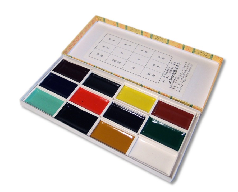
Santa Claus was good to me and left a box of shiny new paint from Japan. These trays of  watercolor are handmade  by the Ueba company in Kyoto. They were established in 1751 and still operate out of the same premises, so they must be doing something right. The main ingredient of the paint is finely ground scallop shells. The process they use to create these paints can be seen on their website (click on Factory Tour)

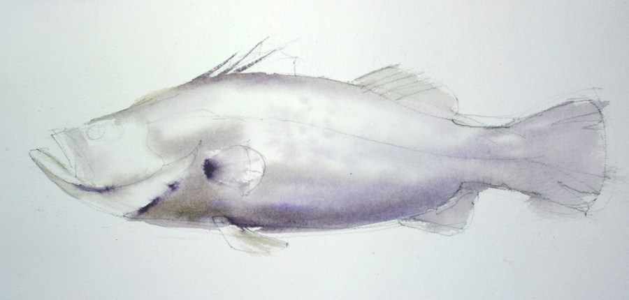
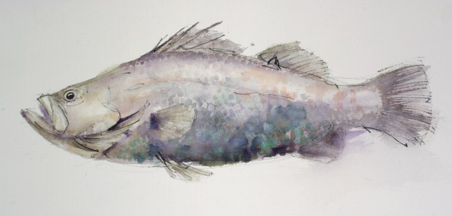
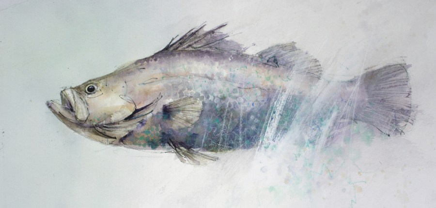
To experiment with these new paints I painted this Barramundi.

Starting with a loose charcoal line drawing, I then washed in some shadows with a mixture of the rich purple color and the yellow ochre. The pigments are very intense and more transparent than I expected, considering the high ground shell content.

After the first washes dried, more detail was built up with Indigo and the pale Turquoise. Scale shapes were painted on and some fine detail marks were applied with a rigger brush. A patchy wash of the orange/red was worked through the upper half of the fish before some spots of the white pigment were applied. I expected the white to be similar to white gouache, but it is more transparent  and dries to a beautiful, pearl like sheen. When the white is used to tint other colors the resulting mixture also dries with this unusual sheen.

Finally, because the Barramundi is an elusive, almost mythical fish, I decided he shouldn’t be presented so blatantly. A big rough brush full of gesso and some scribbly white charcoal marks pushed him back into murky water. A green/grey wash around the head suggests the milky green of a tropical waterhole.

I love these new paints and look forward to playing with them some more. My only fear is that I’ll become hooked on them and then they will run out!

STUDIO WORKSHOP

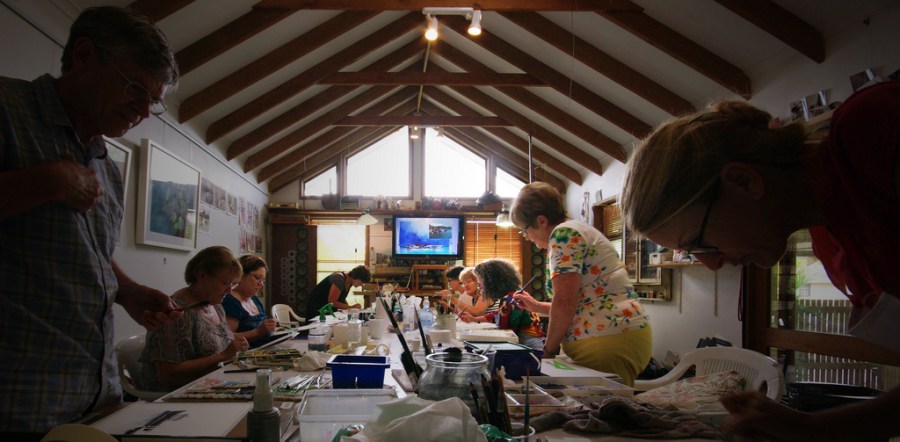
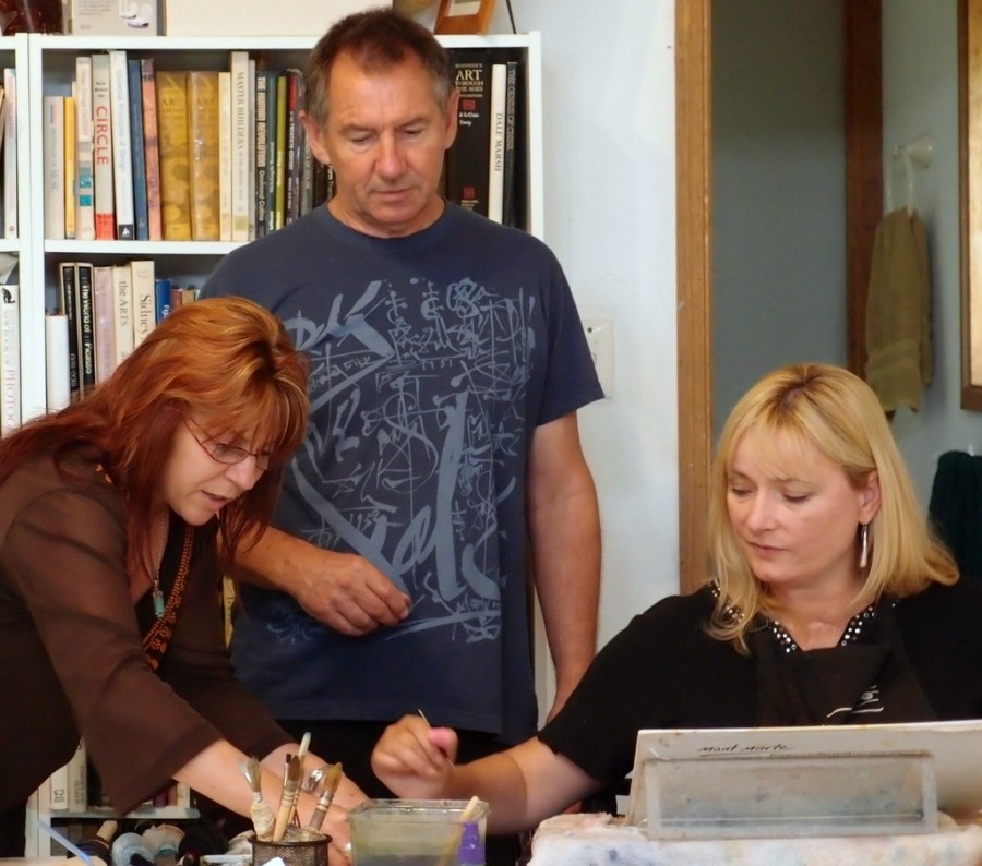
For the last two weeks I have been busy conducting a workshop looking at selecting, manipulating and extracting the most from a painting subject. It was a lot of fun, but we worked hard – doing a couple of paintings each day and squeezing in a few critique sessions, where we examined everybodys work and discussed various problems and solutions.

Studio Workshop John Lovett Nov 2011

It is always a pleasure meeting new students and catching up with students from previous workshops. One of our new students for the second week was Carol and her assistant, Kim. What an inspiring lady – taking up watercolor a couple of years ago after a severe car accident ended her career as a lawyer and left her a quadriplegic. Forgetting about her disability, the standard of her paintings is excellent, but to see how she has overcome so many physical hurdles to produce the work she does is just amazing. On top of this, she is determined to keep on improving and works hard to that end.

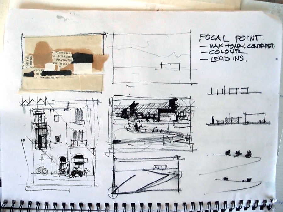
Thumbnail sketches and simple monochrome collages were used to simplify and rearrange our subjects.

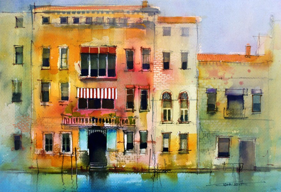
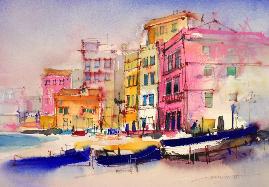
The demonstration paintings below illustrate some of the techniques we explored.

Manipulating a large foreground to lead up to a focal point while not causing a distraction.

Creating depth with hard and soft edges

Flat Ultramarine gouache used to squeeze more vibrancy from the warm, transparent watercolor.

Confining detail and using empty space as an element in the painting.

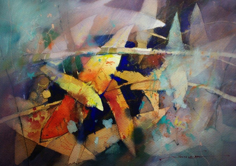
Practicing the random placement of suggestive abstract marks

Blitz Truck Watercolor


Sometimes an unusual subject will free you up to try new techniques.

Making a strong focal point in what was a flat uniform facade.

Starting loosly with a big brush and no preliminary drawing, then adding detail as the painting progresses.

Experimenting with techniques to break up a symetrical subject.

COLOR TEST UPDATE

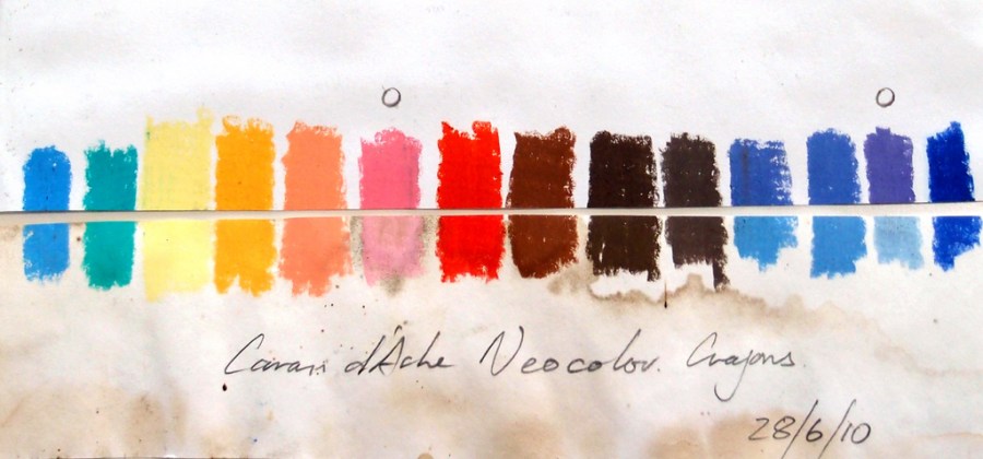
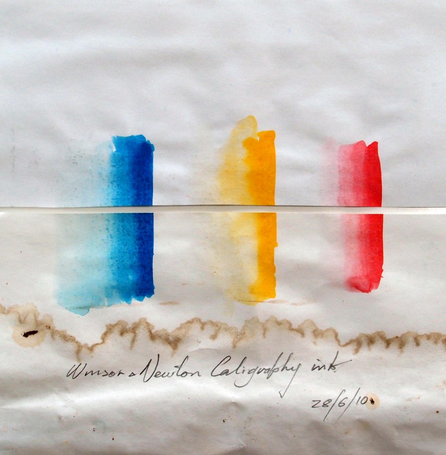
Back in June 2010 I purchased some new inks and water soluble crayons. I posted a color test, where examples of all the new materials were placed on a sheet of paper, the paper cut in half – one half left in the sun, one half placed in a drawer. Well that was over a year ago now, so it’s time to look at the results. (The top half in both these tests was not exposed to the light)

The Caran d’Ache Neocolor Crayons were surprisingly reliable considering the harshness of the test (12 months exposure in full sun)

The pink and mauve colors (marked with a O) fared the worst followed by a couple of the warm blues. No painting should ever be exposed to this amount of sunlight, so I’m happy to use all but the two worst colors.

The Winsor and Newton Calligraphy Ink was exposed to full sun for 12 months and there is no detectable color shift or fading, so these colors can be used with confidence.

Make it a habit to use this test on any new paints, pencils, inks pastels etc. It could save a lot of embarrassment if someone buys one of your works, only to find the colors fade of change over a period of time.

BEND WORKSHOP

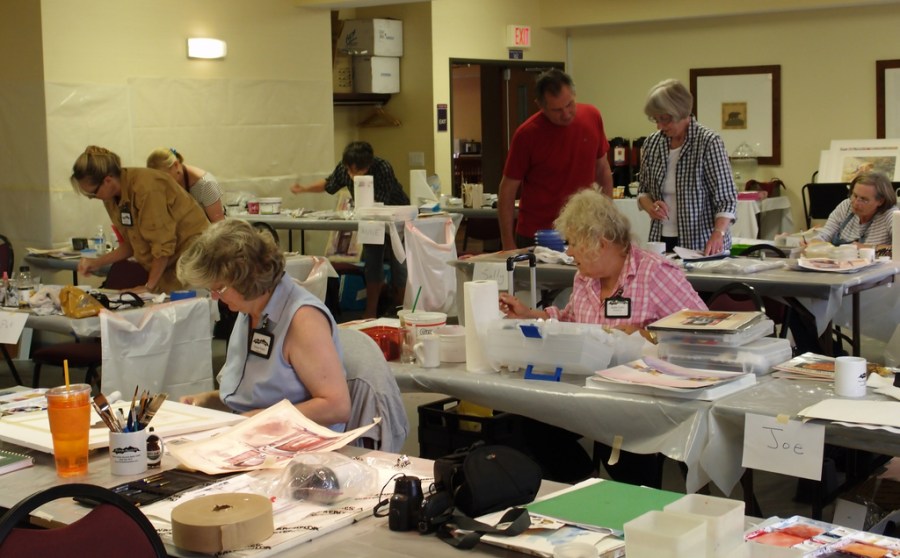
As usual the Bend workshop was a lot of fun. It was great to catch up with friends from our previous Oregon workshops, and to finally meet people we had only spoken to via email. Tracy, Jan and Cindy did a fantastic job keeping things running smoothly and Tracy’s husband, Bob, drove up from Depot Bay one day to treat us to a feast of Dungeness crab and fresh fish –  Yum – fantastic! We had students from as far away as Florida, Hawaii, Canada and even Russia
The big studio at the Pheonix Inn is well set up with an overhead camera for demos and large tables for all students

Two color demo using Indigo and a transparent, Burnt Sienna like color mixed from Quinaceradone Gold, Alizarin and a touch of Ultramarine

Making sense of a complicated subject

A simple subject made interesting by shifting the emphasis away from formal symmetry to a more dynamic diagonal thrust.

A workshop in Bend, Oregon wouldn’t be right without a painting of Mirror Pond.

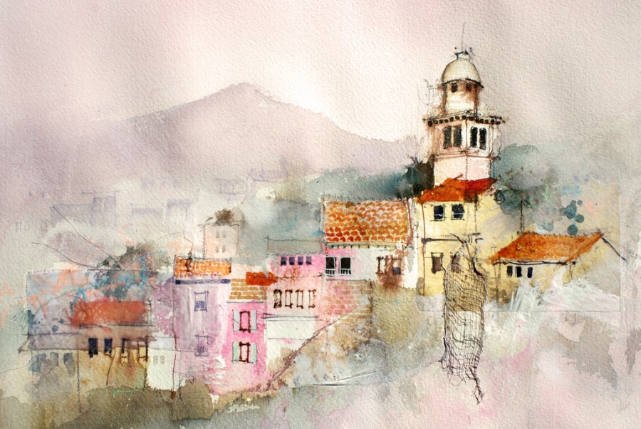
Cheese cloth, rice paper, pastel, ink and gesso were used to build up the interesting textures of this Italian Hilltop Village.

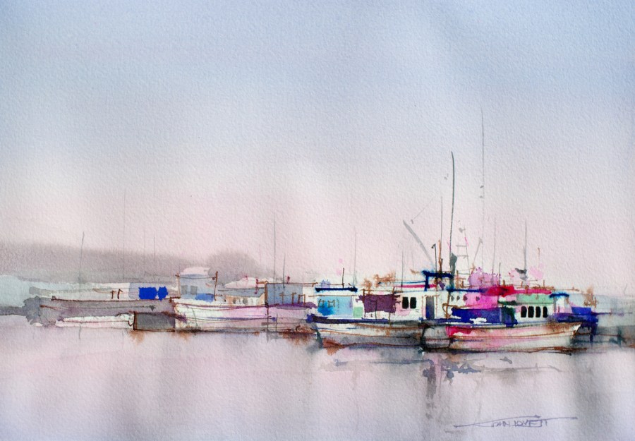
In this painting of Monterey Wharf, Ultramarine Blue gouache was used to give maximum impact to the focal point.

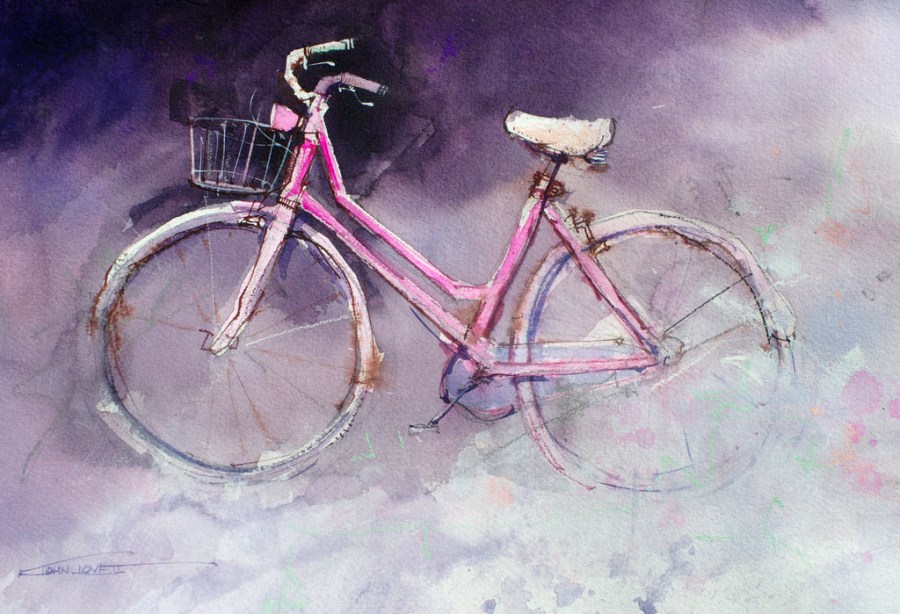
This simple subject is a lot of fun to paint and a great way to work with positive and negative shapes.

We are looking forward to coming back to the US for more workshops in the not too distant future.

STUDIO WORKSHOP

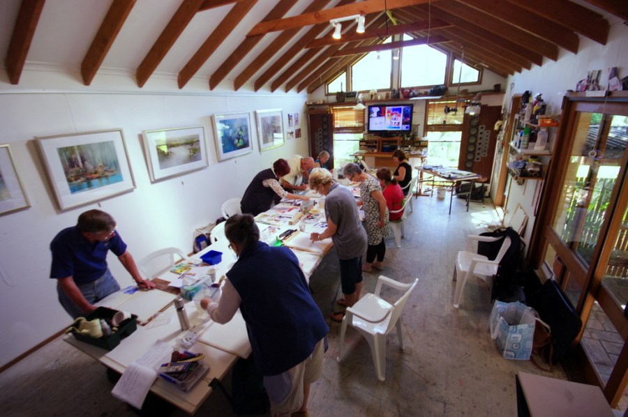
In April we had two one week workshops in my studio. It was a lot of fun. We had students from all over the place – Cairns, Melbourne, Sydney, The Sunshine Coast, even Hamilton Island.

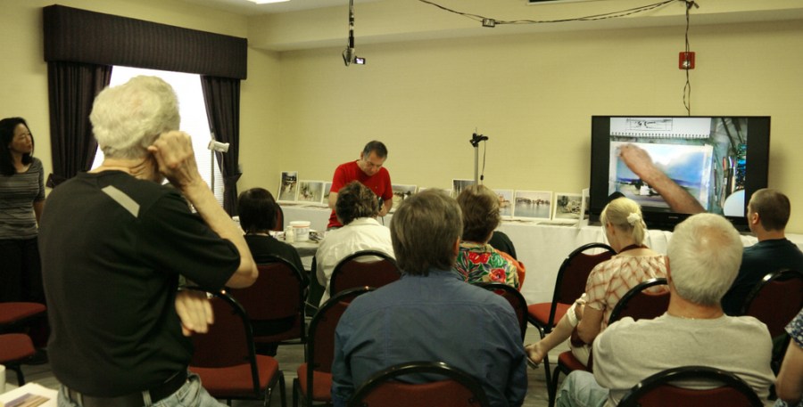
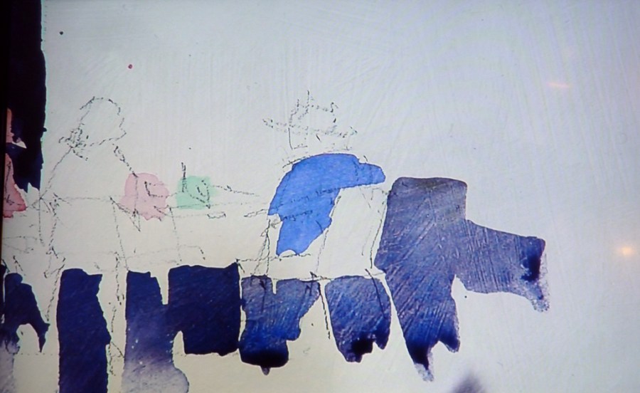
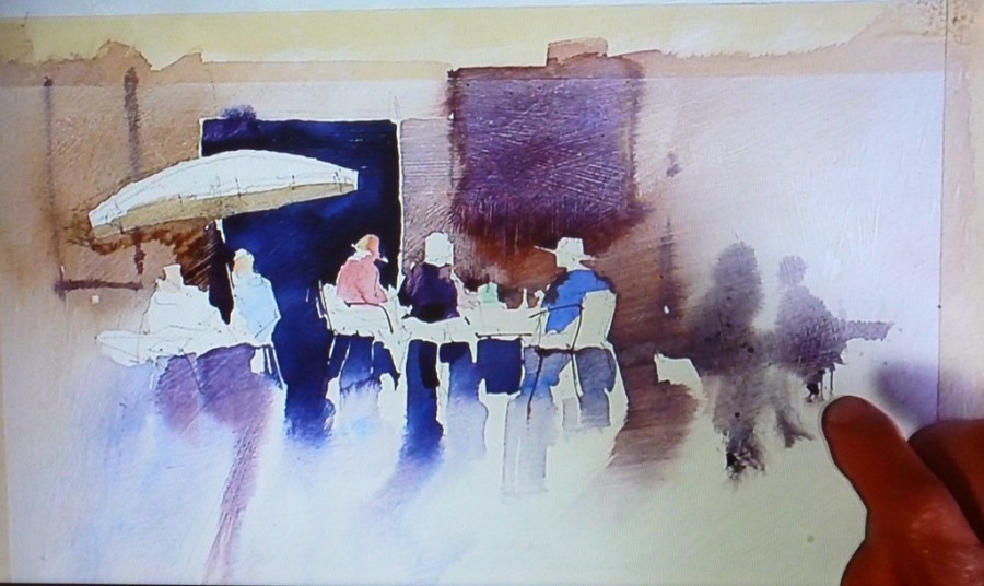
We worked hard and some great paintings were produced. It’s good to see students pick up momentum as the workshops progress. The first day or two are usually a little tentative, then, as every one relaxes and get to know one another, the paintings really start to improve. We all managed to do at least two 1/4 sheet paintings each day. I would demonstrate under a high definition camera hooked up to a large LCD screen, so everyone had a great view of what was happening. Being able to zoom right in on fine detail made it easy to pick up different techniques.

After the demo every one would work on their own paintings while I walked around giving advice and assistance where necessary.

We were spoiled with delicious cakes and slices courtesy of Dianne. I was just getting used to it then the workshop finished!

Hard at work


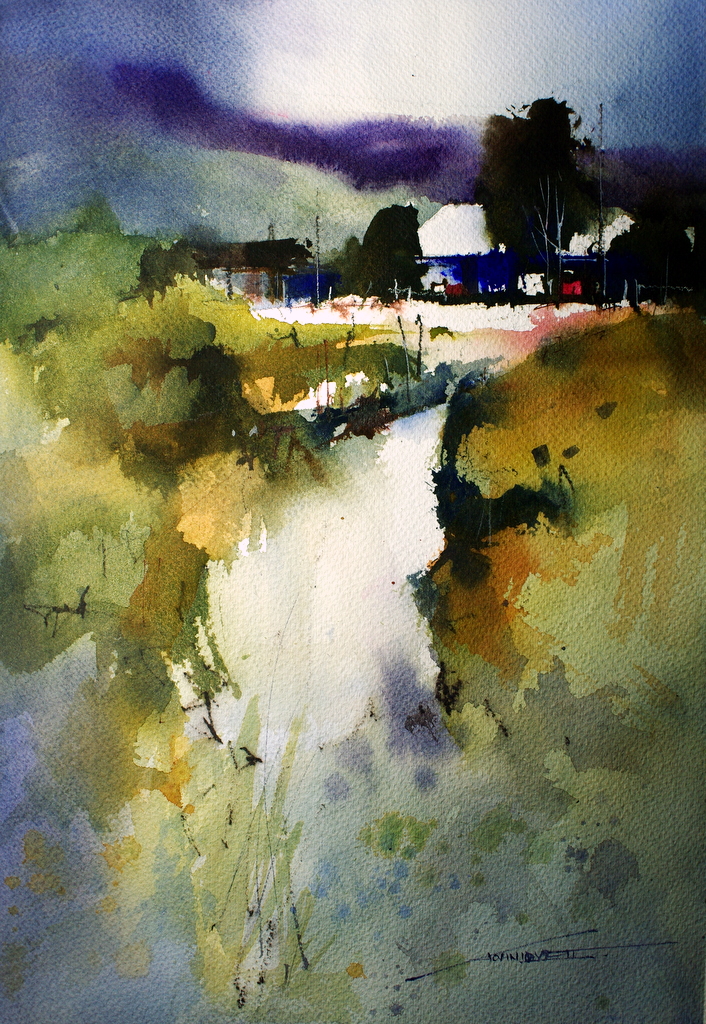
Landscape demo using French Ultramarine Blue, Phthalo Blue, Quinacridone Gold and Permanent Alizarin.

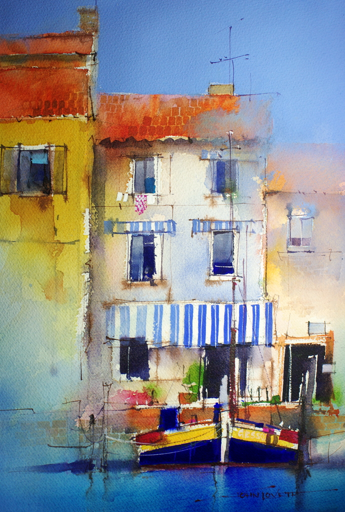
In this demo we took a complicated subject, simplified it then worked detail over the simplified shapes. The sky and awnings were painted with pale ultramarine gouache (mixed from white and ultramarine gouache).

A similar subject, this time we launched into it with a big 1/2 inch bristle brush to make the main Ultramarine shapes then built the rest of the painting around these marks.

Again, using a 1/2 inch bristle brush, we reduced this subject to a few simple shapes. A broad, direct approach delivers just enough information to tell the story without the clutter of unnecessary detail.

This demo was an experiment with negative shapes. The leaves were built up layer by layer, painting the successively darker backgrounds and leaving the leaf  shapes exposed.

.

.

The three images below were an experiment using a watercolor Gesso on aluminium composite panel. The watercolor behaves in a completely different way to working on a paper surface. Pigment sits on the surface rather than soaking in. It is easily washed back or lifted off. I love the way the gesso brush strokes are exaggerated by the settling paint, and I also like the hard, dead flat surface to work on.

WATERCOLOR CANVAS

While we were in Italy one of the artists in our group, Lety Herrera, from Mexico, asked if I had ever tried Watercolor Canvas. I hadn’t, and she suggested I should, so when I arrived home I picked up a pad of small sheets. I was amazed how good it was to work on and how well the washes reacted to the primed surface. I did a couple of small paintings then ordered a roll of the canvas.

It needs to be stretched or mounted securely to a board before you paint on it or it will buckle and twist badly, making it impossible to work on. The paint tends to sit more on the surface than it does on paper, and can easily be washed back to clean canvas. This may sound like a problem, but you soon get use to gently working over underlying washes so as not to disturb them. Eventually, the ability to easily lift off pigment becomes an advantage, allowing tones to be adjusted and whites to be retrieved at any stage.

You may wonder why work on watercolor canvas when there are so many excellent watercolor papers. For me, the big advantage is not having to place the finished painting under glass plus the option to work on a larger surface. Once finished the paintings need to be treated with a suitable varnish.

Palermo Geraniums

.

.

Sorrento Breeze –  Marina Grande

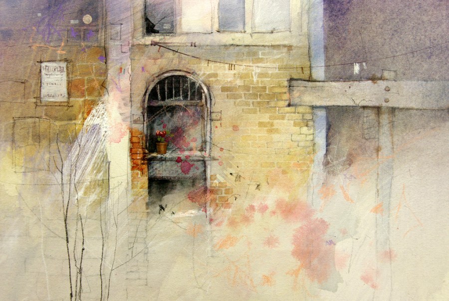
I still love the feeling of painting on watercolor paper but this watercolor canvas offers a new way of working and different way to present your work. I see it as an extension to the traditional format of watercolor on paper. Acrylic, ink and pastel can also be incorporated into these paintings.

Fredrix Watercolor canvas is acid free, 100% cotton canvas, primed with a patent pending, specially formulated Gesso for all water based paints. It is available in pads, boards and in a 58″x 3 yard roll.

PAINT RECYCLING

Do you have a collection of dried up paint tubes you just can’t bring yourself to throwing out?

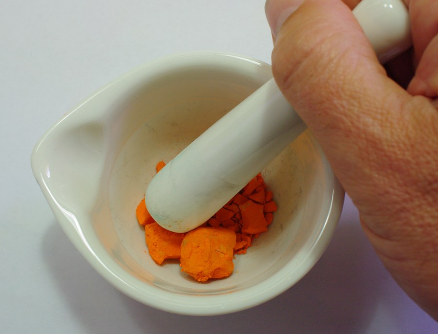
Here is a way to bring the paint back to life.  I found a small pestle and mortar hidden in the back of a kitchen cupboard. It turned out to be the perfect device for grinding the contents of all those dried out tubes into a fine powder, ready to be brought back to life.

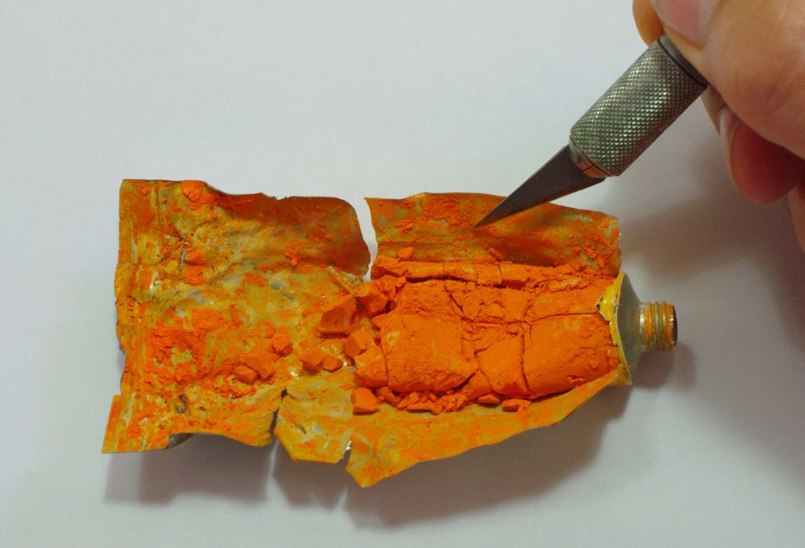
The first thing to do is cut open the tube and empty the dry lumps of pigment into the motar

Next step is to grind them to a fine powder. The pigment sticks to the pestle, so a metal palette knife is handy to scrape and loosen the pigment.

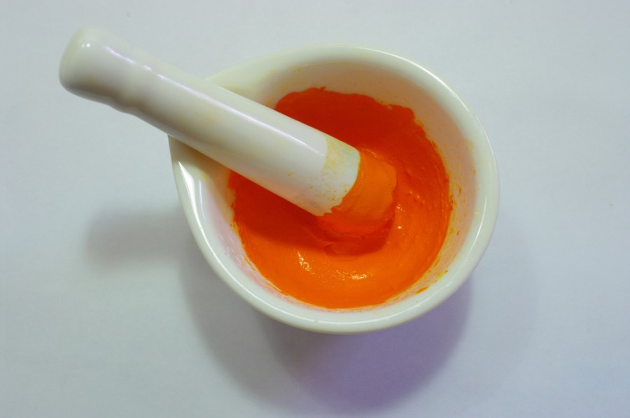
Once the pigment is a fine even powder, slowly stir in some water. Just enough to make a thick, creamy consistency. Keep grinding the paste for a few minutes to make sure there are no small, unbroken lumps left.

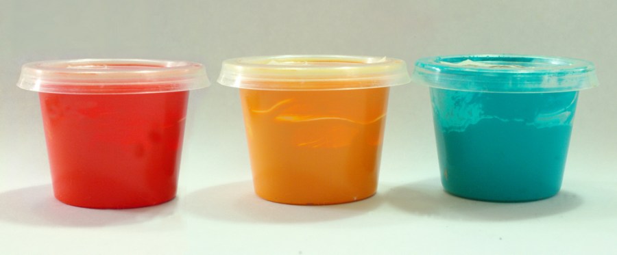
The final step is to scoop the recycled paint into a container. These little plastic sauce containers come from the local Thai restaurant – a couple of dollars for a plastic bag full. A piece of masking tape with details identifying the brand and color is a good idea before you throw away the empty tube.

WARNING

Some pigments contain heavy metals such as Cobalt and Cadmium (check the warnings on the tube). Be careful not to breathe in or swallow the dust off these. Wear a suitable mask if in doubt.

.