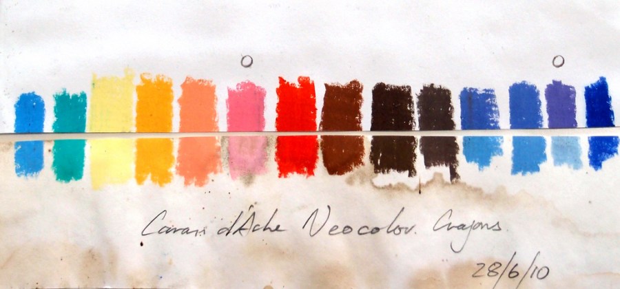
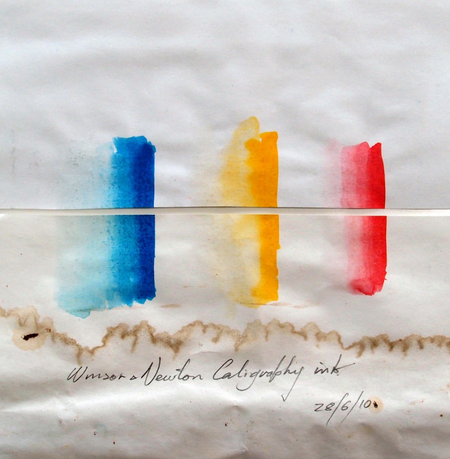
Back in June 2010 I purchased some new inks and water soluble crayons. I posted a color test, where examples of all the new materials were placed on a sheet of paper, the paper cut in half – one half left in the sun, one half placed in a drawer. Well that was over a year ago now, so it’s time to look at the results. (The top half in both these tests was not exposed to the light)
The Caran d’Ache Neocolor Crayons were surprisingly reliable considering the harshness of the test (12 months exposure in full sun)
The pink and mauve colors (marked with a O) fared the worst followed by a couple of the warm blues. No painting should ever be exposed to this amount of sunlight, so I’m happy to use all but the two worst colors.
The Winsor and Newton Calligraphy Ink was exposed to full sun for 12 months and there is no detectable color shift or fading, so these colors can be used with confidence.
Make it a habit to use this test on any new paints, pencils, inks pastels etc. It could save a lot of embarrassment if someone buys one of your works, only to find the colors fade of change over a period of time.


John,
This is an amazing test… I was very surprised the colors fared as well as they did, with only a couple fading. Thanks much both taking the trouble to do the test for sharing this interesting and important information.
Best,
Bill Dunn
Hi Bill,
Thanks for the comments and hope you are getting plenty of painting done
Cheers
John
Though I know that doing color tests is useful I’ve never done one except with ink pens. What is interesting about yours is the effect of weather on the paper you used.
Hi Jo,
Yes, I love those marks made from condensation behind the glass. One day I would like to build up a painting like that. Trouble is, the more unstable the paper is the better it discolors. Have a look at the little Kurt Schwitters paintings on the MOMA post
Thank you very much. This is really valuable information. Have you found the crayons to be less stable than watercolor paint?
Hi Linda,
I have been using a white, a grey and a pale orange water soluble crayon for about 15 years now and they seem to be as reliable as watercolor. Fun to use too!
Cheers
John
You’re the second person in as many days to remind me of Schwitters’ collages. I’ll pay attention. His work is marvelous and a good reminder that brown is a color, too, and that all ranges of brown look great with a bit of red.
Hi Jo,
I love the way he arranges things, and the little bit of cool color he puts in to relieve the warms.
Cheers
John