Category Archives: Painting Demonstrations
LOOKING BACK
A few years ago I sketched this little cottage on Sydney Harbour. It was late in the afternoon and there was no activity – no sign of life at all. As I did the sketch I started wondering what had gone on here in the past. Such an amazing location, I could imagine parties on the verandah, kids running around, boats in the water, but now, nothing – just a little cottage gazing out across the water. It had a kind of empty sadness – a little neglected with vague evidence of lively past.
COLORS:
Quinacridone Gold, Alizarin Crimson, French Ultramarine Blue, Phthalo Blue, Medium Magenta Acrylic, White Gesso, White Gouache
INK:
White pigment Ink, Burnt Sienna Pigment Ink
PENCILS:
White Charcoal, Black Charcoal, Dark Brown Derwent Inktense
URBAN WATERCOLORS
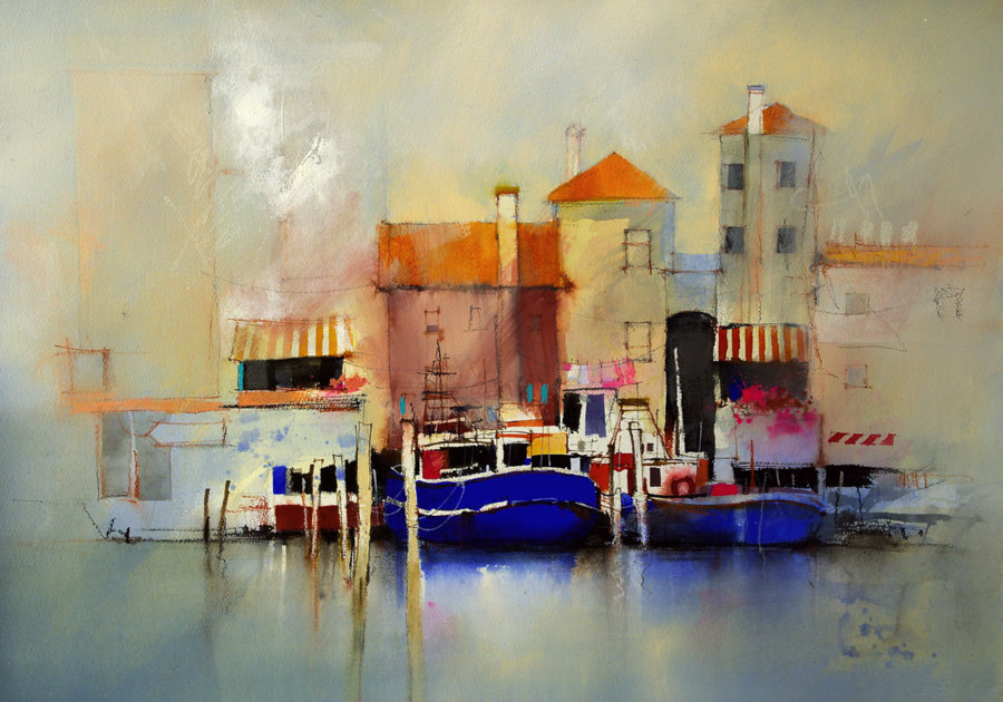
It seems strange I guess, five months traveling through the bush, and I’m back in the studio absorbed in Urban landscapes. Maybe I miss all that noise traffic and chaos.
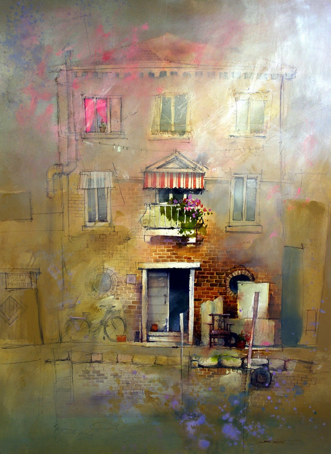
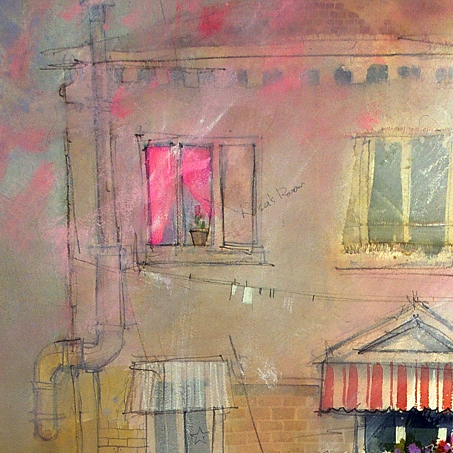
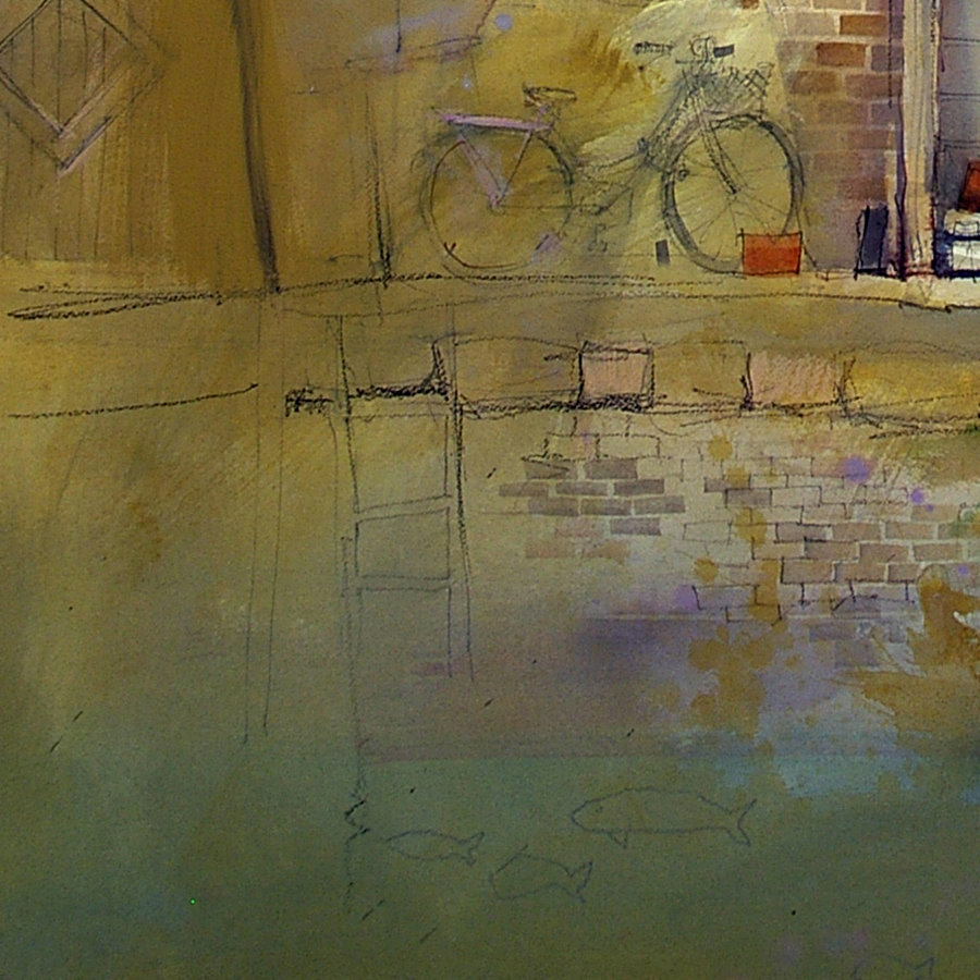
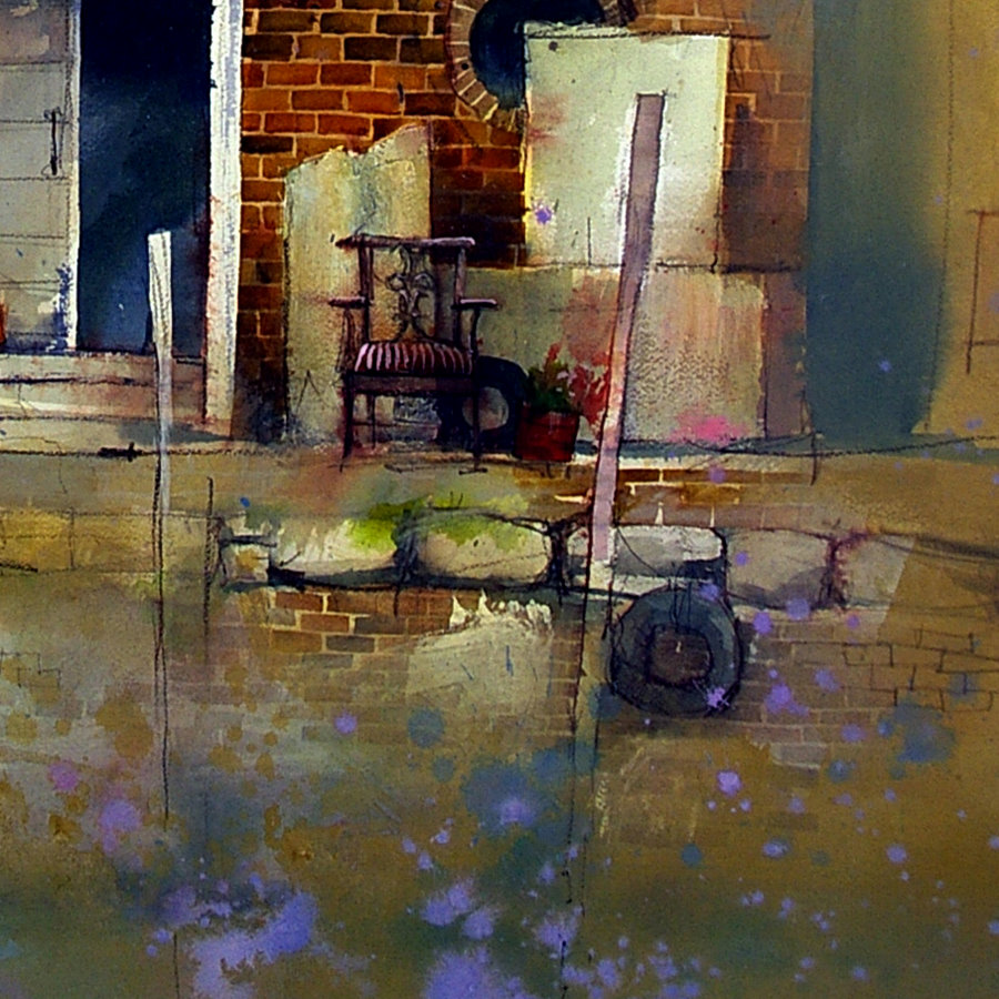
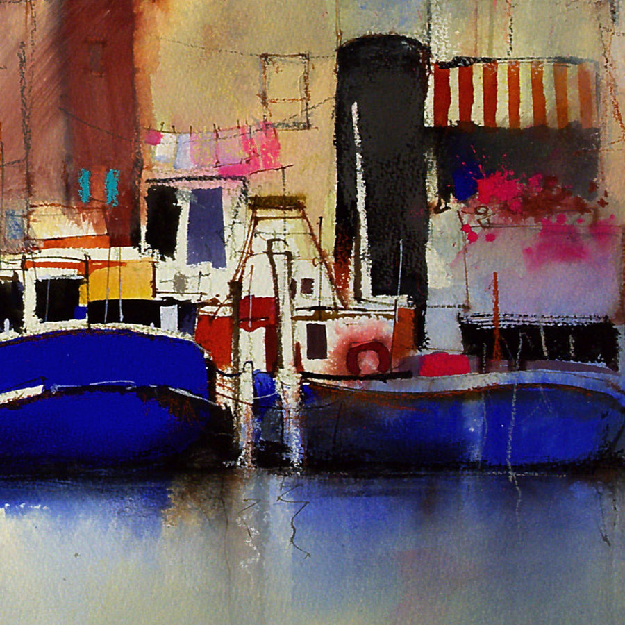
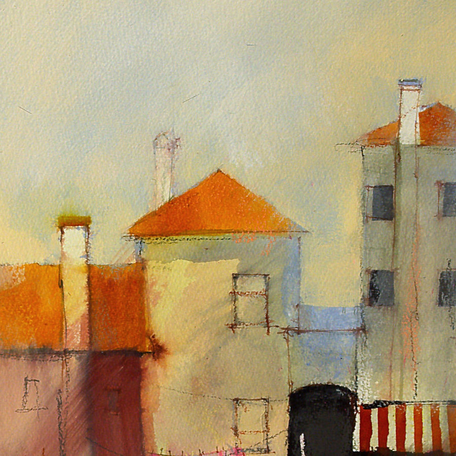
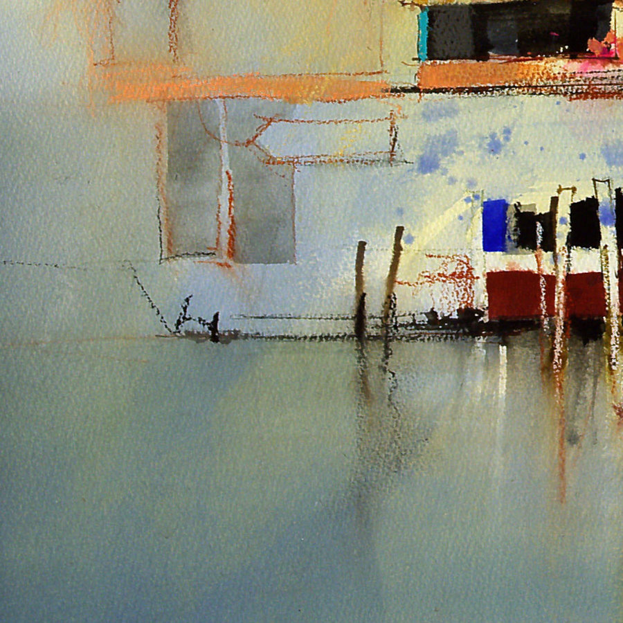
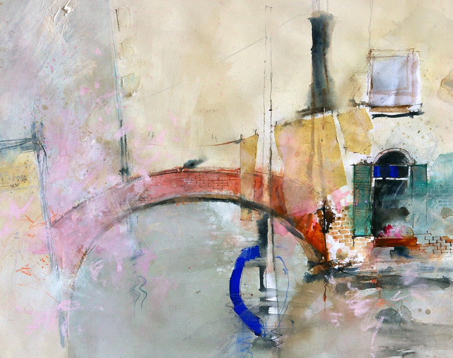
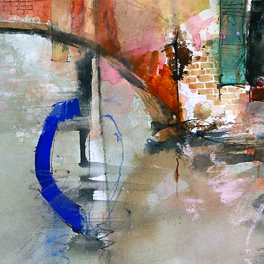
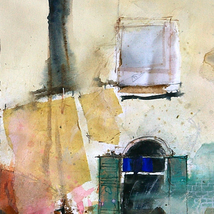
This painting was built up in layers of watercolor and gouache then worked over with thin glazes of gesso. Lots of calligraphic charcoal and pastel pencil marks were then threaded across the surface similar to graffiti on a wall.
Transparent washes of Alizarin Crimson and Quinacridone Gold contrast with the Phthalo Blue foreground glazes and Phthalo tinted White Gouache sky. The brick shaped fine detail was applied with Burnt Sienna tinted White Gouache
A compressed industrial grey color scheme and formal, geometric marks suggest the urban subject rather than accurately describing it in these two paintings.
I find that reducing a painting to the simplest elements and barely suggesting the subject can have a lot more impact. The viewer is engaged on a far deeper level and in a more subliminal way than when details are clearly presented.
BACK IN THE STUDIO
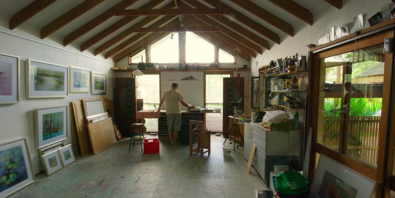
After 5 months away it’s good to get back in the studio and start painting. As much as I enjoy painting outdoors, I always feel the best work comes when conditions are under control and there is limitless time to consider things
.
The first thing I did when I got back to the studio was pull out the last demonstration painting I did at the workshop in Pemberton. At the time I was wrestling with it and hurrying to get it finished. I just wanted to see where it would go with a little more time and less pressure.
I attacked it with a 1″ house painting brush full of gesso , leaving the central core of previously painted watercolor untouched. After the gesso dried, detail was added and blotted back with tissue.
The pigment sits on the surface of the gesso, so can be sprayed and blotted back similar to yupo paper. This produces the subtle effects seen in the detail above. It is an interesting, very controllable way to work and produces unusual results.
MARGARET RIVER WORKSHOP
Our Accommodation for the first few days of the Margaret River Workshop was at the old Karridale Homestead Complex. The homestead was built in the late 1800’s and moved to Margaret River in the early 1960’s. Motel style accommodation was later added, the homestead serving as a restaurant and conference room.

Our first morning painting was in the comfortable courtyard of the Homestead.

After going through all the techniques and materials I like to use everyone chose a small part of the courtyard and, using just two colors, concerntrated on composition and tonal contrast to squeeze as much out of their subject as possible.

That afternoon we walked down to the river. The overcast sky illuminated the gatehouse on a small foot bridge. It was a great subject, but the chilly wind forced us to retreat around 4:30
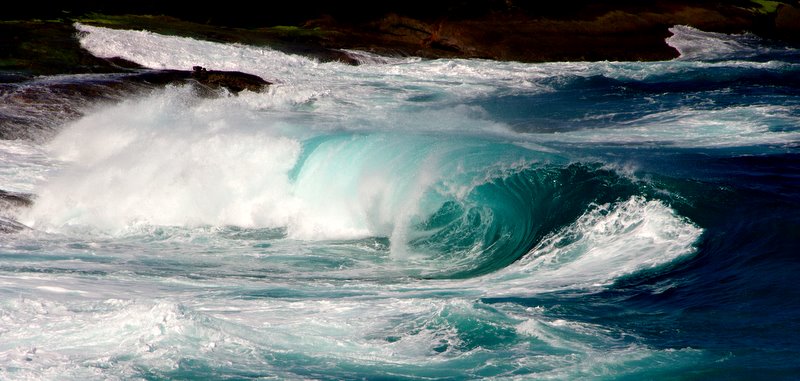
Next day we traveled down to the South West tip of WA to Cape Leeuwin where the Southern Ocean and Indian Ocean meet.

We found a small sheltered beach and spent the morning painting the lighthouse and surrounding buildings.

.

The old Post Office and general store at Witchcliff was closed down a few years ago and is slowly starting to crumble

The interesting shapes and textures kept us busy painting for the afternoon

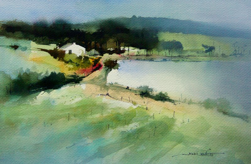
A workshop in Margaret River wouldn’t be complete without painting in one of the wineries. We chose a windy hillside in Voyager Estate. The cold breeze and beckoning cellar full of excellent wines just up the path, meant the painting session finished fairly quickly.

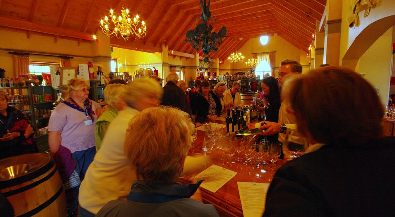
Voyager brought out some of their best wines for us to sample before sitting down to a great lunch in the dining room.
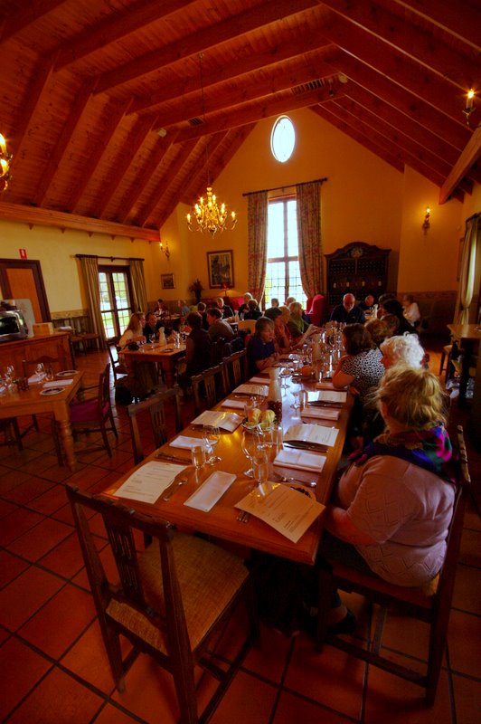
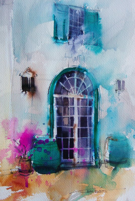
After lunch we found an interesting door at the back of the winery. A simple subject, great surroundings and the warm fuzzy feeling brought about by good food and wine made this a lot of fun to paint.
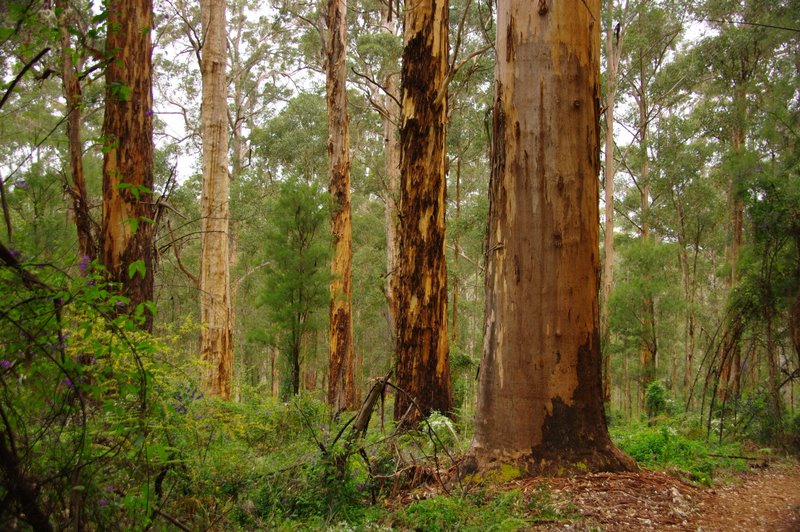
The next day we traveled to Pemberton and the giant Karri forests of South West WA.

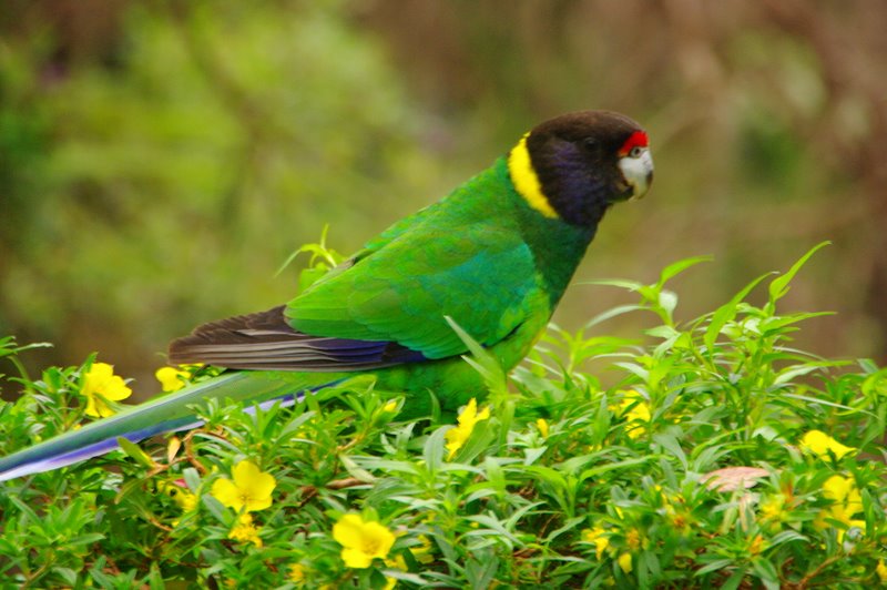

After the windy weather near the coast, the stillness of the Karri forests was a welcome change
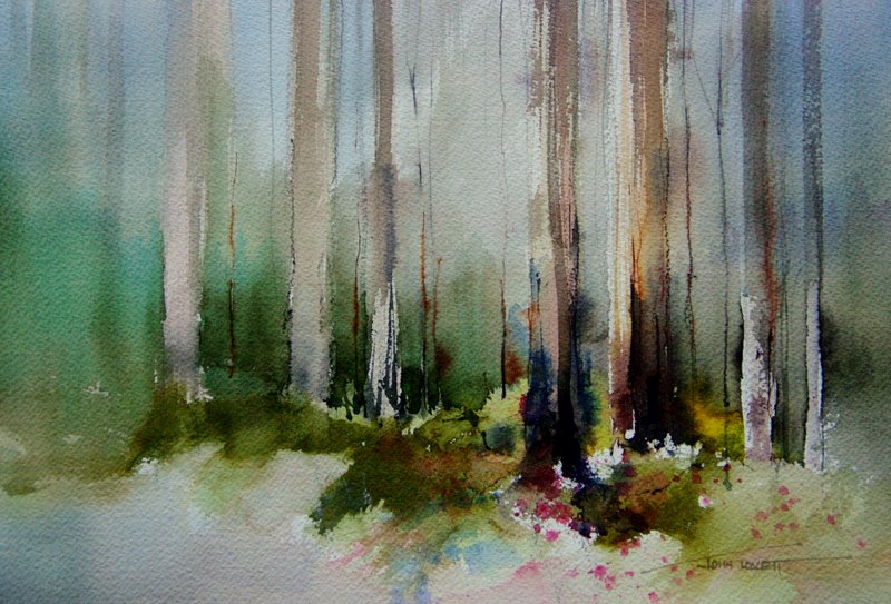
Vertical lines of the Karri trees descend into a chaotic mixture of bushes, ferns and flowers. The formal verticals and varied colorful textures make a great subject.

The last three days of the workshop were spent at the Kari Valley Resort just out of Pemberton. You can hire a fishing rod and catch trout from your balcony.
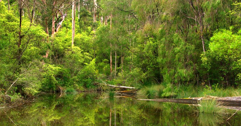

The resort is on the edge of Lake Beedelup. There are walking tracks around the lake and a suspension bridge over the spectacular falls


We had our own private dining room perched over the lake.
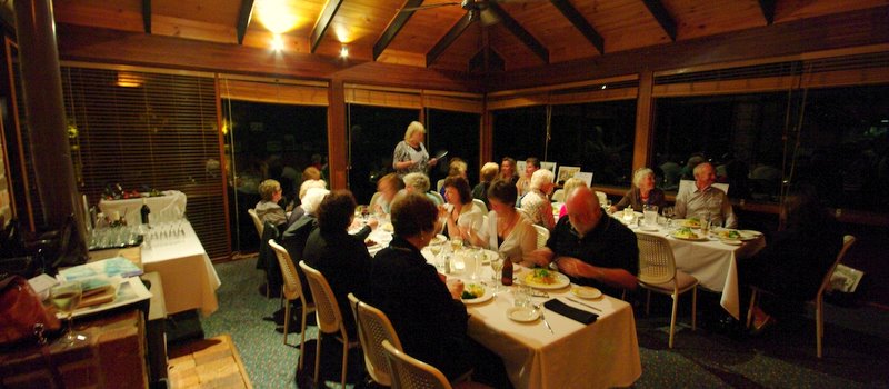
Our farewell dinner was a great night – Steak, Barramundi and local wine. It’s always sad saying goodbye to everyone but hopefully we will all catch up again sometime.
Many Thanks to Amanda Sloan, our tireless, hardworking tour guide, for making this such a great workshop
INKTENSE PENCILS

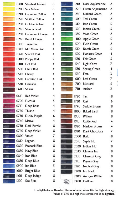
Derwent Cumberland make a great pencil that will draw equally well on wet or dry paper. They come in a broad range of colors, however some are not really lightfast. Fortunately most of the browns, greys, earth colors, and many of the blues are, according to the list below, tested to be lightfast.
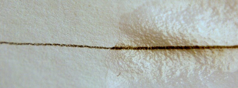
Inktense pencils will produce a strong dark mark on wet or dry paper.
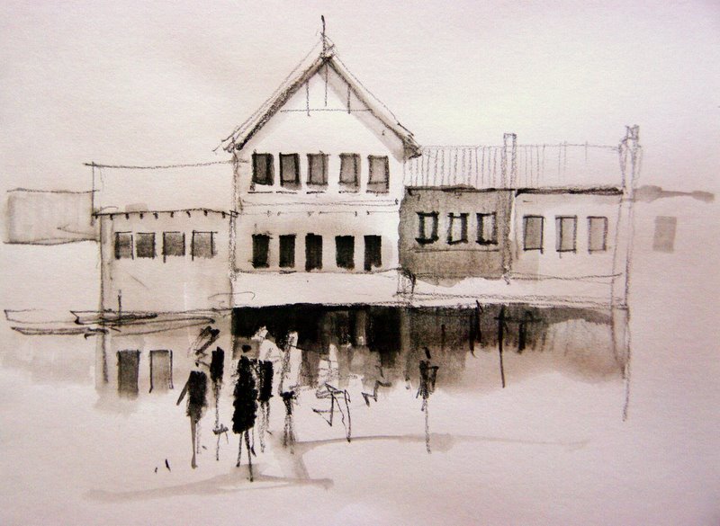
Light shading can be quickly dissolved with a damp brush to make subtle watercolor like washes. Once these washes dry they are permanent and insoluble just like permanent ink. This means they can be worked over without being disturbed.
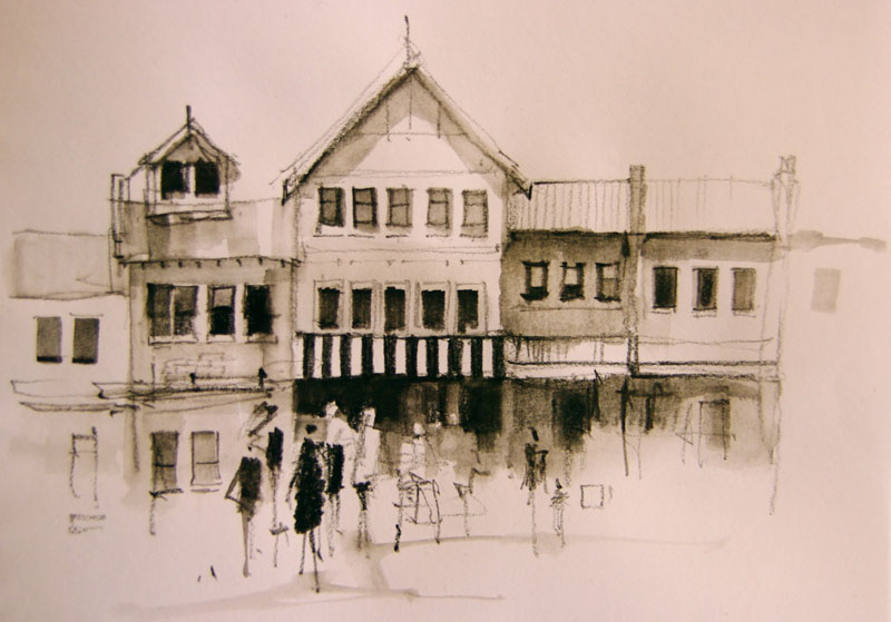

Drawing with Inktense pencils and a damp brush produces interesting results hovering somewhere between pencil and watercolor.
The sketch above was done with a dark brown (Bark 2000). I haven’t experimented with colors yet, but imagine they would be a lot of fun. I have used the Bark (2000) pencil and the Charcoal Grey (2100) in a number of watercolor paintings and I’m really happy with the results.
The pencils are nice and smooth to use and release pigment easily. They sharpen well and the leds, being of a waxy consistency, are resistant to fracturing
Read more about them on the Derwent website (link opens in new window)
FISHERMEN’S HUTS
WATERCOLOR PAINTING DEMONSTRATION
www.johnlovett.com – opens in a new window
Traveling about looking for interesting things to paint is a lot of fun and occasionally you stumble upon a location you just don’t want to leave. This was the case when we followed a rough sandy track down onto an isolated West Australian beach. The sea was that pristine turquoise color and, sheltered by a low headland, were a number of unoccupied fishermen’s huts looking out to sea. The fishermen had built a makeshift jetty and scattered about were lobster pots, nets, floats, ropes and all the tools of the fishermen’s trade.

The area was stark and windswept, and the salt air had rusted, corroded and faded everything in site. We wound our way along a sandy track past the huts and set up camp under the shelter of the headland. It was a short walk back to the huts to sketch and paint.

What appealed to me was the bleached weathered look of everything and the interesting contrast between warm and cool blues. For this reason I chose a palette containing three blues. Phthalo, Ultramarine and Cobalt. The only other colors were Permanent Alizarin Crimson and Quinacridone Gold.

These five pigments give us a good range of colors to suit our subject. Quinacridone Gold doesn’t give us a saturated yellow, but this subject doesn’t require one. What we do have is a warm, neutral and cool blue. The Ultramarine leans towards violet, so contains a little red. This is our warm blue. The Cobalt is neither warm or cool. It is about as close as we can get to a pure primary blue. The Phthalo leans towards green, so contains a little yellow. It is our cool blue.
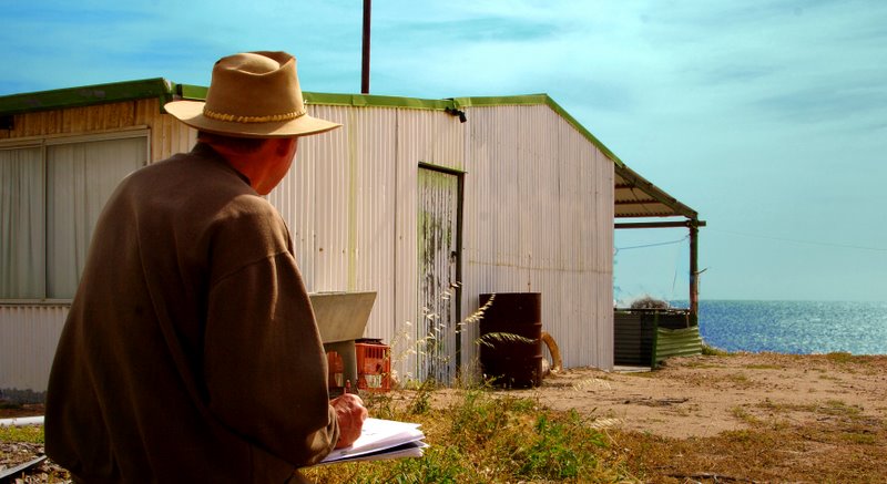

This painting was started with a graded wash of Cobalt Blue put through the sky and water then allowed to dry. The sandy foreground was washed in with a mixture of Quinacridone Gold, Alizarin and a touch of Ultramarine. Some more Quinacridone Gold and a little Phthalo was added to the sandy color on the palette. This was then splashed into the still wet foreground.

The next step was to wet the sea and drop some pure Ultramarine along the horizon. Before this dried Phthalo blue was put into the lower part of the sea. The shadow areas of the hut were then painted, leaving those punctuating white marks. The bushes were mixed from Quinacridone Gold, Phthalo Blue and a little Alizarin. They were not applied until the painting was completely dry so the edges could be softened. The blue surrounding the door is pure Cobalt.

Fine details were added next with a No.2 Rigger Brush. A few Burnt Sienna ink lines were also added and sprayed with a mist of water to make them bleed and run.
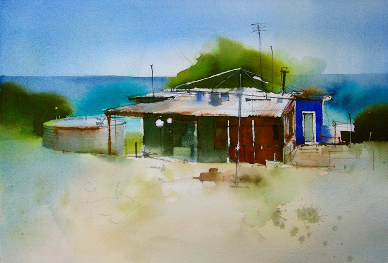
The final step after adding some more detail to the foreground, was to grade a wash of straight Cobalt in from either side of the painting. This helps focus attention on the center of interest and makes the warm colors of the hut jump out from the surrounding area of cool. For these Cobalt washes to succeed the painting first needs to be thoroughly dry.

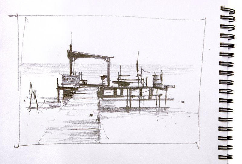
The old makeshift jetty was great to draw with all the interesting negative shapes and varied lines and spacing.

After I finished the sketch, a series of graded washes using the same five colors was laid over the pencil lines. A few dark rigger lines added strength to the pencil marks and a couple of patches of white paper draw attention to the center of interest.
This article will appear in full in the next issue of INTERNATIONAL ARTIST MAGAZINE.

