PAINT BY ACCIDENT

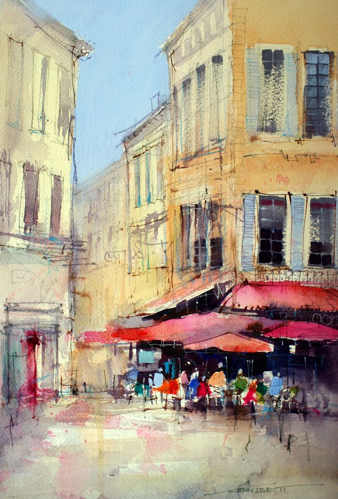
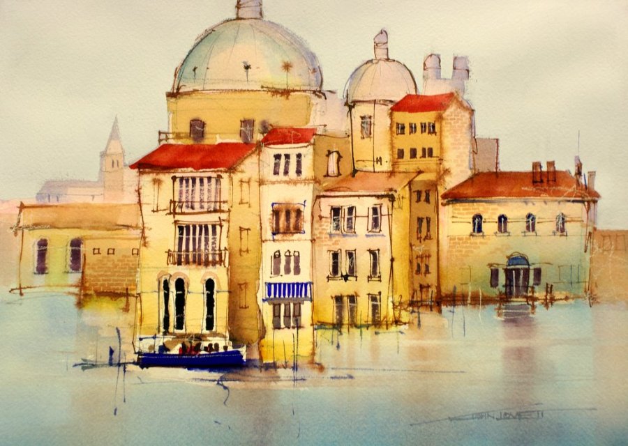
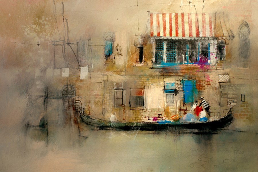
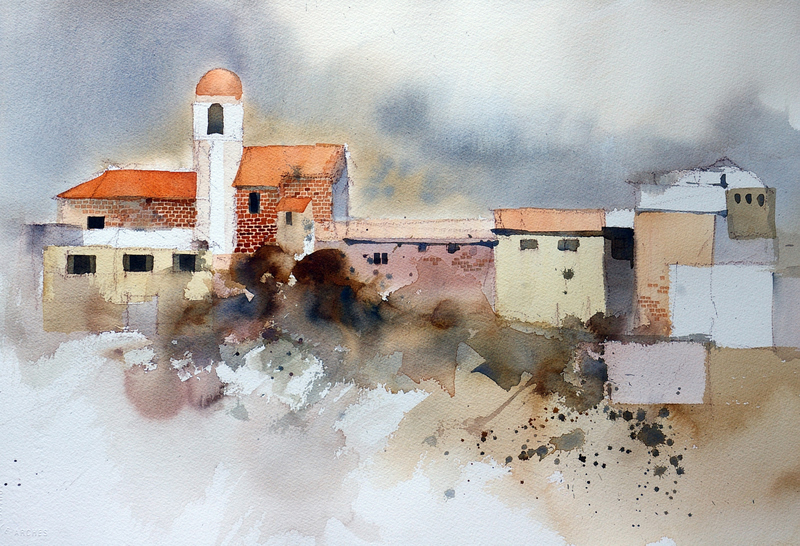
There is nothing like a looming magazine deadline to speed up the painting process. I had just finished an article on controlling color temperature for International Artist Magazine and realized I didn’t have an example of a dominant warm painting using a cool contrast. Rather than go through paintings I already had, I decided to work on a sketch I did along one of the little back canals in Venice.

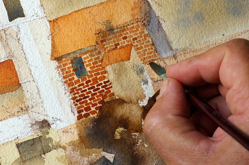
Most of this painting was done using a 1″  bristle brush. I attacked it mercilessly using watercolor and pots of premixed acrylic and gesso, splashing the paint on and feathering it out with a 3″ Hake brush. This quickly covered the paper and provided the area of light at the focal point. Once the dark shapes were scrubbed in with the 1″ brush, I used a charcoal pencil to define the details – again very quickly and accidentally – sort of like draw first and ask questions later. After all this a small brush added all the details – bricks, window frames, striped awning etc.

It is a fantastic way to work, pushing and shoving until things somehow work themselves into place. The hardest thing is learning not to be careful until it is absolutely necessary! The beauty of building up a painting in layers like this means you really can’t go wrong – things can continually be worked over and changed.

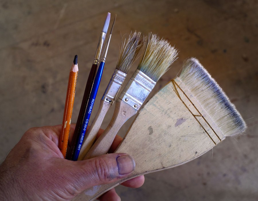
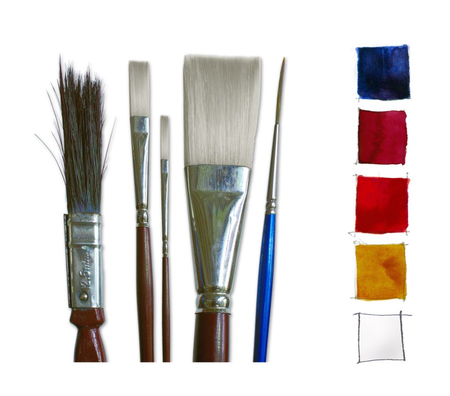
A rough looking collection of brushes, but perfect for this type of painting.

  • A charcoal pencil
  • 1/4″ flat One Stroke
  • #1 Liner Brush
  • 1/2″  Bristle Brush
  • 1″ Bristle Brush
  • 3″ Hake Brush

WATERCOLOR CHICKEN

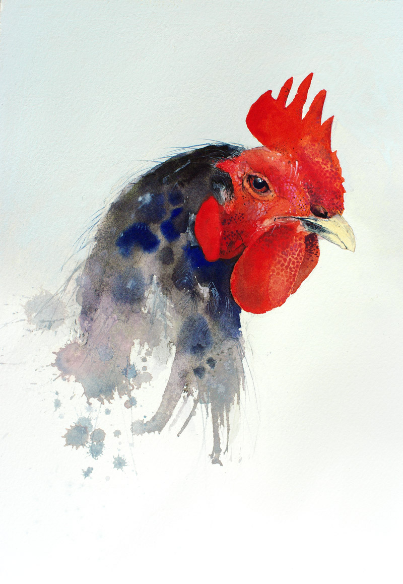
Over the past couple of months I have been busy working on a new book, which means I am madly leaping from one subject to another. Somehow I ended up choosing a chicken to demonstrate the different qualities of watercolor and Gouache. I hope to have the book finished before the end of the year. A step by step guide to painting this chicken will feature in book. It combines clear washes of watercolor and the opaque flatness of gouache to get that fantastic contrast between glowing transparency and flat, velvety gouache.

This type of subject is a lot of fun, I love the contrast between fine detail and loose abstraction. The face of the chicken leaves nothing to the imagination, but as the eye moves down the neck, things get a little out of control – just like a chicken tearing around in a chicken coop.

French Ultramarine Blue, Permanent Alizarin, Windsor Red, and Quinacridone Gold  with White Gouache provided all the necessary colors.

A few one stroke brushes and a rigger took care of the detail and the 1/2 inch bristle brush made all the mess.

The book should be available towards the end of the year. As soon as it’s out I will put a link on my website

SILENT ECHOES

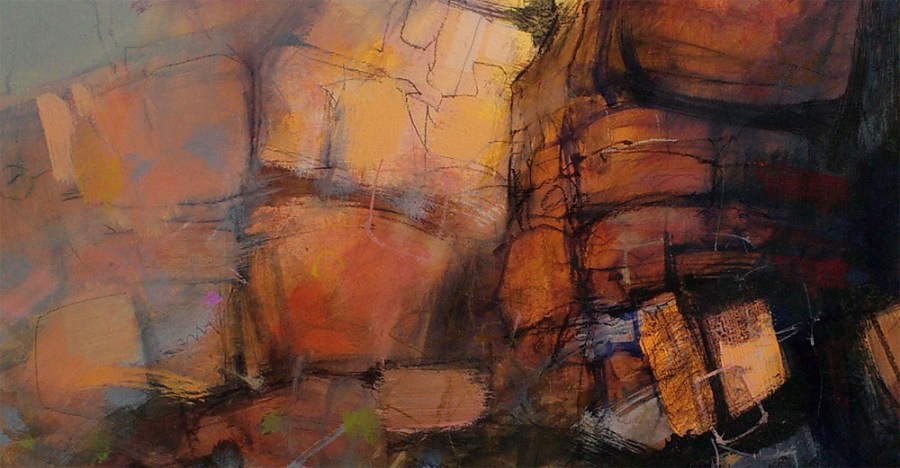
Over the past couple of weeks I have been busy working on this large (1500×900) acrylic, charcoal and ink painting. It is based on a large sandstone wall, towering over a rock pool in the Umbrawarra Gorge, south of Litchfield National Park in the Northern Territory. Apart from the spectacular appearance of the place, the thing that impressed me was the strange silence, broken by occasional disjointed echoes. The sounds of distant birds, insects and breezes all seemed to emanate from the rocks, always punctuated by long periods of silence. Hidden through the rocks was evidence of faded aboriginal rock paintings.

I used colored acrylic glazes over white areas of gesso to get a transparent glow into some of the rock shapes. These are contrasted with solid opaque patches of similar colored acrylic. When the paint was dry I drew over it with charcoal pencil (black and white) and Burnt Sienna pigment ink. The most difficult part of this painting was getting the abstract marks right. It took a lot of looking and adjusting until everything seemed to fall into place. What I like about this process are the intricate, underlying textures that build up. Painting like this really makes me appreciate the work of  Franz Kline. He seems to effortlessly create the most beautiful abstract marks – perfectly balanced and proportioned, right from scratch.

TRIAL AND ERROR

.
When writing magazine articles, I usually try to have a nice clean start to finish demonstration, free of  problems or corrections. With this painting, however, I ran into a period of indecision and confusion. Rather than put it aside for something else, I decided to make the eventual solution to the problem the subject of the article.

This article will appear in the next issue of International Artist Magazine.
Sometimes a painting will happily sail along to a certain point, then, seemingly without reason, grind to a halt.  An indecisive moment perhaps, not enough planning, a lack of concentration, who knows? What ever the cause it can be a frustrating and time-consuming experience. Short of putting the painting aside and forgetting it, the best solution sometimes is to plough on fearlessly and see what happens.
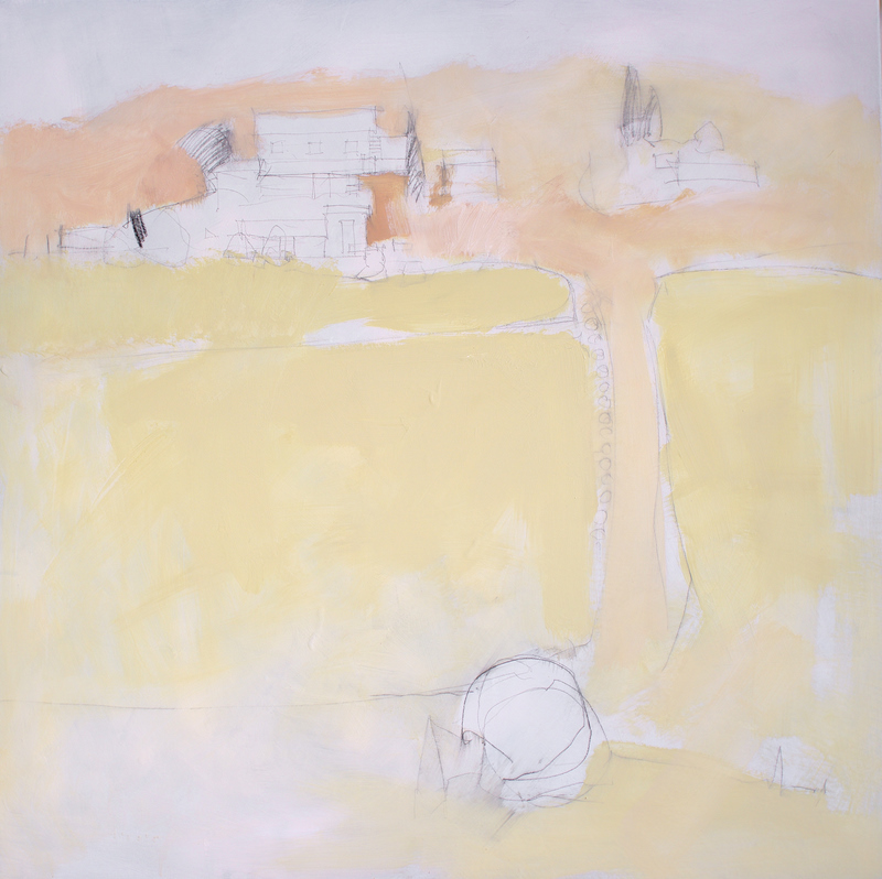
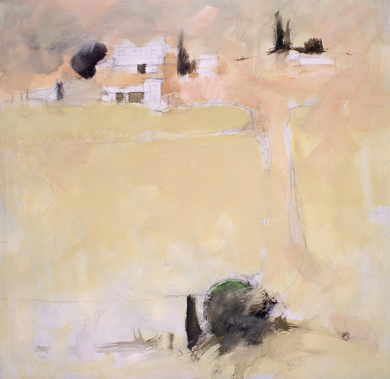
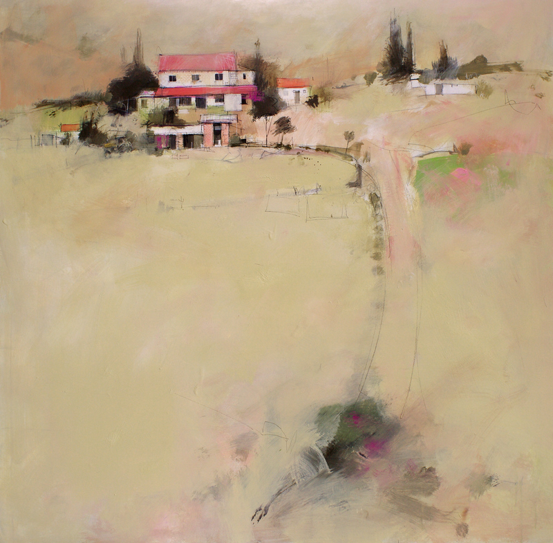
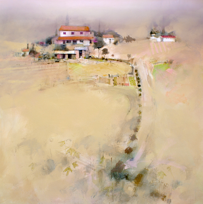
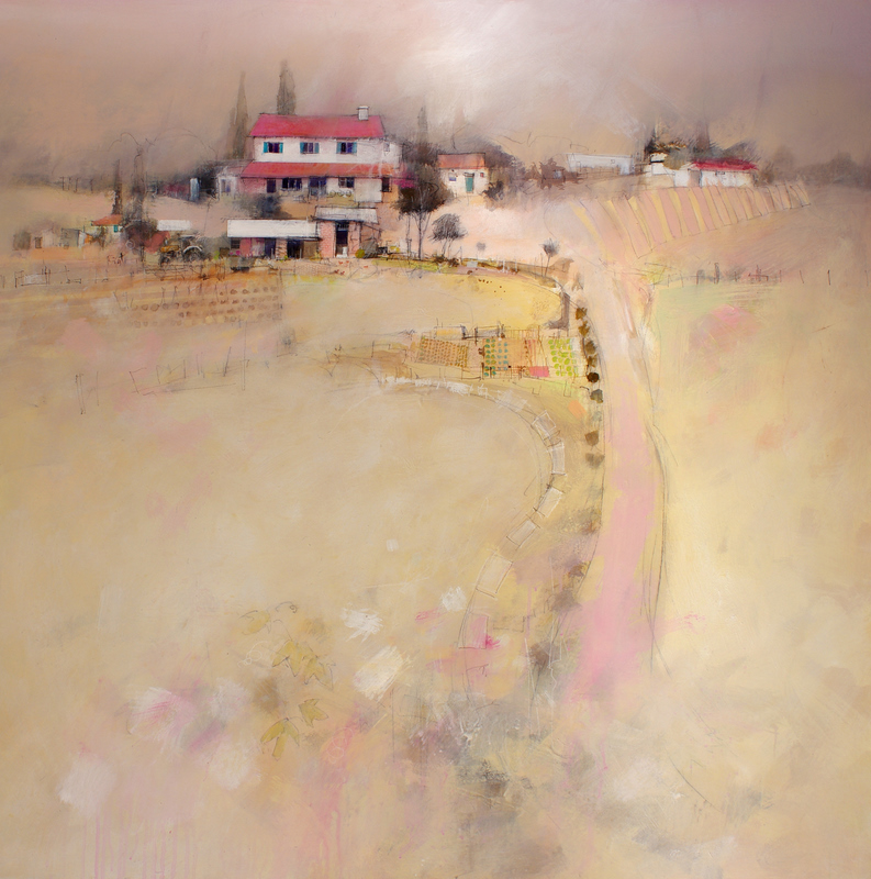
This painting, of a small Tuscan farm, was going well right up till it was almost finished. For some reason I was not quite happy with the result. I was unsure where to go.  After looking at the painting for a couple of weeks I still could not put my finger on what the problem was. The only solution was to try out a few options – play with it till something started to emerge.
.
Mixed Media on Canvas  1200×1200
.
.

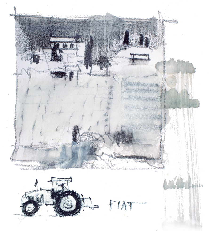
My rough thumbnail sketch certainly was rough, but I was happy with the composition. The old Fiat tractor eventually snuck its way in, off to the left of the farmhouse.
.

Initial drawing was done with a charcoal pencil and the first big areas of paint were roughed in with a 2″ brush
.
.

A little more modeling took place, then a few dark shapes were added. So far, so good!

.

.

Perhaps this is where things started to get confusing. Too much color too quickly. I threaded some strong green through the top of the painting then, rather than trying to subdue it, attempted to counter the green with strong reds and pinks.After much head scratching I decided to knock back the pinks and put more light into the large foreground. The single dark shape in the immediate foreground was causing distraction and not really saying much. It needed a little more definition and a stronger link to the main focal point.

.

.

The foreground was broken up with the suggestion of grape vines. Not too much detail – just enough information to add some meaning as the eye moves across the foreground. The line linking the foreground to the focal point was also strengthened. The pink roof was changed to a more terracotta color just to see the effect.

.

.

Not happy with the warm terracotta roof I decided to go back to the cooler pink. After much trial and error, I finally found a balance between the pink and green. Working the pink from the main focal point down the curve of the road and into the foreground.

.

.

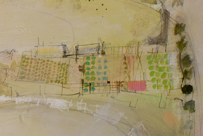
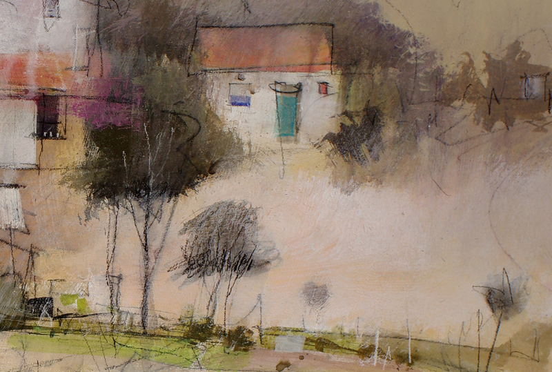
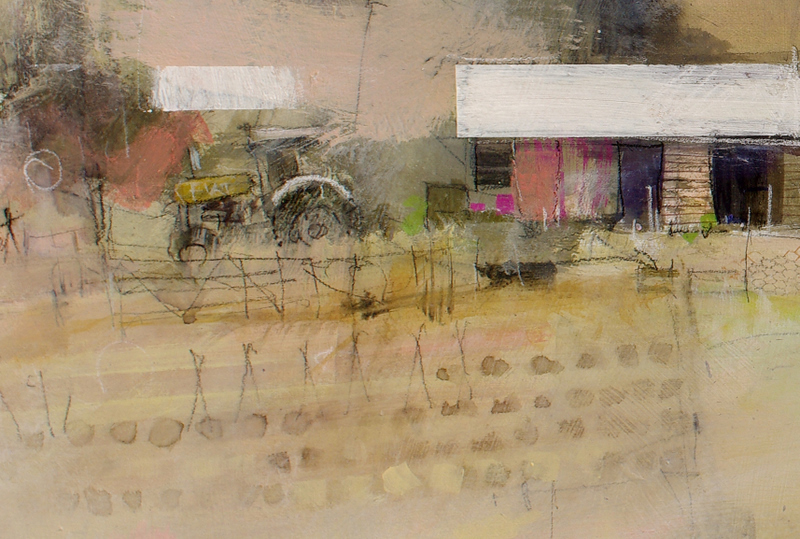
This detail shows the vegetable garden put in with a combination of fine acrylic lines painted with a rigger brush, charcoal pencil marks and areas of colored acrylic. Although many of the details are repeated, I have varied their color, shape and tone to keep the detail interesting.

.

.

The building detail shows how the loose, spidery charcoal lines add a sketchy quality to the areas of detail. The small patches of cool green and blue add interesting relief to the areas of warm color.

.

.

Next to the masked roof of the shed is the old Fiat tractor, barely suggested with roughly scribbled charcoal pencil.

..

JOIN ME FOR A WORKSHOP IN ITALY THIS MAY.

Discover the spectacular beauty of Sicily and Sorrento
MON. MAY 17 TO SUN. MAY 30, 2010

This workshop offers 14 days of painting and adventure. Starting in spectacular Sorrento, the entrance to the Neapolitan Coast then traveling to  Sicily, Italy’s most historically cosmopolitan region surrounded by the beautiful blue waters of the Mediterranean.
Click here for details

.

SUGGESTING DETAIL

Italian Village
.
When faced with a complex, detailed subject, the temptation is often to try and include every detail. This approach can lead to a confusing overload of information. In this demonstration we will concentrate on simplifying and suggesting detail. Our approach will be to decide on an area of interest to serve as our focal point or centre of interest, then simplify and suggest detail in the rest of the painting.
.
MATERIALS
Paper
1/2 sheet 300gsm (140lbs) Cold Pressed
Colors
Ultramarine Blue
Permanent Alizarin Crimson
Quinacridone Gold
Ink – Burnt Sienna and Dip Pen
Brown Pastel Pencil
Brushes
1″  Bristle Brush
1″ and 1/4″ Flat brushes
No. 2 Rigger Brush
3″ Hake Brush
.
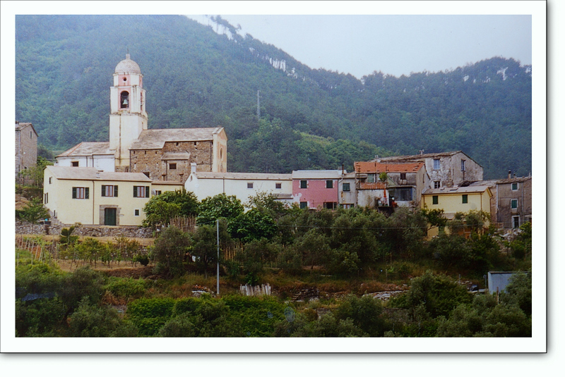
This little village, high above the sea on the coast of Italy makes a wonderful subject. The impact of the weathered textures and subdued colors can be amplified by focusing attention on the area of the bell tower and simply suggesting the detail in the right hand side of the village.
.
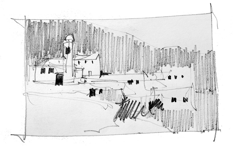
A quick thumbnail sketch will help organise the composition for your painting. I have decided to spread the interest horizontally across the painting then contrast it with a  dark diagonal band from the top left to the bottom right. The top right and lower left areas will be left virtually untouched.
.
Quinacridone Gold, Ultramarine Blue and Alizarin Crimson are all we need to mix all the colors in this painting
.
DRAWING AND FIRST WASHES
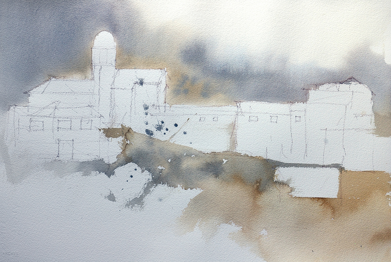
Simply block in the major shapes with a brown pastel pencil. More detail can be drawn in as the painting progresses if necessary. The entire area above the village is first wet with clean water before a wash of Ultramarine Blue, Quinacridone Gold and Alizarin Crimson is worked diagonally through the background. Vary the mixture from a warm, dirty yellow to a cool grey. The same colours can then be roughly washed through the dry paper in the foreground. All these early washes are best applied with an old 1″ bristle brush. (The cheap house painting type are ideal).
A loose soft suggestion of background trees works much better than carefully painting in the line of trees in the photograph.
.
BUILDING SHAPES
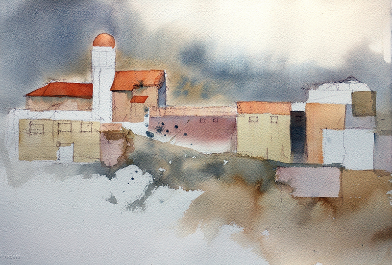
Using various combinations of our three colours and a 1″ flat brush, we can suggest the shapes for the various buildings. Keep the tones fairly light at this stage. We can always make them darker but it’s a bit more difficult to make them lighter if we need to.
Vary the size and shape of the buildings to keep them interesting
.
DARKER BUSHES AND WINDOWS
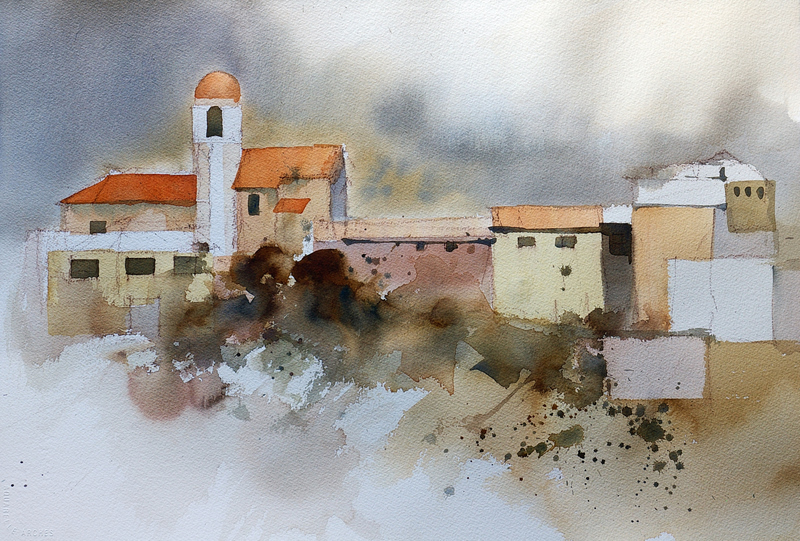
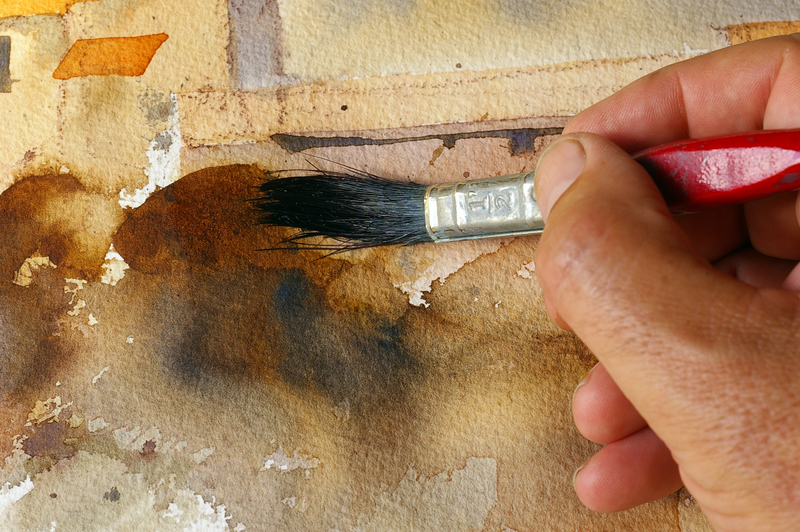
Once all the building shapes are dry we can use our three colors to mix up a nice rich dark – aim for a color something like Burnt Sienna. Splash it on fairly loosely with your old 1″ bristle brush, then quickly rinse out the brush, dry it slightly and run it around the edge of some of the marks you have just made. This will make the edges bleed out and soften, helping tie the shapes to the rest of the painting.
Before these shapes dry, drop a couple of spots of pure Ultramarine into the lower part of the bushes. This gives them a more three dimensional appearance. Use your 1/4″ flat brush to paint in some of the windows. Remember to vary their shape, tone and colour slightly.
When you paint the bushes, try to think of them as shapes that will suggest bushes rather than trying to carefully render a realistic looking bush.
.
Use a clean, damp brush to soften and feather out the top edge of the bush shapes.
.
BUILDING TEXTURES
To help reinforce the centre of interest, we will add some brick textures to some of the walls. Spread a few small, less noticeable areas of brick into other parts of the painting, but keep the texture in the centre of interest strong and definite
The detailed brick texture at the centre of interest holds attention in this area. Adding softer, less defined brick textures to a few of the other buildings maintains unity and helps tie the centre of interest to the rest of the painting.
.
A flat 1/4″ brush is perfect for putting brick texture into some of the walls. Keep the lines of bricks roughly horizontal and stager the brick joints.
.
IMPACT THROUGH CONTRAST
The final step is to add some depth and drama to the painting by darkening the background behind the centre of interest and the lower right foreground.
Before we do this though, a few fine pen lines sprayed with a fine mist of water will add some interesting textures to the buildings.
Burnt Sienna ink works well. Spray it as soon as it’s applied and it will produce fantastic spidery lines. Have a tissue or some paper towel handy as the results are a bit unpredictable and you may need to do some quick tidying up.
The dark contrast behind the main building is a combination of our three colours. Wet the area behind the building first so the top edge of the wash feathers out softly. A dry Hake brush can be used to help even out the wash.
Apart from the detail at the centre of interest, most of the painting is fairly loose and suggested. There is enough information there for the viewer to know what is happening but much of the painting requires some sort of viewer interpretation making it much more engaging than an overload of carefully rendered detail.
 

.

TELLING A STORY

This is an article I wrote for International Artist Magazine a couple of years ago. A comment on imagining stories to embellish different locations prompted me to upload it.  It is amazing what goes through your mind after thirty or forty minutes sketching. Almost subconsciously stories emerge tying up and making sense of all the observed details.
.
.
TELLING A STORY
It is easy to be seduced by spectacular scenery or panoramic landscape, but sometimes it’s the little incidents associated with fairly unspectacular subject matter that can be the catalyst for a successful painting. In these paintings the appeal, for me, lies beyond the immediate visual impact and has more to do with the incidents or atmosphere surrounding what is depicted.
.
Rosa’s New Pink Curtains
These old Italian waterfront buildings tell wonderful stories about their inhabitants. Pushbikes, fishing gear, potted herbs and flowers, an old comfortable chair in the sun. An hour spent sketching all these details cause all sorts of stories to evolve concerning the day to day life of the building.
.
The paintings title is derived from the bright pink curtains in the upper window. To stop this bright color drawing too much attention away from the centre of interest, Permanent Rose was worked over the greys in the top corner of the painting. This eases the impact of the curtains, pushing them back into the painting.
.
Fine rigger lines and sketchy pencil marks define the detail in the bottom left. This describes what is happening without drawing too much attention.
.
The center of interest is treated with strong contrast and sharp, focused detail to act as a pivot point for the painting. The viewers eye can wander out to other areas of less defined detail, but will always be drawn back to this area.
.
Fishermen Wait – Pelleistrina
The long thin island of Pellestrina protects the Venetian lagoons from the Adriatic Sea. Passing the Island early in the afternoon it struck me that even the fishermen, along with every other inhabitant, observes the afternoon siesta. Tide and fish can wait, food, wine and rest come first, then the fishing. I have used strong horizontal and vertical lines to give the painting a sleepy static feeling. The vertical drift of smoke adds to the calm quiet atmosphere
.
Flowers were splashed in with a mixture of Permanent Rose and White Gouache. I liked the contrast between the dirty, smelly fishing boats, clean washing and fresh flowers. Ultramarine Blue Gouache gives the fishing boats a flat, velvety finish.
.
The hazy sky was first washed over with Ultramarine watercolor. After this dried, a glaze of  cream tinted Gesso was worked over the surface giving the sky a pearly translucent quality.
.
The calm water adds to the sleepy feeling of the painting. The same technique of Gesso over glazing similar to the sky was used. This time the underlying wash was Phthalo blue.
.
Last Bus Leaving
The frantic pace of down town London is regularly punctuated by the hot diesel clatter of these ancient relics. Huge and shiny, it’s hard to believe these  awesome machines form the backbone of a reliable transport system. This painting plays on the contrast between the enormous mass of lovingly polished duco and the machines apparent attempt to self destruct while idling.
.
Loose strokes of red pastel suggest the resonating vibration of the engine and contrast with the glossy sheen of the paintings centre of interest.
.

Halfway through the painting  a loose scumbling of dilute gesso was scrubbed over the top right hand corner. This obliterated most of the roof and upper detail allowing it to be loosely suggested with pencil lines and red pastel.
.
The bonnet and lower section of the bus were treated with more detail to pull attention down to this area of the painting. The bright red bonnet and white highlights make a great contrast with the surrounding black gouache. I normally avoid flat neutral black, but used it in this case to give the feeling of bitumen, soot and diesel oil associated with the bus.
.
Pass This Way – Venice
This is one of a thousand romantic corners that draw you deeper and deeper into the labyrinth of Venice. Rather than documenting all the details, I have focused on the essential elements and reduced everything else to simple areas of contrasting textures. Lines and angles have been distorted to echo the random chaotic nature of Venice.
.
Flat Ultramarine gouache was used to convey the brilliant blue of the canal boat. By contrasting this with the rich terracotta of the bridge, a focal point is established.
.
The washing hanging on the line was torn from pieces of Japanese rice paper and stuck to the surface with acrylic matt varnish. The rice paper shapes were softened by splashing them with a mixture of Permanent Rose watercolour mixed with  White gouache.
.
A fine translucent glaze of White gouache and Permanent Rose watercolor softens the far end of the bridge, encouraging the eye back to the centre of interest.
.

LOOKING BACK

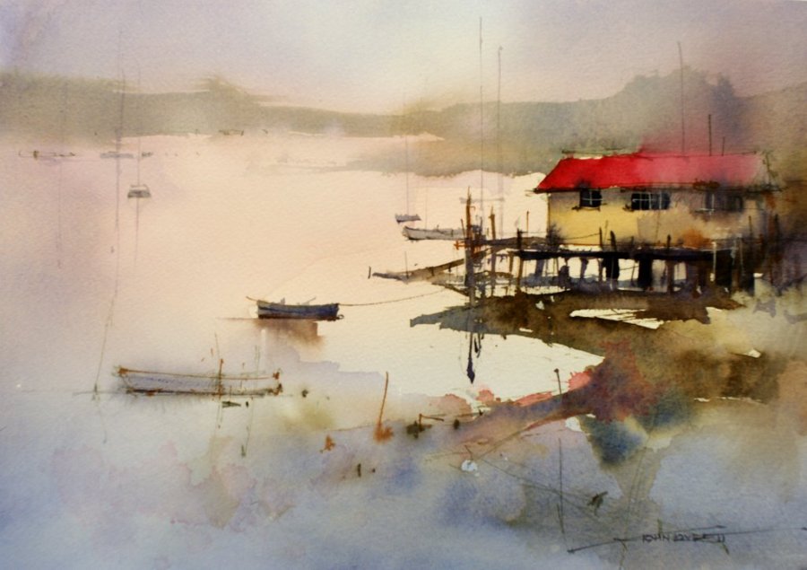
A few years ago I sketched this little cottage on Sydney Harbour. It was late in the afternoon and there was no activity – no sign of life at all. As I did the sketch I started wondering what had gone on here in the past. Such an amazing location, I could imagine parties on the verandah, kids running around, boats in the water, but now, nothing – just a little cottage gazing out across the water. It had a kind of empty sadness – a little neglected with vague evidence of lively past.

COLORS:

Quinacridone Gold, Alizarin Crimson,  French Ultramarine Blue,  Phthalo Blue, Medium Magenta Acrylic, White Gesso, White Gouache

INK:

White pigment Ink, Burnt Sienna Pigment Ink

PENCILS:

White Charcoal,  Black Charcoal, Dark Brown Derwent Inktense