COLOR TEST

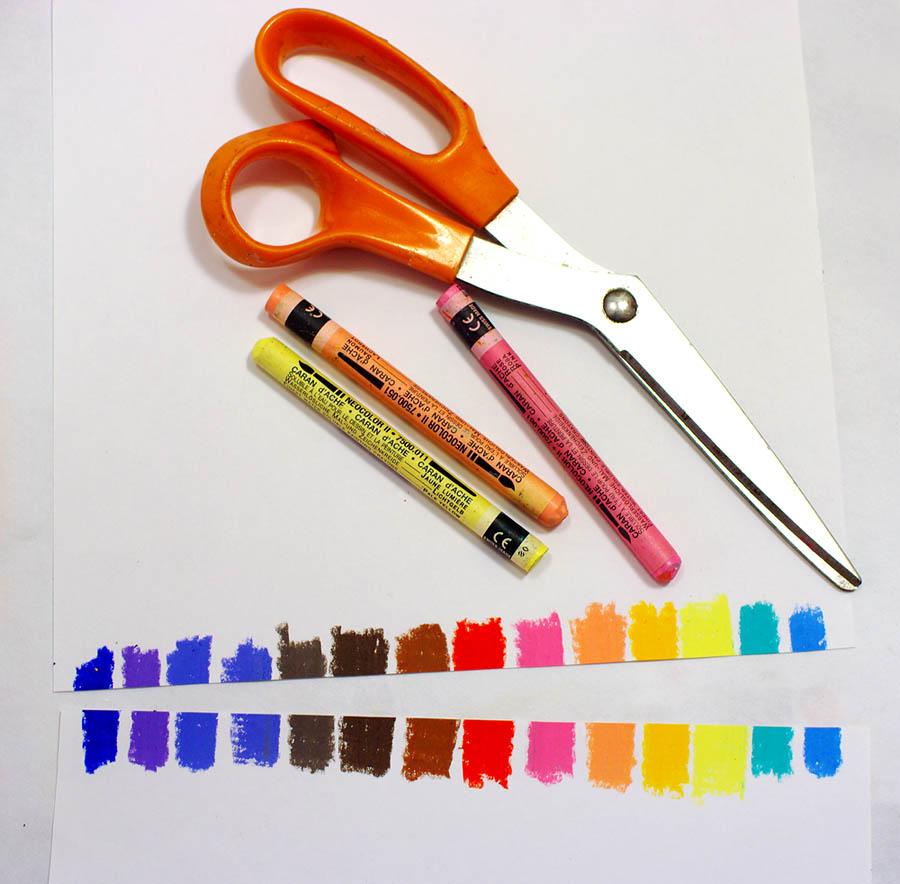
After the excitement of playing with a pile of new art materials dies down, the important job of testing for light fastness must be done. It is a simple task, but takes a couple of months to yield a result. The test involves putting a mark of all the new materials onto a piece of paper. Cutting the paper so that the marks are cut in half, then placing one half behind glass, on a window sill or ledge exposed to the sun and the other half in a book or dark draw.  After 2 – 3 months compare the two halves and don’t use any of the products that show signs of fading or color shift.

With the ink marks, a graded dilution with clean water will also show the permanence of thin washes.

Many manufacturers provide light-fastness and permanence ratings on their products, but, for the small effort involved, it is worthwhile checking for yourself.

NEW TOYS

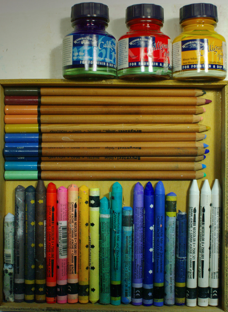
I’m a sucker for an Art Supply Shop. I just can’t walk past them. While we were in Hong Kong an assortment of pastel pencils, water soluble crayons and colored inks became absolute necessities. Things that I couldn’t leave the shop without!

I have drawers full of such items. Essential in the excitement of the moment, but once in the studio and tested, they become just another unnecessary distraction. Fortunately, this bout of impulse buying resulted in some really useful new toys.

The inks are Winsor and Newton Calligraphy inks – Brilliant primary colors

The pastel pencils are a Dutch brand I have not tried before – Bruynzeel. Fine textured and good colors.

I have used the Caran d’Ache water soluble crayons before, but fell for a pile of new colors.

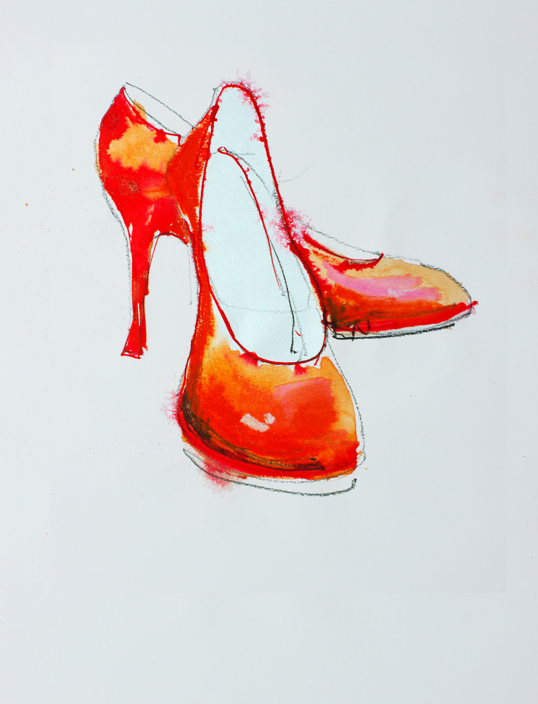
Red Shoes – Sketched with a charcoal pencil then colored with a red, orange and pink crayon. After the crayon was applied, a wet 1/2″ brush was used to dissolve and blend the colors. Finally a few red ink lines were drawn on and sprayed with a mist of water.

These Lemons were painted with a mixture of crayon ink and pastel pencil. A gesso wash was scrubbed over the foreground before the final yellow crayon marks were applied. Before the Gesso had dried the lemon was carefully sliced and dropped into a Gin and tonic.

WALLS AND DOORS

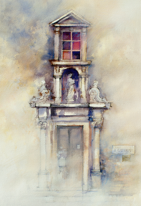
It’s good to be back in the studio again after our Italian workshop break. Over the next few months I will be kept busy working on an Exhibition for late October. These first few paintings of architectural subjects will probably find their way into the exhibition. They will also be used in an article on The Illusion of Accuracy for International Artist Magazine.

“Notes on a Door” – Watercolor, Ink and Gesso on Arches 300gsm paper

“Medievalness” Watercolor and Ink on 300gsm Arches paper

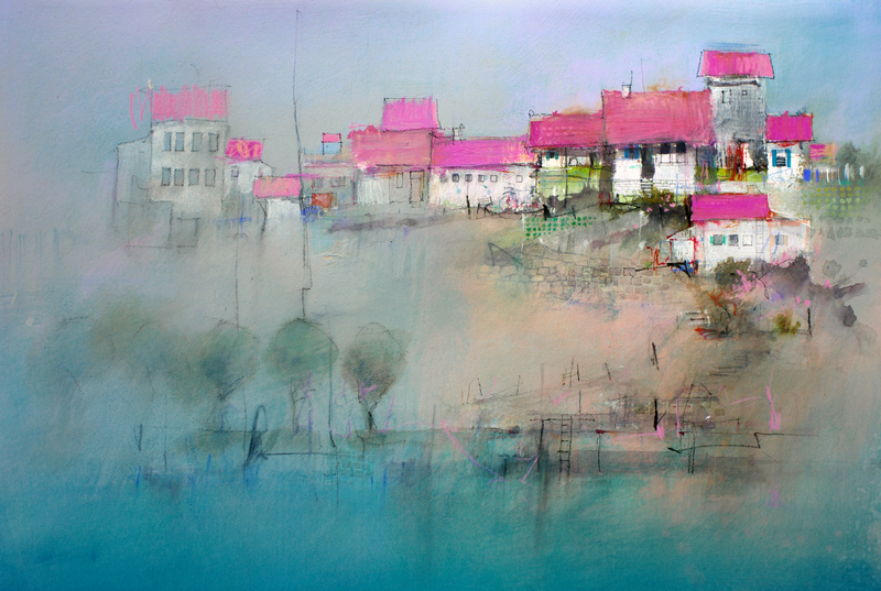
“Village with lake and Olive Trees” mixed media on 300gsm Blue Lake Paper

AIRPLANE SKETCHES

How do you kill 30 odd hours strapped into the seat of an airplane? Movies on a tiny screen with the background drone of jet engines are OK for a while, reading is fine for a couple of hours, but scribbling in a little sketch book eats up the hours and is a lot of fun.

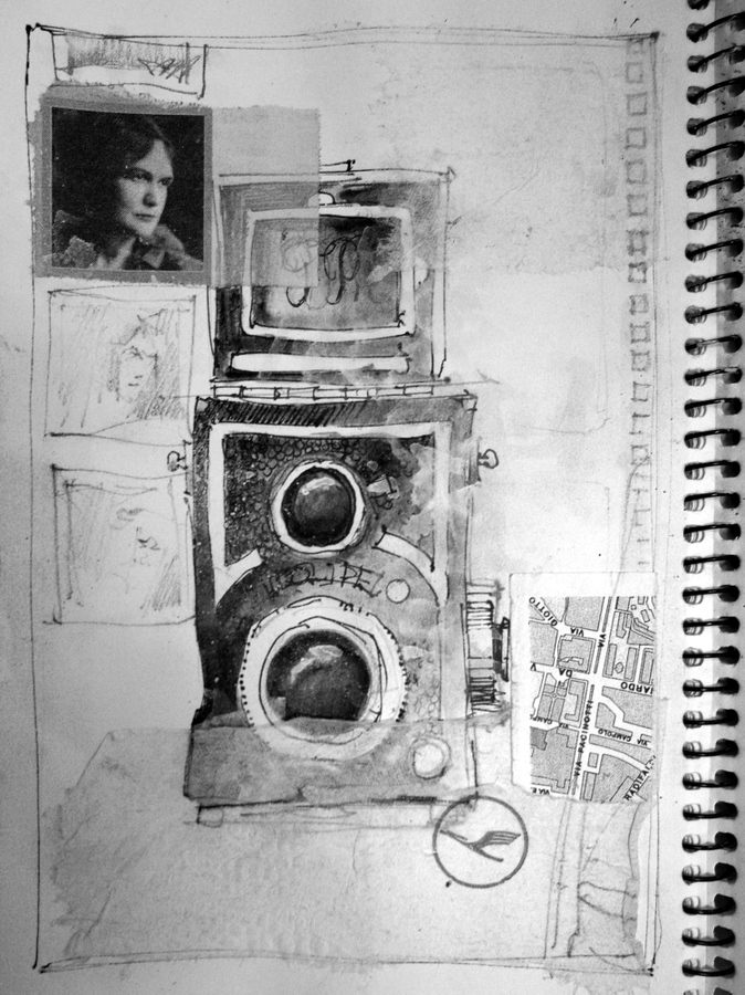
To keep things simple I use a tube of black and a tube of white gouache, a small brush with a built in water reservoir, a charcoal pencil, glue stick, fine line black  pen and a liner brush cut in half.

I once tried a uni posca white paint pen, but the change in atmospheric pressure at 30,000 feet caused it to empty half a cup of white paint all over my sketch book on the first stroke. The Uni Posca is only used at ground level now.

All stored in a ziplock plastic bag. Cut down rigger – still in the seat pocket of a Jumbo Jet somewhere?

PAINT BY ACCIDENT

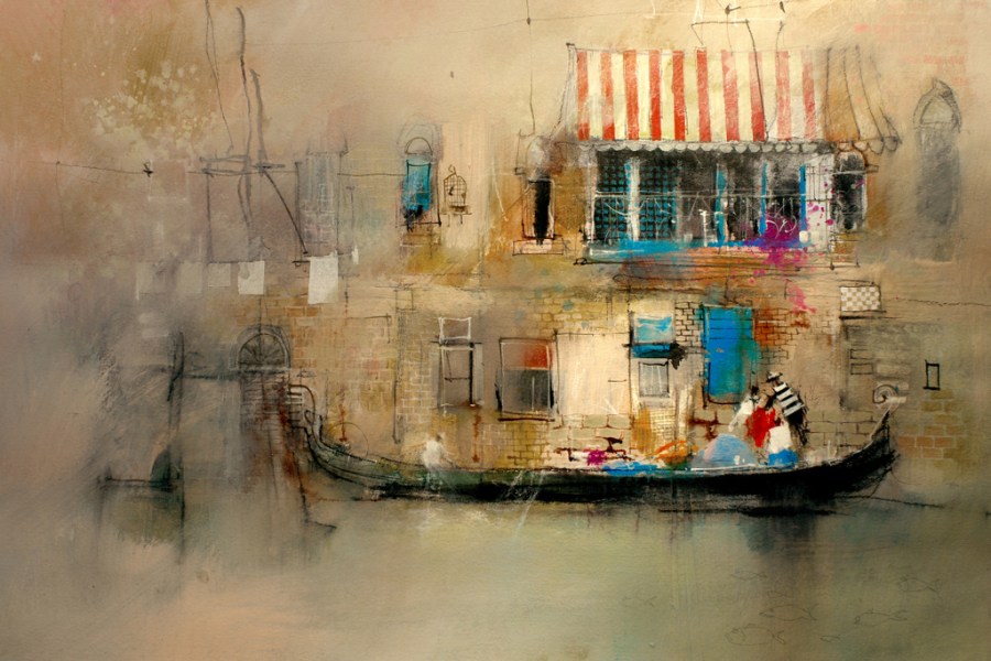
There is nothing like a looming magazine deadline to speed up the painting process. I had just finished an article on controlling color temperature for International Artist Magazine and realized I didn’t have an example of a dominant warm painting using a cool contrast. Rather than go through paintings I already had, I decided to work on a sketch I did along one of the little back canals in Venice.

Most of this painting was done using a 1″  bristle brush. I attacked it mercilessly using watercolor and pots of premixed acrylic and gesso, splashing the paint on and feathering it out with a 3″ Hake brush. This quickly covered the paper and provided the area of light at the focal point. Once the dark shapes were scrubbed in with the 1″ brush, I used a charcoal pencil to define the details – again very quickly and accidentally – sort of like draw first and ask questions later. After all this a small brush added all the details – bricks, window frames, striped awning etc.

It is a fantastic way to work, pushing and shoving until things somehow work themselves into place. The hardest thing is learning not to be careful until it is absolutely necessary! The beauty of building up a painting in layers like this means you really can’t go wrong – things can continually be worked over and changed.

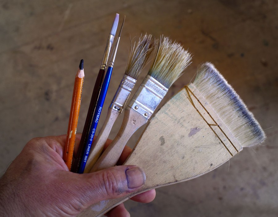
A rough looking collection of brushes, but perfect for this type of painting.

  • A charcoal pencil
  • 1/4″ flat One Stroke
  • #1 Liner Brush
  • 1/2″  Bristle Brush
  • 1″ Bristle Brush
  • 3″ Hake Brush

WATERCOLOR CHICKEN

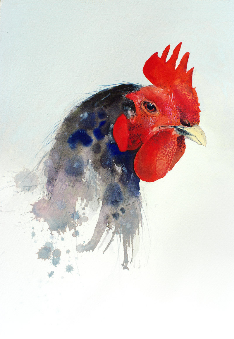
Over the past couple of months I have been busy working on a new book, which means I am madly leaping from one subject to another. Somehow I ended up choosing a chicken to demonstrate the different qualities of watercolor and Gouache. I hope to have the book finished before the end of the year. A step by step guide to painting this chicken will feature in book. It combines clear washes of watercolor and the opaque flatness of gouache to get that fantastic contrast between glowing transparency and flat, velvety gouache.

This type of subject is a lot of fun, I love the contrast between fine detail and loose abstraction. The face of the chicken leaves nothing to the imagination, but as the eye moves down the neck, things get a little out of control – just like a chicken tearing around in a chicken coop.

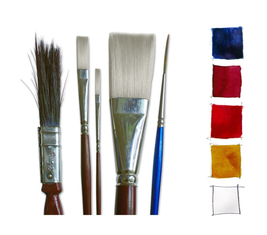
French Ultramarine Blue, Permanent Alizarin, Windsor Red, and Quinacridone Gold  with White Gouache provided all the necessary colors.

A few one stroke brushes and a rigger took care of the detail and the 1/2 inch bristle brush made all the mess.

The book should be available towards the end of the year. As soon as it’s out I will put a link on my website

SILENT ECHOES

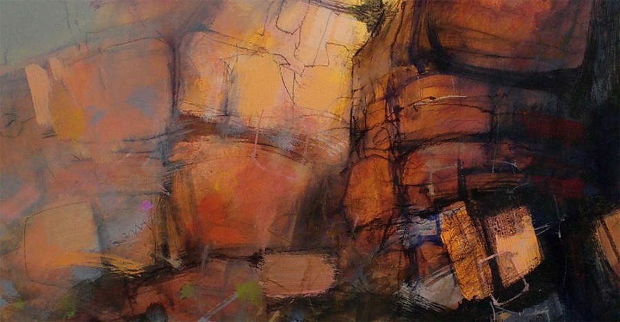
Over the past couple of weeks I have been busy working on this large (1500×900) acrylic, charcoal and ink painting. It is based on a large sandstone wall, towering over a rock pool in the Umbrawarra Gorge, south of Litchfield National Park in the Northern Territory. Apart from the spectacular appearance of the place, the thing that impressed me was the strange silence, broken by occasional disjointed echoes. The sounds of distant birds, insects and breezes all seemed to emanate from the rocks, always punctuated by long periods of silence. Hidden through the rocks was evidence of faded aboriginal rock paintings.

I used colored acrylic glazes over white areas of gesso to get a transparent glow into some of the rock shapes. These are contrasted with solid opaque patches of similar colored acrylic. When the paint was dry I drew over it with charcoal pencil (black and white) and Burnt Sienna pigment ink. The most difficult part of this painting was getting the abstract marks right. It took a lot of looking and adjusting until everything seemed to fall into place. What I like about this process are the intricate, underlying textures that build up. Painting like this really makes me appreciate the work of  Franz Kline. He seems to effortlessly create the most beautiful abstract marks – perfectly balanced and proportioned, right from scratch.