From Marrakesh we flew to Toulouse where we had a couple of days to explore the city. We were then picked up by a driver and taken through the French countryside to Domaine d’En Naudet, the beautiful venue for our week long painting retreat hosted by Uptrek.
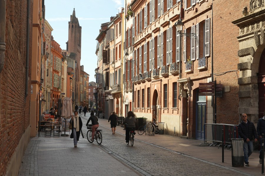
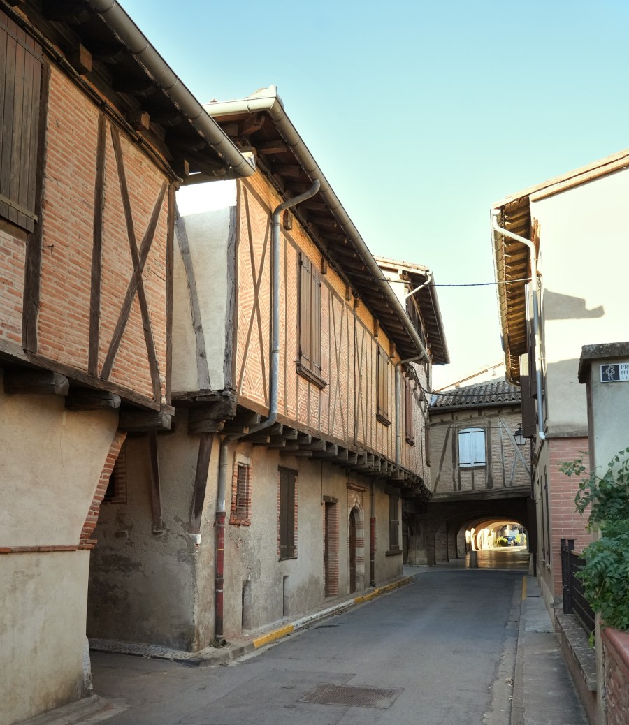
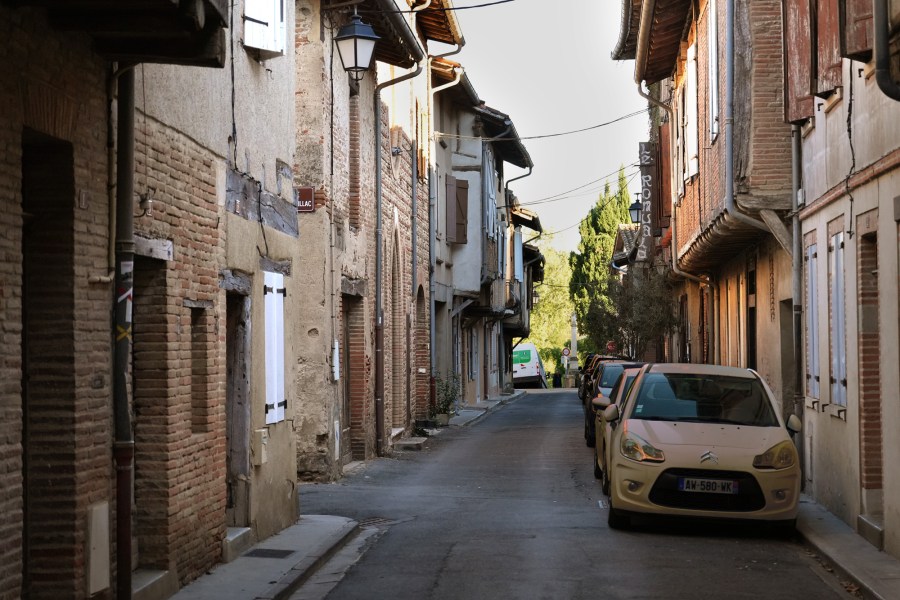
Winding streets of Toulouse.
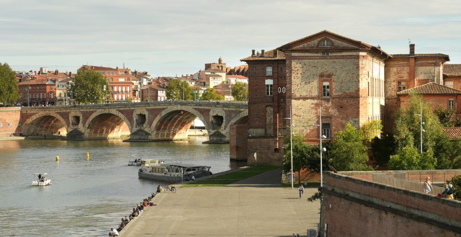
Bridge over the river Tarn, Toulouse.
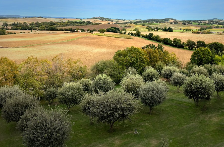
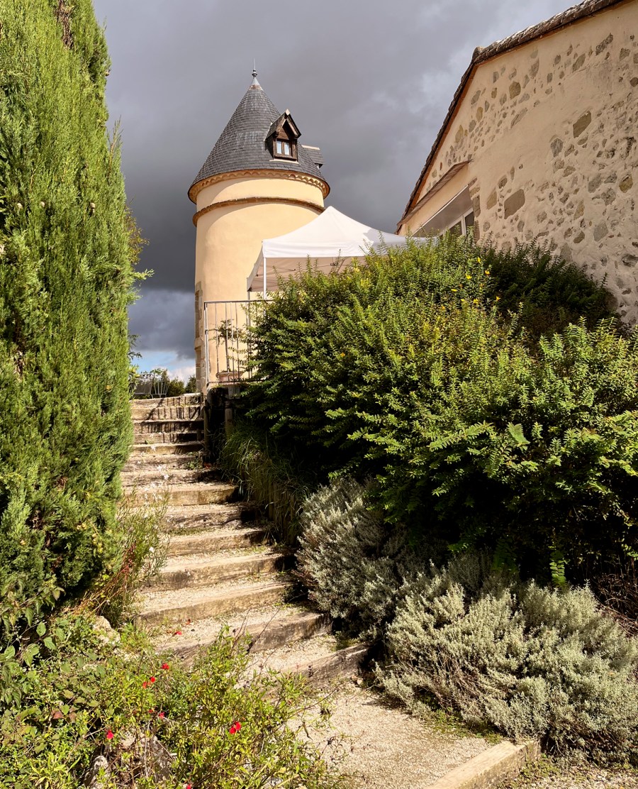
View of the countryside from the tower at Domaine d’En Naudet. The foreground trees are oaks planted to grow truffles.
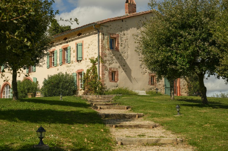
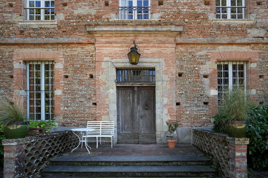
Domaine d’En Naudet
The tower at Domaine d’En Naudet was originally built for protection then in the early 1800’s converted to a pigeon house. It now serves as tall, thin accommodation.
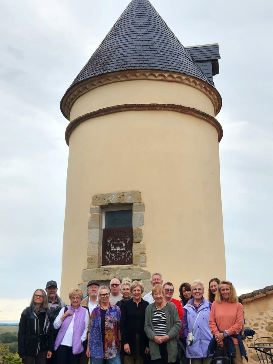
Our painting group gathered under the tower
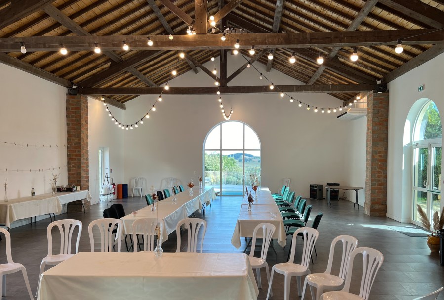
We were spoilt with a huge, well lit studio with attached kitchen and bathrooms and views from every window. Our hosts, Sophie and Nicholas, spoilt us with cakes, pastries, biscuits, cheese, fruit and coffee while we were busy painting in the studio
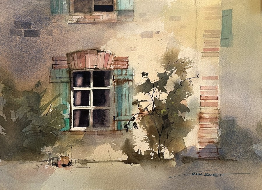
One of the downstairs windows at Domaine d’En Naudet.
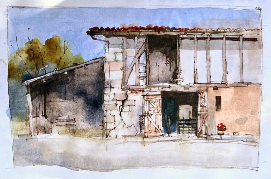
Our host Nicholas arranged for us to visit his nearby neighbour, Madeline. She lives in a wonderfull old Medieval house with attached barn. It was a magnificent, unspoilt building and a pleasure to sit and paint the rustic details
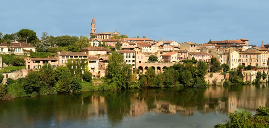
The town of Albi was a spectacular surprise
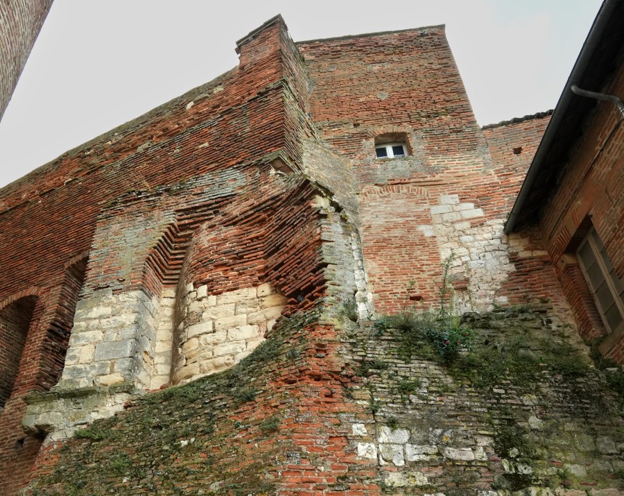
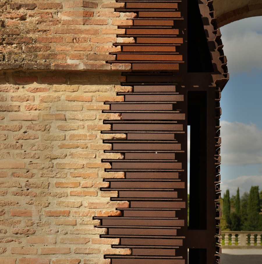
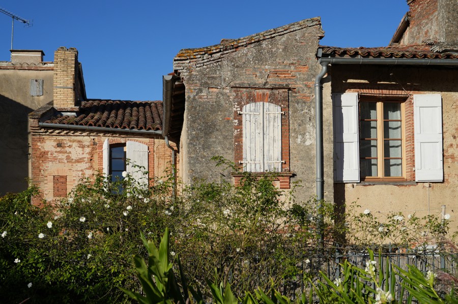
Ancient brick and stonework reveals the history of these fantastic old buildings. Centuries of alterations, renovations and repairs create an amazing texture and expose the skill of these tradesmen over the centuries.
A modern steel gate blends beautifully with the ancient brickwork.
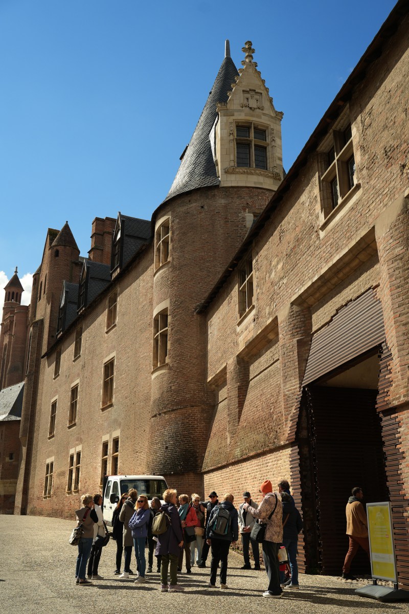
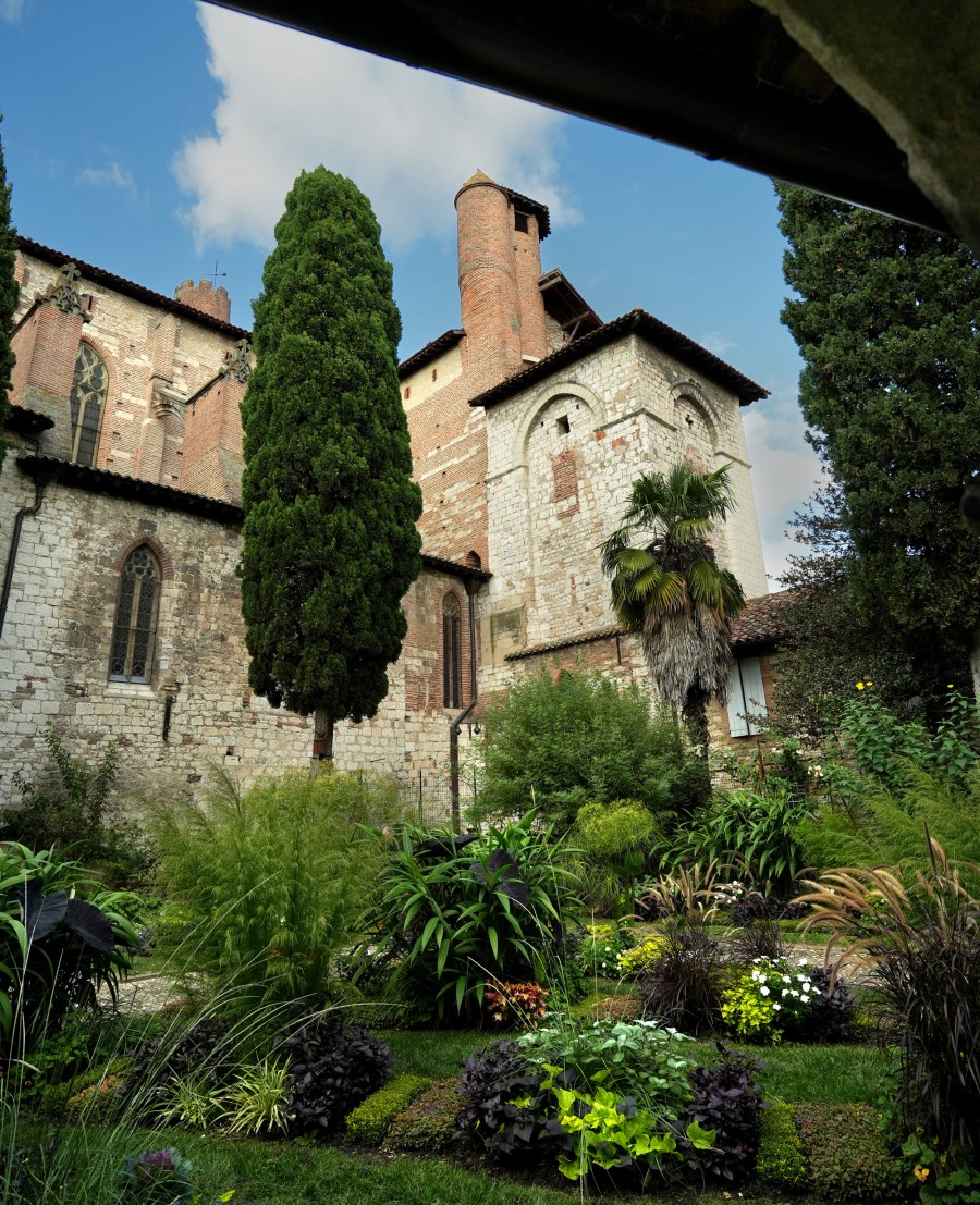
Saint-Salvy Cloister – Albi
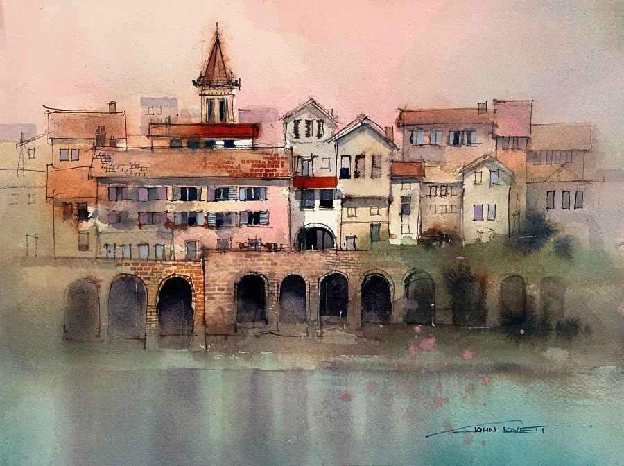
Painting Albi from across the river Tarn
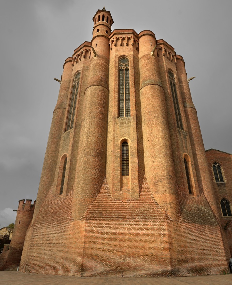
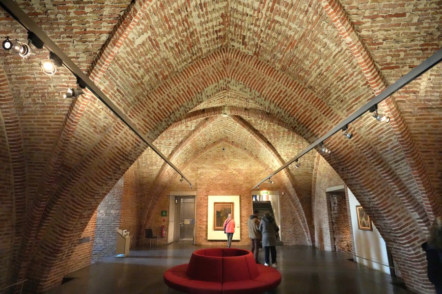
Sainte-Cecile Cathedral in Albi sure is an impressive building – lots of intricate, intersecting curves built entirely of brick.
Next to the Cathedral Sainte-Cecile is the Toulouse Lautrec museum. Another massive, construction all built from brick with a great collection of Lautrec’s paintings drawings and posters.
Château Lastours sits on the banks of the Tarn River surrounded by beautiful vineyards. We had a tour through their winery one afternoon, and sampled some fabulous wines – all stopped with cork, unlike the screw caps that have taken over in Australia.
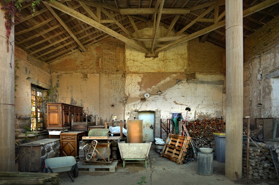
Château Lastours old store room
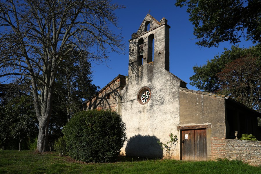
Old church in the grounds of Château Lastours
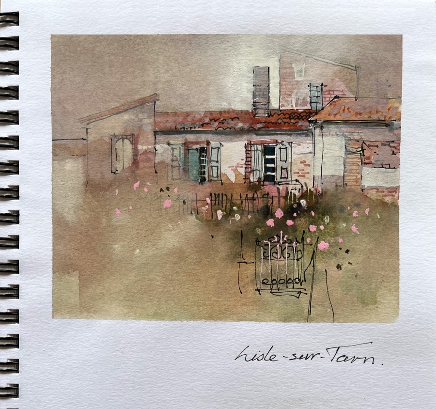
Not far from Château Lastours, on the way back to Domaine d’En Naudet, Nicholas took us to the village of Lisle-sur-Tarn. The village dates back to the 13th century and many of the old Medieval buildings are still intact. Taxes were paid on the footprint of a building, so it was common practise to build a small footprint ground floor, then cantilever a larger second story.
Southern France’s Occitanie region is a beautiful landscape filled with well preserved medieval towns and villages that make visible its long and fascinating history.
A wonderful place for a painting retreat.
Many thanks to Nicholas and Sophie for being such wonderful hosts, to Uptrek for organising the retreat and to the fabulous group of people who made the retreat so memorable and enjoyable.
What a lot of fun, six weeks of workshops and travel in Tasmania. We had two workshops in Hobart and one traveling from Launceston to Smithton then on to Strahan and finally back to Hobart. We were spoilt with fabulous food, great accommodation, wonderful company and a coach to take us to the numerous painting locations.
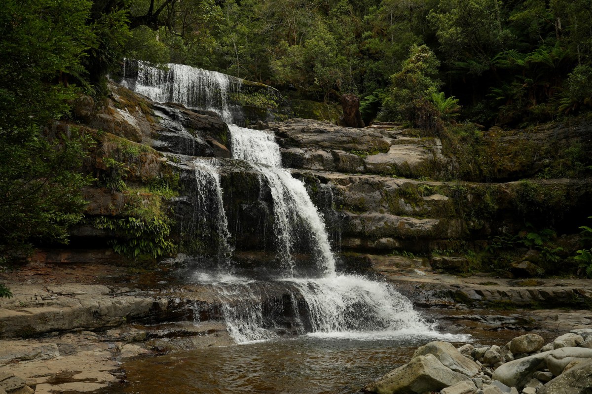
We had some great painting locations and also did a lot of sketches.
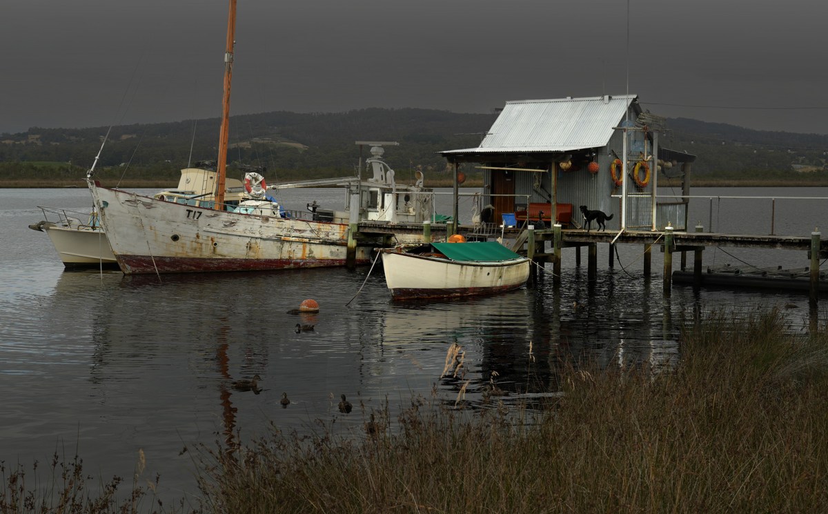
While in Hobart we traveled down to the village of Franklin – Famous for it’s wooden boats
Beautifully built from Huon Pine
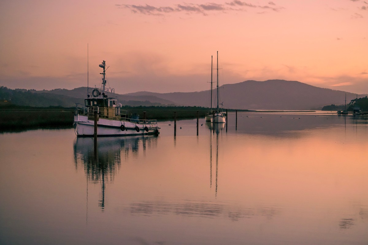
Life on the river
Late afternoon light was amazing.
The old boathouse where wooden boats are built and repaired.
Parked carefully in a shed, this old Suzuki still has a lot of life in it yet.
I cant resist photographing houses painted this crazy green
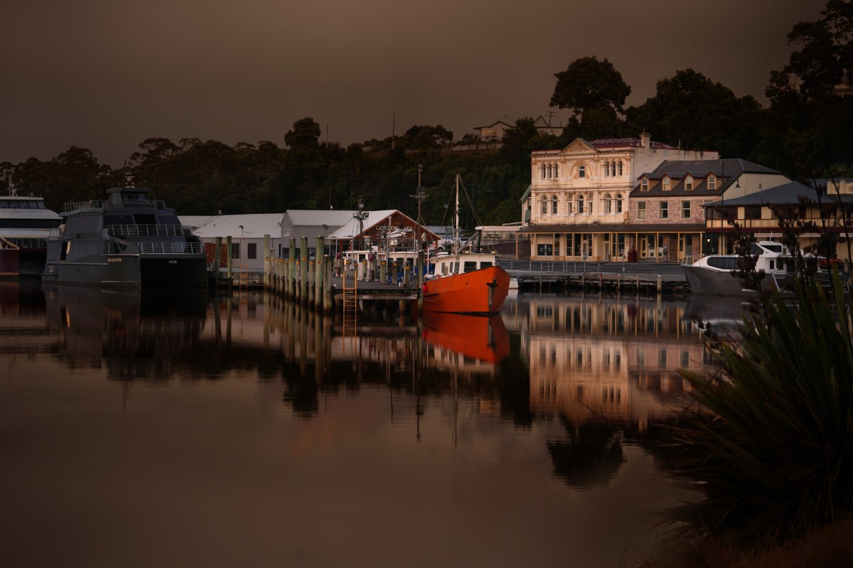
Strahan Evening
Strahan early in the morning
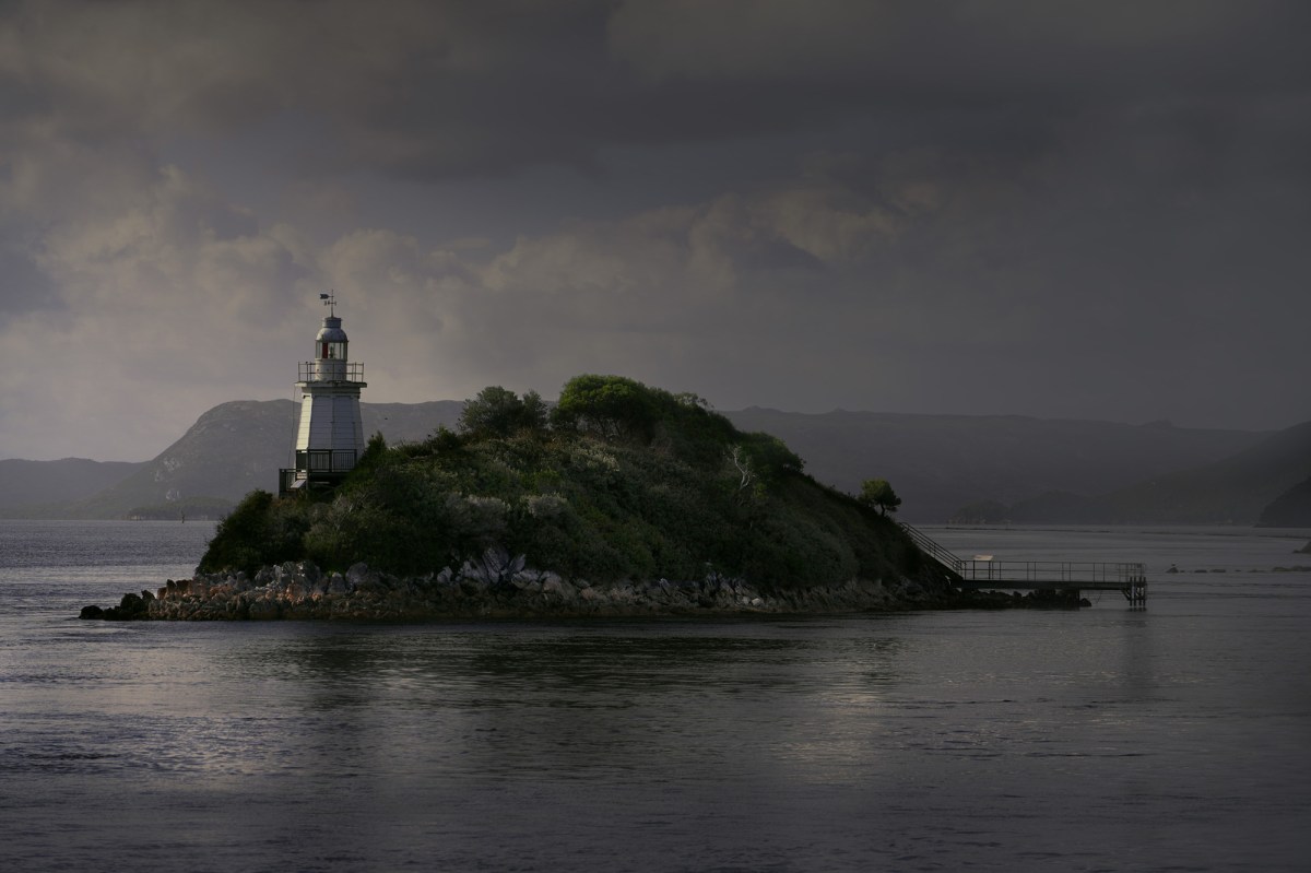
Hells Gate lighthouse
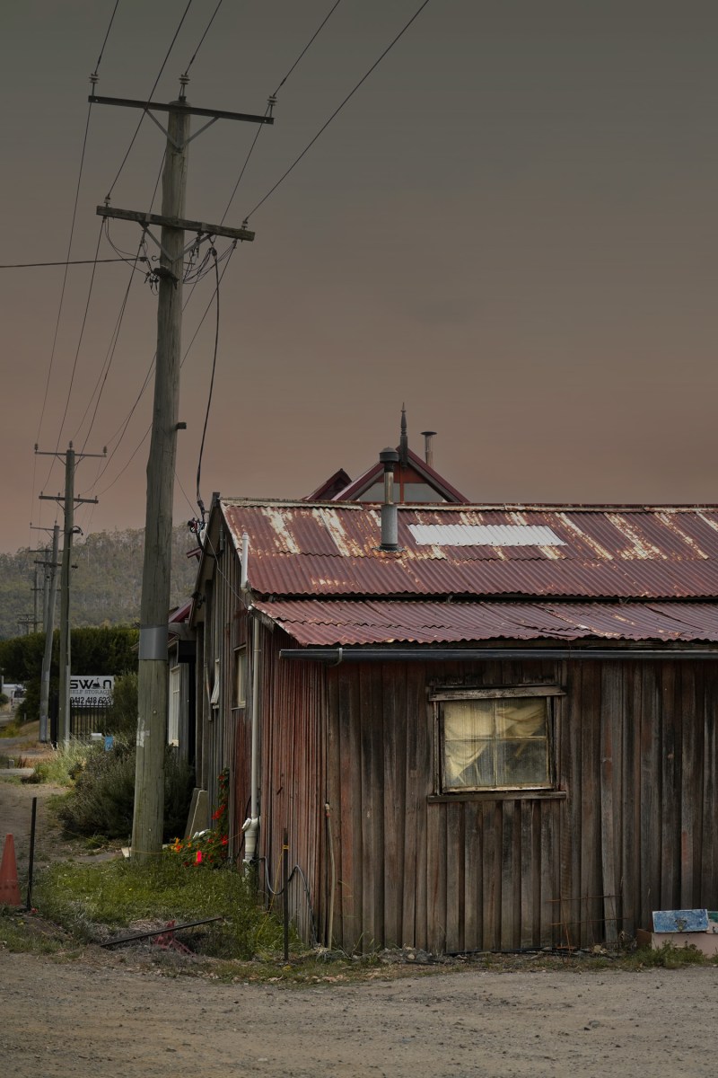
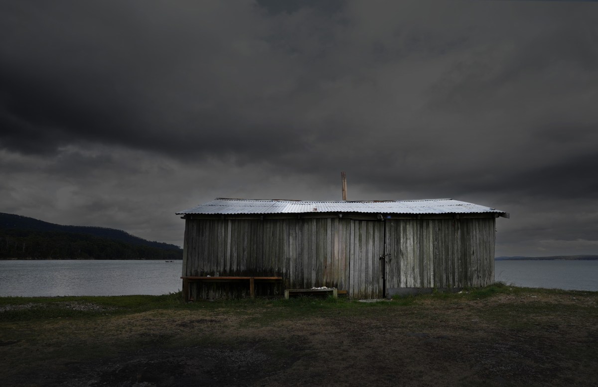
There are some fantastic old wooden boat sheds, apple sheds and huts south of Hobart – some in better condition than others.
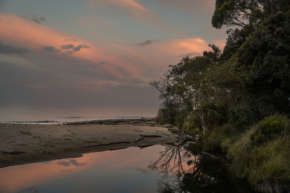
After the workshop Dianne and I drove down to Cockle Creek, the southern tip of Tasmania. Great camping spots, beautiful beaches and inlets.
We were lucky to see this Spotted Quoll out foraging
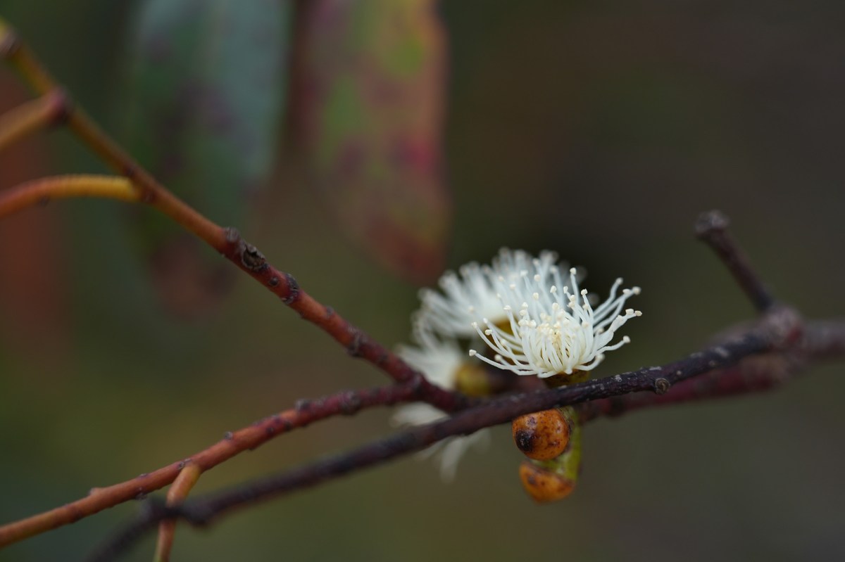
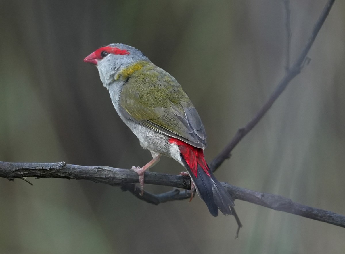
Great birdlife too.
Tasmania is a great place to travel. It is small and easy to get around, it has a huge variety of attractions. We travelled from the cold dramatic Western Tiers and Highland Lakes down to the sunny comfort of the coast in a couple of hours. The forests of the extreme south are unspoilt and beautiful. Tasmania’s history is dramatic and well preserved, and the state has some of the best food, wine and beer in Australia.
Placing figures in a painting often adds life and interest that can make the difference between an average painting and an engaging one. Here are some simple tips
One of the great pleasures of traveling is documenting the things we encounter. Not only do we accumulate a collection of paintings and sketches that become lasting memories of where we have been and what we have seen, but we also tend to observe much more by stopping and painting.
Check out the Article – 10 Tips I have found useful when traveling and painting.
If you have any helpful travel tips for painting, add them below in the comments.
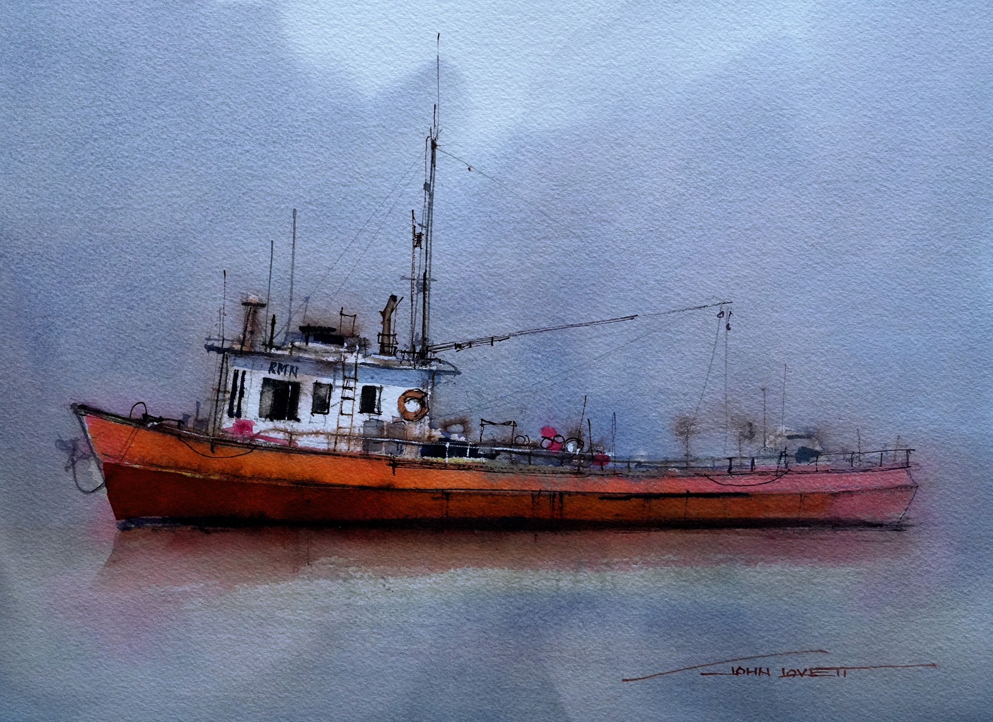
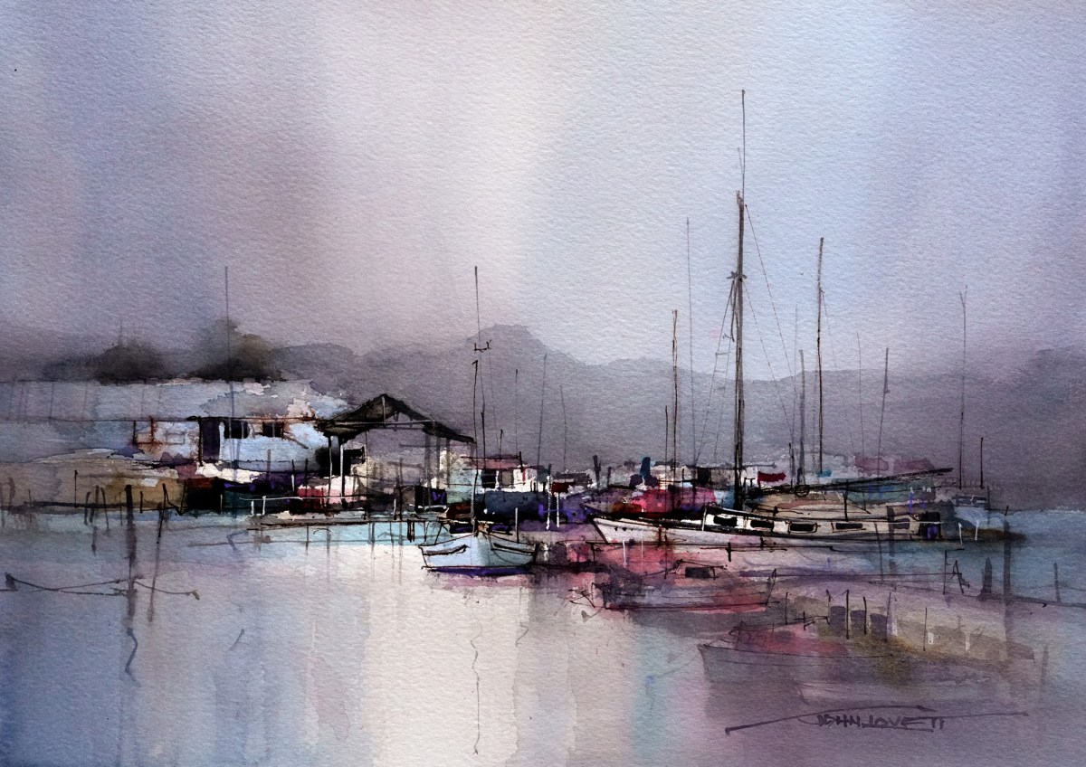
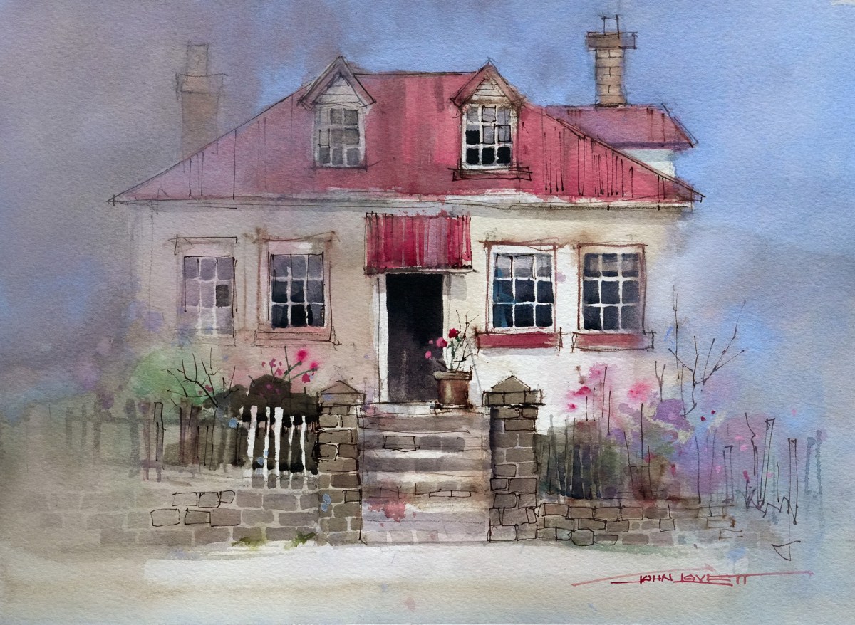
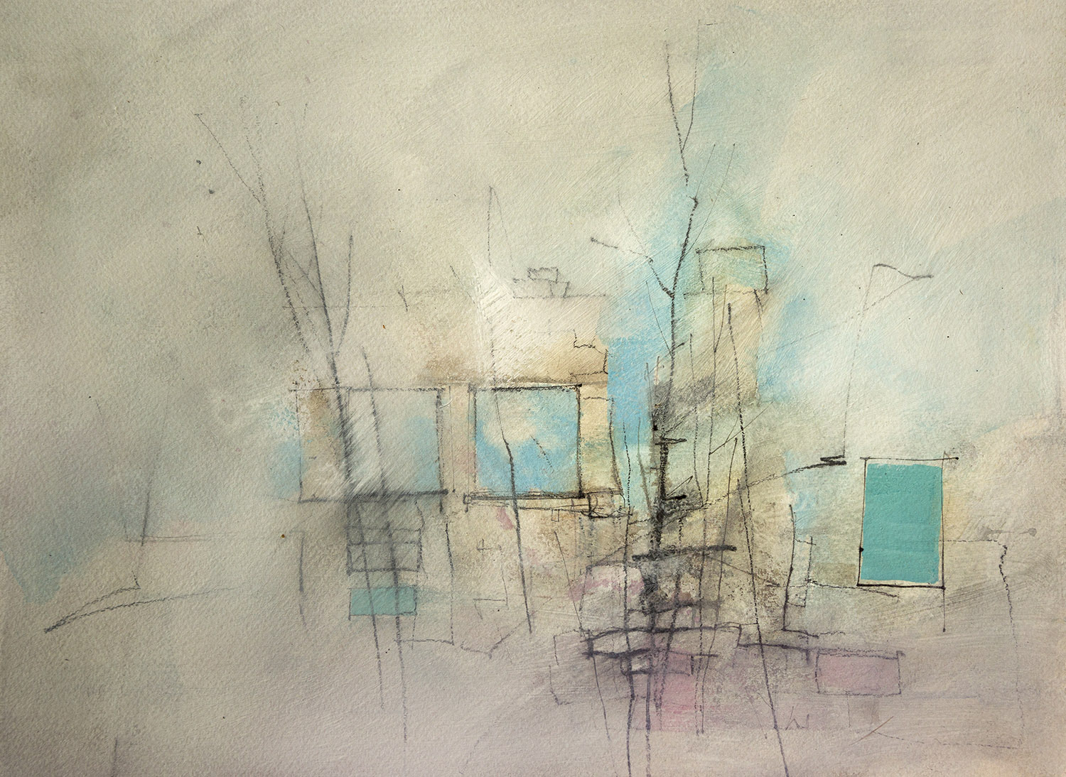
Varying degrees of abstraction can add greatly to the impact of a painting by encouraging the viewer to observe and interpret suggested details. When our paintings are based on a specific subject there is often a tendency to rely too heavily on what we see. Sometimes it is good to step back and ask ourselves just how much reliance on what we are seeing is really needed to express what we are feeling.
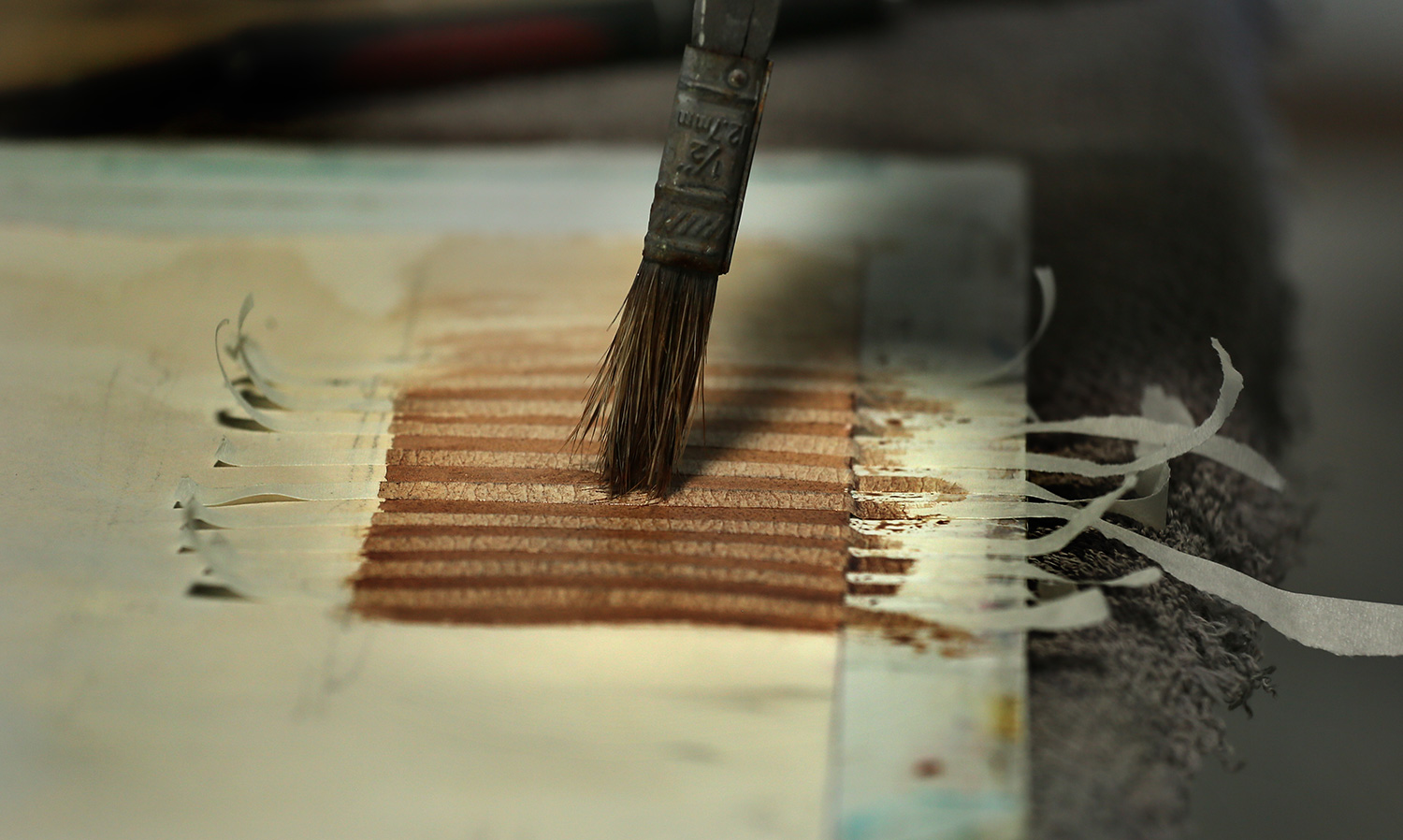
Watercolor is not a medium generally associated with texture, but there are a number of things we can do to create physical texture and many ways to create visual texture. Here are some ideas.