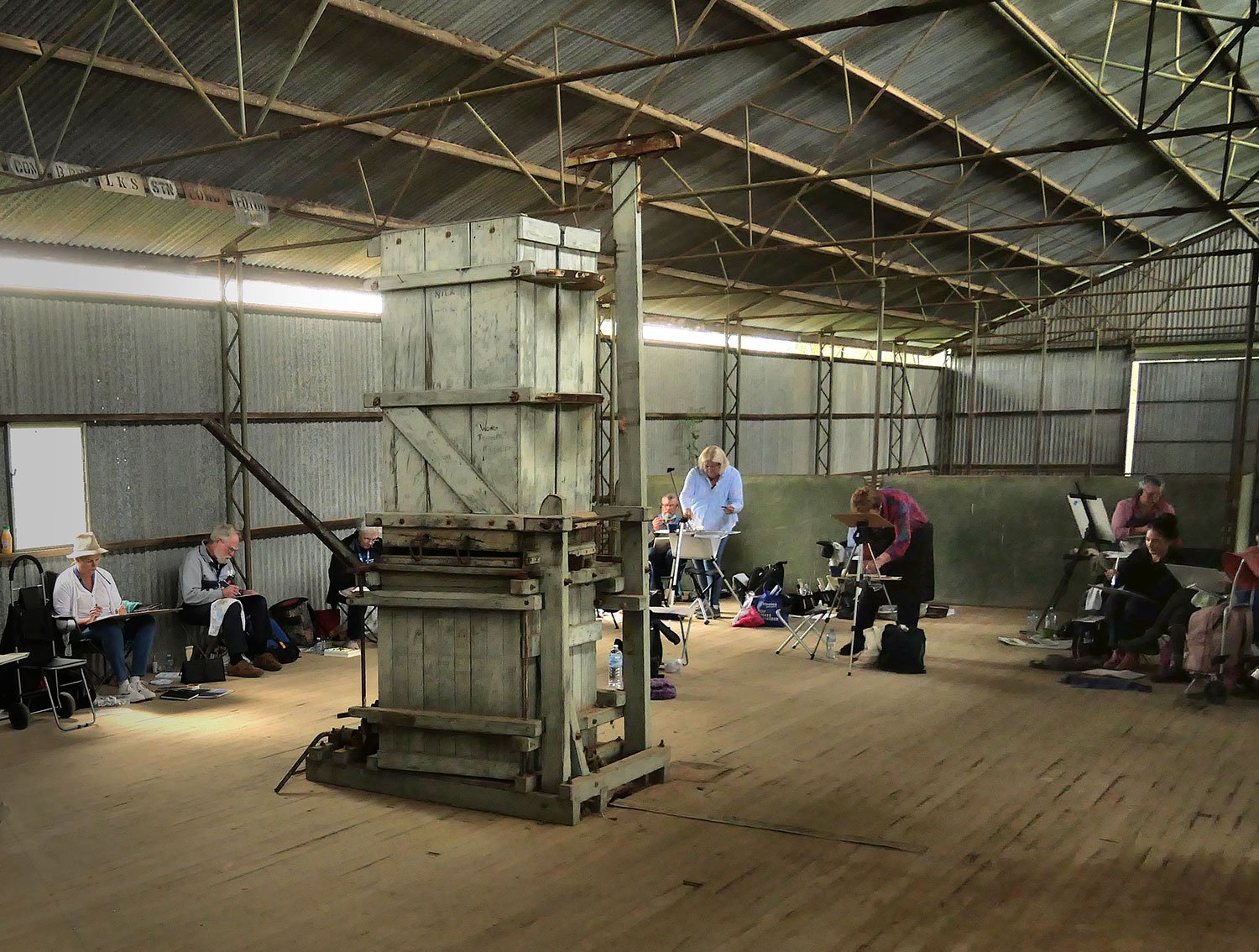
What a lot of fun, six weeks of workshops and travel in Tasmania. We had two workshops in Hobart and one traveling from Launceston to Smithton then on to Strahan and finally back to Hobart. We were spoilt with fabulous food, great accommodation, wonderful company and a coach to take us to the numerous painting locations.


We had some great painting locations and also did a lot of sketches.


While in Hobart we traveled down to the village of Franklin – Famous for it’s wooden boats

Beautifully built from Huon Pine

Life on the river

Late afternoon light was amazing.

The old boathouse where wooden boats are built and repaired.
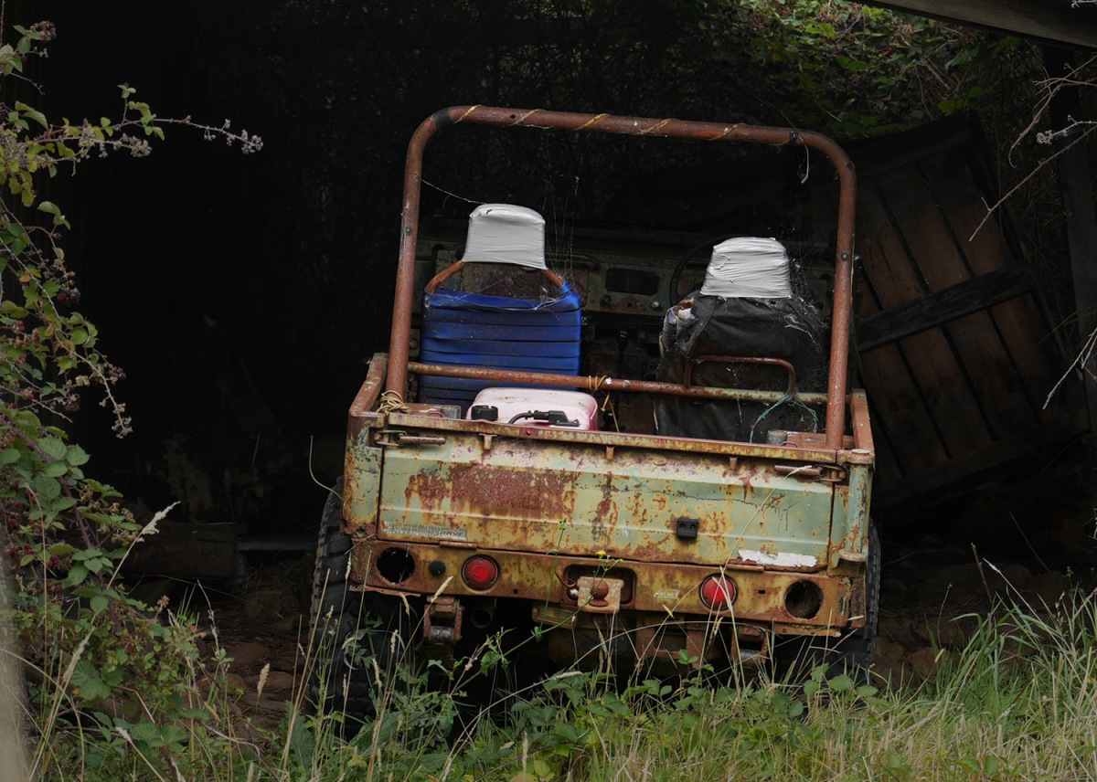
Parked carefully in a shed, this old Suzuki still has a lot of life in it yet.

I cant resist photographing houses painted this crazy green

Strahan Evening

Strahan early in the morning

Hells Gate lighthouse

There are some fantastic old wooden boat sheds, apple sheds and huts south of Hobart – some in better condition than others.


After the workshop Dianne and I drove down to Cockle Creek, the southern tip of Tasmania. Great camping spots, beautiful beaches and inlets.


We were lucky to see this Spotted Quoll out foraging

Great birdlife too.


Tasmania is a great place to travel. It is small and easy to get around, it has a huge variety of attractions. We travelled from the cold dramatic Western Tiers and Highland Lakes down to the sunny comfort of the coast in a couple of hours. The forests of the extreme south are unspoilt and beautiful. Tasmania’s history is dramatic and well preserved, and the state has some of the best food, wine and beer in Australia.
Well worth a visit.